Chart#
Embeds a matplotlib figure as a themed widget that recolors with the app.
Usage#
Chart is the bridge between bootstack and the scientific Python plotting
stack. You draw with matplotlib (or seaborn, which draws onto the same axes) and
the chart owns the rest: it embeds the figure as a first-class widget that fills
its space, recolors its chrome — figure and axes backgrounds, spines, ticks, and
text — to match the active theme, and flips with light/dark like everything else.
Chart is deliberately not a plotting API. It does not wrap matplotlib’s
drawing calls, so you keep the full expressive power of matplotlib and seaborn;
bootstack owns only embedding, theming, and the redraw loop.
Note
matplotlib is an optional dependency. Install it with the visualization
extra: pip install bootstack[viz] (or bootstack[viz-seaborn] to add
seaborn). Constructing a Chart without matplotlib installed raises a
BootstackError explaining how to
install it.
The mental model: two modes#
There are two ways to use a chart, and which one you pick decides how much bootstack does for you:
Figure host — you build a
Figureand hand it over. The chart embeds it and recolors its chrome to the theme. You own the figure; theming the data series is up to you.Managed render — you pass a
rendercallback and a reactive source. The chart owns the figure and the redraw loop: each redraw clears the axes, applies the theme (including a semantic accent color cycle), then calls yourrender. It re-renders when the theme changes or when the bound data changes.
Reach for the managed path whenever the plot reflects live state — it is what makes a chart reactive and fully themed. Use the figure host for a one-off figure you have already built.
Build figures with matplotlib’s object API (Figure),
never pyplot — an embedded figure must be a standalone object, and pyplot
would also pop a separate OS window.
Hosting a figure#
Build a figure and pass it as the first argument. The chart embeds it and themes its chrome:
from matplotlib.figure import Figure

fig = Figure()
ax = fig.add_subplot(111)
ax.plot([1, 2, 3], [4, 5, 6])
bs.Chart(fig, grow=True)
chart.figure is a live property — assign a new figure to swap what is shown.
For quick, imperative plotting, chart.ax returns the figure’s primary axes
(creating one if the figure is empty); call chart.draw() after mutating it:
chart = bs.Chart()
chart.ax.plot([1, 2, 3])
chart.draw()
Managed render and live data#
Pass a render callback to let the chart own the redraw. Bind it to a
Signal and the chart re-renders whenever the signal changes —
just draw, the chart clears and re-themes the axes for you:
count = bs.Signal(20)

def render(ax, n):
    ax.plot(range(n), [i * i for i in range(n)])

bs.Chart(render=render, signal=count, grow=True)   # redraws when count changes
Bind a data_source instead and render receives the source’s records (a
list of dicts). The chart re-renders whenever the source changes — so a chart and
a DataTable can share one source and stay in lockstep:
from bootstack.data import MemoryDataSource

ds = MemoryDataSource()
ds.load([{"month": "Jan", "sales": 12}, {"month": "Feb", "sales": 18}])

def render(ax, rows):
    ax.bar([r["month"] for r in rows], [r["sales"] for r in rows])

bs.Chart(render=render, data_source=ds, grow=True)
The chart reads the source’s current filtered/sorted view, so calling where()
or order() on the source reshapes the plot. For a high-frequency source, pass
debounce=<ms> to coalesce rapid changes into one render.
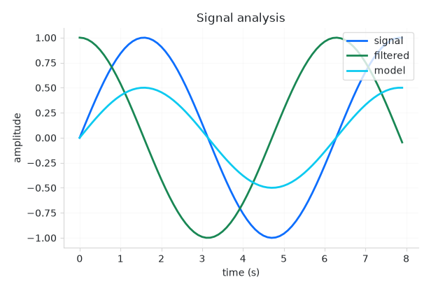
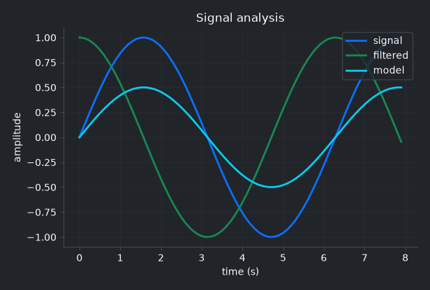
Theming and the accent cycle#
In the managed path the chart runs your render under the theme’s matplotlib
settings, including a semantic color cycle drawn from the accent roles
(primary, success, info, warning, danger, secondary). So
multiple series are on-brand without you naming a single color — the first plot is
primary, the second success, and so on, and they recolor on a theme
change.
This automatic styling governs the managed path only. A figure you build and pass as a host already owns its series colors, so the chart only recolors its chrome (faces, spines, ticks, text) — a fully bespoke figure styles itself.
To keep your own series colors while still letting the chart fit the app, pass
themed=False. The chrome (background, axes, text, ticks, grid) still tracks
the theme — so the chart never floats as a mismatched panel — but the accent
cycle and seaborn palette are not imposed, leaving the data colors to you (or to
your own matplotlib style). Colors you set explicitly on a series always win
regardless:
bs.Chart(render=render, signal=count, themed=False, grow=True)
Navigation toolbar#
Pass toolbar=True to add a themed navigation toolbar above the chart, with
home / back / forward history, pan, zoom-to-rectangle, and save:
bs.Chart(render=render, signal=count, toolbar=True, grow=True)
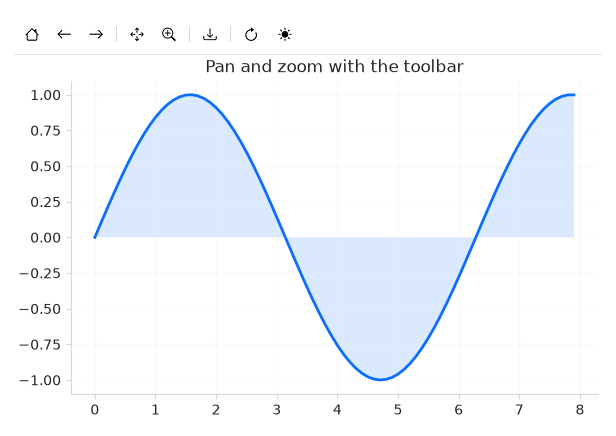
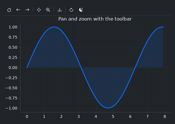
Pan and zoom drive matplotlib’s own navigation, so they work on any embedded figure; the active tool is highlighted in the bar, and the coordinate readout follows the cursor. Save opens bootstack’s file dialog and writes a PNG, PDF, or SVG.
To include only some of the standard tools, pass a list instead of True —
the named tools appear in that order, with dividers grouping them:
bs.Chart(render=render, toolbar=["pan", "zoom", "save"], grow=True)
The tool names are home, back, forward, pan, zoom, and
save. Pass [] for an empty bar you fill entirely yourself.
The toolbar is also yours to extend. chart.toolbar returns a
Toolbar — add your own buttons (a refresh, an export, a theme
toggle) and they sit beside the built-in tools:
chart = bs.Chart(render=render, signal=count, toolbar=True, grow=True)
chart.toolbar.add_divider()
chart.toolbar.add_button(icon="arrow-clockwise", on_click=refresh)
chart.toolbar.add_widget(bs.ThemeToggle)
Seaborn#
seaborn draws onto a matplotlib axes, so it works
inside a render callback with no special integration — call it with
ax=ax. When seaborn is installed (the viz-seaborn extra) and imported, the
chart seeds its palette from the same accent cycle, so a categorical plot picks up
the theme’s colors:
import seaborn as sns

def render(ax, rows):
    sns.barplot(data=rows, x="quarter", y="revenue", hue="region", ax=ax)

bs.Chart(render=render, data_source=ds, grow=True)
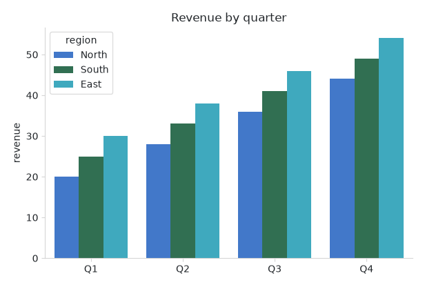
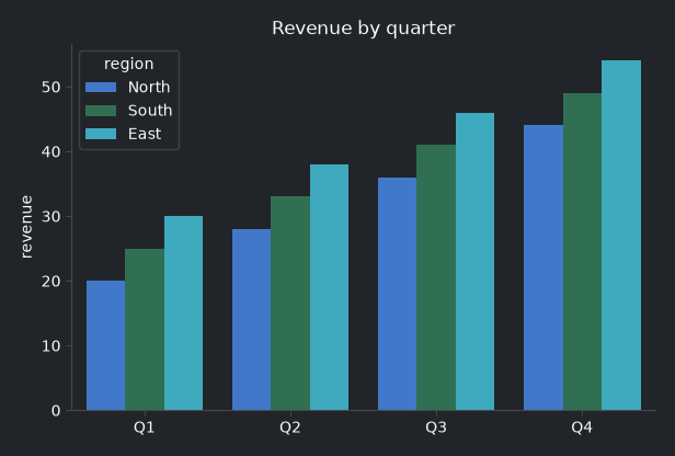
Because seaborn plots are usually area-filled (bars, violins, KDE), the seeded
palette is softened from the full accent saturation to suit that look. Tune it
with seaborn_desat (0–1; default 0.75) — pass 1.0 to keep the
accents fully saturated, or give your seaborn call an explicit palette= to
override entirely.
Animation#
For continuous motion, animate is the fast path. The managed render path
rebuilds the whole figure on each update — right for occasional data changes, but
limited to roughly 30 fps. Animation instead updates artists in place and redraws
only them over a cached background, sustaining high frame rates:
import math

def setup(ax):
    (line,) = ax.plot([], [])
    ax.set_xlim(0, 2 * math.pi)        # fixed limits — blitting needs stable axes
    ax.set_ylim(-1, 1)
    return line

def update(t, line):                    # t is elapsed seconds
    xs = [i / 20 for i in range(126)]
    line.set_data(xs, [math.sin(x - t) for x in xs])

chart = bs.Chart()
anim = chart.animate(setup, update, interval=30)
# anim.stop() / anim.start() to control it
setup runs once to create the artists and set fixed axis limits; update
runs each frame with the elapsed time in seconds, so apparent speed stays constant
under timer jitter. The animation pauses automatically when the chart is hidden (a
switched-away tab, a minimized window) and resumes when shown, and stops when the
widget is destroyed.
Widget sizing#
All widgets accept self-placement kwargs via **kwargs. The parent
container determines which options apply — Column / Row parents use
the layout kwargs below, grid-based parents use grid kwargs.
Column (vertical layout)
Used inside a Column, App, or any other container with a column layout.
Children are arranged top-to-bottom, so horizontal aligns each child across
the width and grow shares the vertical space. (vertical does not apply —
the order of the children sets their top-to-bottom position.)
|
Cross-axis placement of the widget: |
|
Claim and fill a share of the leftover vertical space (the layout
direction). |
|
External spacing in pixels. Accepts an integer (equal on all
sides), a 2-tuple |
|
Horizontal external spacing (left and right). Accepts an integer
or a 2-tuple |
|
Vertical external spacing (top and bottom). Accepts an integer
or a 2-tuple |
Row (horizontal layout)
Used inside a Row or any other container with a row layout. Children are
arranged left-to-right, so vertical aligns each child across the height and
grow shares the horizontal space. (horizontal does not apply — the order
of the children sets their left-to-right position.)
|
Cross-axis placement of the widget: |
|
Claim and fill a share of the leftover horizontal space (the layout
direction). |
|
External spacing in pixels. Accepts an integer (equal on all
sides), a 2-tuple |
|
Horizontal external spacing (left and right). Accepts an integer
or a 2-tuple |
|
Vertical external spacing (top and bottom). Accepts an integer
or a 2-tuple |
Grid
Used inside a Grid container.
|
Zero-based row and column indices. |
|
Number of rows or columns to span. |
|
Horizontal placement within the grid cell: |
|
Vertical placement within the grid cell: |
|
External spacing in pixels. Accepts an integer, a 2-tuple
|
|
Horizontal external spacing. Accepts an integer or |
|
Vertical external spacing. Accepts an integer or |
A chart fills the space it is given. Pass grow=True (and
horizontal="stretch" in a column) so it expands to fill its container.
See also#
Displaying Data — backing widgets with a data source.
Signal— the reactive value a managed chart binds to.DataTable — pair a table and a chart on one data source.
API#
The complete reference for Chart lives on the
Widgets API page. At a glance:
Embed a matplotlib figure in a bootstack app, themed to match. |
Full Example#
 1
 2with bs.App(title="Chart", size=(680, 520), padding=16, gap=12) as app:
 3    points = bs.Signal(60)
 4
 5    def render(ax, n):
 6        """Draw two themed series; colors come from the accent cycle."""
 7        xs = [i / 8 for i in range(n)]
 8        ax.plot(xs, [math.sin(x) for x in xs], label="sin", linewidth=2)
 9        ax.plot(xs, [math.cos(x) for x in xs], label="cos", linewidth=2)
10        ax.set_title("Trigonometric curves")
11        ax.set_xlabel("x")
12        ax.set_ylabel("amplitude")
13        ax.grid(True, alpha=0.3)
14        ax.legend(loc="upper right")
15
16    bs.Label("A reactive matplotlib figure, themed to match the app",
17             font="heading-md")
18    bs.Chart(render=render, signal=points, toolbar=True,
19             grow=True, horizontal="stretch")
20
21    with bs.Row(gap=12, horizontal="stretch"):
22        bs.Label("Points")
23        bs.Slider(signal=points, min_value=10, max_value=120, grow=True)
24        bs.Button("Toggle theme", on_click=bs.toggle_theme)
25
26app.run()