Row#
A container that lays out its children in a single horizontal row, left to right. By default each child keeps its natural size and the group sits against the left edge.
Usage#
A row lays its children out left to right. By default they keep their natural
size — use gap= to space them, vertical_items= to align them on the cross
axis, and a child’s grow=True (or a Spacer) to fill the
leftover width.
Gap#
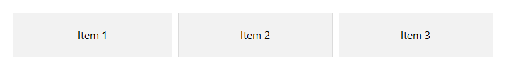
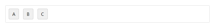
gap= sets uniform spacing in pixels between children.
# gap=4 — items close together
with bs.Row(gap=4, show_border=True, padding=8):
    for i in range(1, 4):
        bs.Button(f"Item {i}")

# gap=24 — items spread apart
with bs.Row(gap=24, show_border=True, padding=8):
    for i in range(1, 4):
        bs.Button(f"Item {i}")

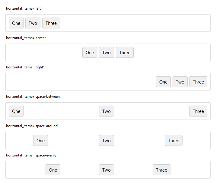
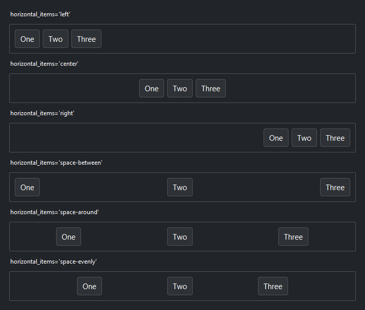
Arranging the group#
horizontal_items= positions the whole group of children along the row.
'left' (the default), 'center', and 'right' cluster them at one
edge; 'space-between', 'space-around', and 'space-evenly' distribute
them across the full width. (It has no effect once a child grows.)
Arrangement only has room to act when the row is wider than its children, so
these rows use horizontal="stretch" to span their parent.
# cluster the group at one edge
with bs.Row(horizontal_items="center", horizontal="stretch", show_border=True, padding=8):
    bs.Button("One"); bs.Button("Two"); bs.Button("Three")

# distribute the group across the full width
with bs.Row(horizontal_items="space-evenly", horizontal="stretch", show_border=True, padding=8):
    bs.Button("One"); bs.Button("Two"); bs.Button("Three")
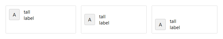
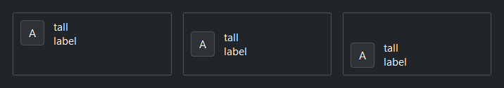
Cross-axis alignment#
vertical_items= aligns children up and down within the row. 'center'
(the default) lines up mixed-height widgets (e.g. a label next to a text field);
'top' or 'bottom' pin them to an edge, and 'stretch' makes every
child fill the row height. Override a single child with vertical=.
with bs.Row(vertical_items="center", gap=8, height=90, show_border=True, padding=8):
    bs.Button("A")
    bs.Label("tall\nlabel")
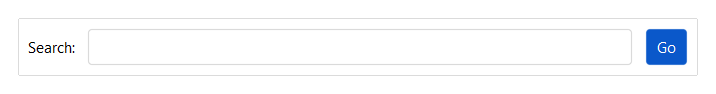
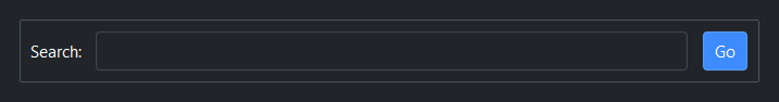
Growing a child#
grow=True lets one child claim and fill the leftover width while the others
keep their natural size. A search field between a fixed label and button is the
classic case.
with bs.Row(gap=8, vertical_items="center"):
    bs.Label("Search:")
    bs.TextField(grow=True)          # fills the leftover width
    bs.Button("Go", accent="primary")
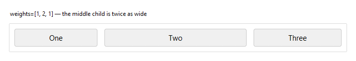
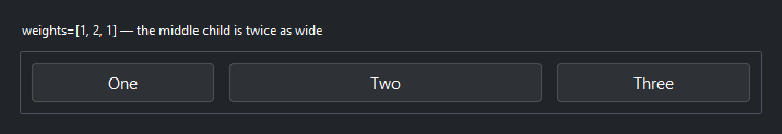
Proportional widths#
weights= sizes children by a fixed ratio rather than by content.
weights=[1, 2, 1] makes the middle child twice as wide as each neighbor, the
three together filling the row.
with bs.Row(gap=8, weights=[1, 2, 1], horizontal="stretch"):
    bs.Button("One"); bs.Button("Two"); bs.Button("Three")
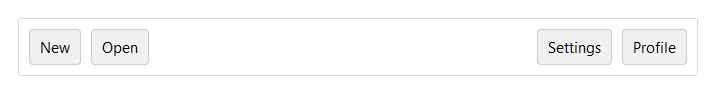
Spacer#
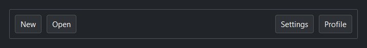
A Spacer is a local break that pushes its neighbors
apart — use it to split a row into clusters without nesting. Where
horizontal_items moves the whole group, a Spacer opens a gap at one
point.
with bs.Row(gap=4):
    bs.Button("New")
    bs.Button("Open")
    bs.Spacer()                      # everything after is pushed right
    bs.Button("Settings")
    bs.Button("Profile")
Background#
surface= sets the container background. It accepts a surface token
('content', 'card', 'chrome', 'overlay') or any accent token
('primary', 'success', etc.) with optional modifiers:
with bs.Row(surface="card", padding=12, gap=8):
    bs.Label("Sits on card surface")

with bs.Row(surface="primary[subtle]", padding=12, gap=8):
    bs.Label("Accent-tinted background")
Border#
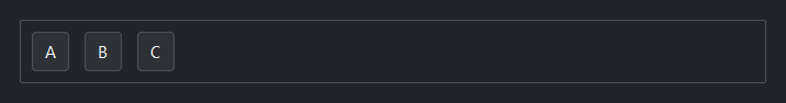
show_border=True draws a 1 px border along the inside edge of the frame.
Without padding, children render flush against it. Use at least padding=1
to give the border visual clearance.
with bs.Row(gap=8, show_border=True, padding=8):
    bs.Button("A")
    bs.Button("B")
    bs.Button("C")
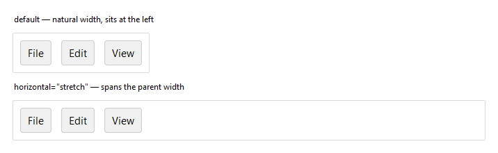
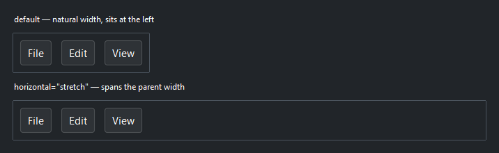
Self-placement#
horizontal, vertical, and grow control how the Row places itself
within its parent — separate from how it arranges its own children. By default a
Row sits at its natural width; horizontal="stretch" makes it span the parent,
which is what lets a toolbar fill the window.
# Natural width — sits against the left edge
with bs.Row(gap=8, show_border=True, padding=8):
    bs.Button("File"); bs.Button("Edit"); bs.Button("View")

# horizontal="stretch" — spans the full window width
with bs.Row(gap=8, show_border=True, padding=8, horizontal="stretch"):
    bs.Button("File"); bs.Button("Edit"); bs.Button("View")
Widget sizing#
All widgets accept self-placement kwargs via **kwargs. The parent
container determines which options apply — Column / Row parents use
the layout kwargs below, grid-based parents use grid kwargs.
Column (vertical layout)
Used inside a Column, App, or any other container with a column layout.
Children are arranged top-to-bottom, so horizontal aligns each child across
the width and grow shares the vertical space. (vertical does not apply —
the order of the children sets their top-to-bottom position.)
|
Cross-axis placement of the widget: |
|
Claim and fill a share of the leftover vertical space (the layout
direction). |
|
External spacing in pixels. Accepts an integer (equal on all
sides), a 2-tuple |
|
Horizontal external spacing (left and right). Accepts an integer
or a 2-tuple |
|
Vertical external spacing (top and bottom). Accepts an integer
or a 2-tuple |
Row (horizontal layout)
Used inside a Row or any other container with a row layout. Children are
arranged left-to-right, so vertical aligns each child across the height and
grow shares the horizontal space. (horizontal does not apply — the order
of the children sets their left-to-right position.)
|
Cross-axis placement of the widget: |
|
Claim and fill a share of the leftover horizontal space (the layout
direction). |
|
External spacing in pixels. Accepts an integer (equal on all
sides), a 2-tuple |
|
Horizontal external spacing (left and right). Accepts an integer
or a 2-tuple |
|
Vertical external spacing (top and bottom). Accepts an integer
or a 2-tuple |
Grid
Used inside a Grid container.
|
Zero-based row and column indices. |
|
Number of rows or columns to span. |
|
Horizontal placement within the grid cell: |
|
Vertical placement within the grid cell: |
|
External spacing in pixels. Accepts an integer, a 2-tuple
|
|
Horizontal external spacing. Accepts an integer or |
|
Vertical external spacing. Accepts an integer or |
See also#
Column — vertical equivalent.
Spacer — a composable break that
pushes neighbors apart.
Grid — row and column layout.
Card and
GroupBox — a Row/Column with
an elevated background or labelled border.
API#
The complete reference for Row lives on the
Widgets API page. At a glance:
Lays out children left to right along the horizontal axis. |
Full Example#
 1
 2with bs.App(title="Row Demo", minsize=(720, 1), padding=20, gap=16) as app:
 3
 4    # Gap
 5    bs.Label("gap", font="heading-sm")
 6    with bs.Row(gap=16):
 7        with bs.Column(gap=4):
 8            bs.Label("gap=4", font="caption")
 9            with bs.Row(show_border=True, gap=4, padding=8):
10                [bs.Button(lbl) for lbl in ("A", "B", "C")]
11        with bs.Column(gap=4):
12            bs.Label("gap=16", font="caption")
13            with bs.Row(show_border=True, gap=16, padding=8):
14                [bs.Button(lbl) for lbl in ("A", "B", "C")]
15
16    # horizontal_items — arrange the whole group along the row
17    bs.Label("horizontal_items", font="heading-sm")
18    for arrangement in ("left", "center", "right", "space-between"):
19        bs.Label(f"horizontal_items={arrangement!r}", font="caption")
20        with bs.Row(horizontal_items=arrangement, show_border=True, padding=8,
21                    horizontal="stretch"):
22            [bs.Button(lbl) for lbl in ("One", "Two", "Three")]
23
24    # vertical_items — cross-axis alignment of mixed-height children
25    bs.Label("vertical_items", font="heading-sm")
26    with bs.Row(gap=16, horizontal="stretch"):
27        for alignment in ("top", "center", "bottom"):
28            with bs.Column(gap=4, grow=True):
29                bs.Label(f"={alignment!r}", font="caption")
30                with bs.Row(vertical_items=alignment, show_border=True,
31                            padding=8, height=90, gap=8, horizontal="stretch"):
32                    bs.Button("A")
33                    bs.Label("tall\nlabel")
34
35    # grow — let a child claim and fill leftover width
36    bs.Label("grow", font="heading-sm")
37    with bs.Row(gap=8, show_border=True, padding=8, vertical_items="center",
38                horizontal="stretch"):
39        bs.Label("Search:")
40        bs.TextField(grow=True)        # claims the leftover width
41        bs.Button("Go", accent="primary")
42
43    # weights — share width in a fixed ratio (here 1 : 2 : 1)
44    bs.Label("weights=[1, 2, 1]", font="heading-sm")
45    with bs.Row(gap=8, weights=[1, 2, 1], show_border=True, padding=8,
46                horizontal="stretch"):
47        [bs.Button(lbl) for lbl in ("1", "2", "1")]
48
49    # Spacer — a local break that pushes a cluster aside (no nesting)
50    bs.Label("Spacer", font="heading-sm")
51    with bs.Row(gap=4, show_border=True, padding=8, horizontal="stretch"):
52        bs.Button("New")
53        bs.Button("Open")
54        bs.Spacer()
55        bs.Button("Settings")
56        bs.Button("Profile")
57
58app.run()