Column#
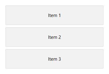
A container that lays out its children in a single vertical column, top to bottom. By default each child keeps its natural height and the group sits at the top edge.
Usage#
A column lays its children out top to bottom. By default they keep their natural
height — use gap= to space them, horizontal_items= to align them on the
cross axis, and a child’s grow=True (or a Spacer) to fill the
leftover height.
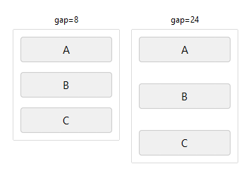
Gap#
gap= sets uniform spacing in pixels between children.
# gap=8 — rows close together
with bs.Column(gap=8, show_border=True, padding=8, horizontal_items="stretch"):
    for lbl in ("A", "B", "C"):
        bs.Button(lbl)

# gap=24 — rows spread apart
with bs.Column(gap=24, show_border=True, padding=8, horizontal_items="stretch"):
    for lbl in ("A", "B", "C"):
        bs.Button(lbl)
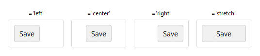
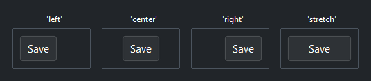
Cross-axis alignment#
horizontal_items= aligns children left and right within the column.
'left', 'center' (the default), and 'right' size each child to its
content and pin it to that edge; 'stretch' makes every child fill the column
width — the usual choice for a form column. Override a single child with
horizontal=.
with bs.Column(horizontal_items="center", show_border=True, padding=8):
    bs.Button("Save")

with bs.Column(horizontal_items="stretch", show_border=True, padding=8):
    bs.Button("Save")          # fills the column width
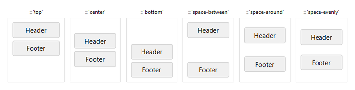
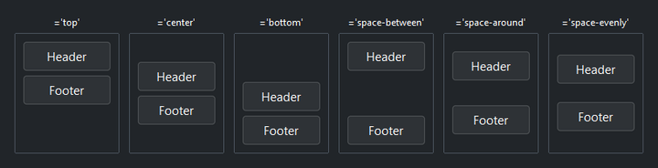
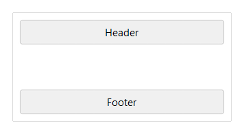
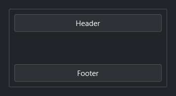
Arranging the group#
vertical_items= positions the whole group of children down the column.
'top' (the default), 'center', and 'bottom' cluster them at one
edge; 'space-between', 'space-around', and 'space-evenly' distribute
them across the full height. (It has no effect once a child grows.)
Arrangement only has room to act when the column is taller than its children, so
these examples set a fixed height=.
# cluster the group at one edge
with bs.Column(vertical_items="center", height=140,
               show_border=True, padding=8, horizontal_items="stretch"):
    bs.Button("Header")
    bs.Button("Footer")

# distribute the group across the full height
with bs.Column(vertical_items="space-evenly", height=140,
               show_border=True, padding=8, horizontal_items="stretch"):
    bs.Button("Header")
    bs.Button("Footer")
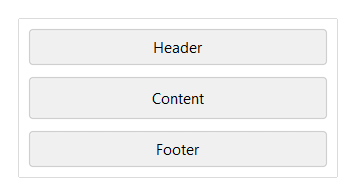
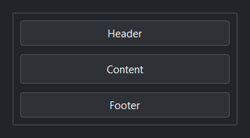
Growing a child#
grow=True lets one child claim and fill the leftover height while the others
keep their natural size — ideal for a content area between a fixed header and
footer.
with bs.Column(gap=6, height=150, horizontal_items="stretch"):
    bs.Button("Header")
    bs.Button("Content", grow=True)   # fills the middle
    bs.Button("Footer")
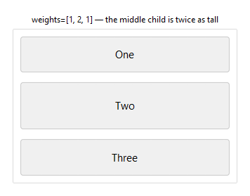
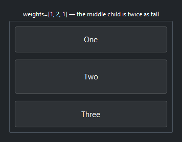
Proportional heights#
weights= sizes children by a fixed ratio rather than by content.
weights=[1, 2, 1] makes the middle child twice as tall as each neighbor, the
three together filling the column.
with bs.Column(gap=8, weights=[1, 2, 1], height=220, horizontal_items="stretch"):
    bs.Button("One"); bs.Button("Two"); bs.Button("Three")
Spacer#
A Spacer is a local break that pushes its neighbors
apart — drop one in to send a footer to the bottom without fixing the column
height. Where vertical_items moves the whole group, a Spacer opens a
gap at one point.
with bs.Column(gap=6, height=150, horizontal_items="stretch"):
    bs.Button("Header")
    bs.Spacer()                       # pushes the footer to the bottom
    bs.Button("Footer")
Background#
surface= sets the container background. It accepts a surface token
('content', 'card', 'chrome', 'overlay') or any accent token
('primary', 'success', etc.) with optional modifiers:
with bs.Column(surface="card", padding=12, gap=8):
    bs.Label("Sits on card surface")

with bs.Column(surface="primary[subtle]", padding=12, gap=8):
    bs.Label("Accent-tinted background")
Border#
show_border=True draws a 1 px border along the inside edge of the frame.
Without padding, children render flush against it. Use at least padding=1
to give the border visual clearance.
with bs.Column(gap=8, show_border=True, padding=8, horizontal_items="stretch"):
    bs.Button("A")
    bs.Button("B")
    bs.Button("C")
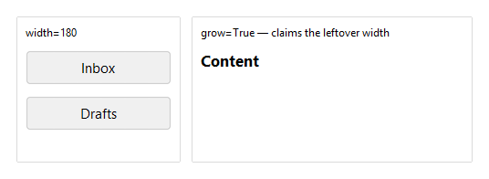
Self-placement#
horizontal, vertical, and grow control how the Column places itself
within its parent — separate from how it arranges its own children. In a
horizontal parent, grow=True lets a Column claim the leftover width — a fixed
sidebar beside a growing content area.
with bs.Row(gap=12, horizontal="stretch"):
    with bs.Column(gap=8, width=180):              # fixed-width sidebar
        bs.Button("Inbox"); bs.Button("Drafts")
    with bs.Column(grow=True, horizontal_items="stretch"):
        bs.Label("Content", font="heading-md")     # claims the rest
Widget sizing#
All widgets accept self-placement kwargs via **kwargs. The parent
container determines which options apply — Column / Row parents use
the layout kwargs below, grid-based parents use grid kwargs.
Column (vertical layout)
Used inside a Column, App, or any other container with a column layout.
Children are arranged top-to-bottom, so horizontal aligns each child across
the width and grow shares the vertical space. (vertical does not apply —
the order of the children sets their top-to-bottom position.)
|
Cross-axis placement of the widget: |
|
Claim and fill a share of the leftover vertical space (the layout
direction). |
|
External spacing in pixels. Accepts an integer (equal on all
sides), a 2-tuple |
|
Horizontal external spacing (left and right). Accepts an integer
or a 2-tuple |
|
Vertical external spacing (top and bottom). Accepts an integer
or a 2-tuple |
Row (horizontal layout)
Used inside a Row or any other container with a row layout. Children are
arranged left-to-right, so vertical aligns each child across the height and
grow shares the horizontal space. (horizontal does not apply — the order
of the children sets their left-to-right position.)
|
Cross-axis placement of the widget: |
|
Claim and fill a share of the leftover horizontal space (the layout
direction). |
|
External spacing in pixels. Accepts an integer (equal on all
sides), a 2-tuple |
|
Horizontal external spacing (left and right). Accepts an integer
or a 2-tuple |
|
Vertical external spacing (top and bottom). Accepts an integer
or a 2-tuple |
Grid
Used inside a Grid container.
|
Zero-based row and column indices. |
|
Number of rows or columns to span. |
|
Horizontal placement within the grid cell: |
|
Vertical placement within the grid cell: |
|
External spacing in pixels. Accepts an integer, a 2-tuple
|
|
Horizontal external spacing. Accepts an integer or |
|
Vertical external spacing. Accepts an integer or |
See also#
Row — horizontal equivalent.
Spacer — a composable break that
pushes neighbors apart.
Grid — row and column layout.
Card and
GroupBox — a Row/Column with
an elevated background or labelled border.
API#
The complete reference for Column lives on the
Widgets API page. At a glance:
Lays out children top to bottom along the vertical axis. |
Full Example#
 1
 2with bs.App(title="Column Demo", minsize=(720, 500), padding=20, gap=16) as app:
 3
 4    with bs.Row(gap=16, horizontal="stretch", vertical_items="top"):
 5
 6        # gap
 7        with bs.Column(gap=4, grow=True):
 8            bs.Label("gap", font="heading-sm")
 9            with bs.Column(show_border=True, gap=8, padding=8,
10                           horizontal="stretch", horizontal_items="stretch"):
11                [bs.Button(lbl) for lbl in ("A", "B", "C")]
12
13        # horizontal_items — cross-axis alignment of the children
14        with bs.Column(gap=4, grow=True):
15            bs.Label("horizontal_items", font="heading-sm")
16            for alignment in ("left", "center", "right", "stretch"):
17                bs.Label(f"={alignment!r}", font="caption")
18                with bs.Column(horizontal_items=alignment, show_border=True,
19                               padding=8, horizontal="stretch"):
20                    bs.Button("Save")
21
22    # vertical_items — arrange the whole group down the column
23    bs.Label("vertical_items", font="heading-sm")
24    with bs.Row(gap=16, horizontal="stretch", vertical_items="top"):
25        for arrangement in ("top", "center", "bottom", "space-between"):
26            with bs.Column(gap=4, grow=True):
27                bs.Label(f"={arrangement!r}", font="caption")
28                with bs.Column(vertical_items=arrangement, show_border=True,
29                               padding=8, height=140, horizontal="stretch",
30                               horizontal_items="stretch"):
31                    bs.Button("Header")
32                    bs.Button("Footer")
33
34    # grow — one child claims and fills the leftover height
35    bs.Label("grow", font="heading-sm")
36    with bs.Column(gap=6, show_border=True, padding=8, height=150,
37                   horizontal="stretch", horizontal_items="stretch"):
38        bs.Button("Header")
39        bs.Button("Content", grow=True)   # fills the middle
40        bs.Button("Footer")
41
42    # Spacer — push a footer to the bottom without a fixed height
43    bs.Label("Spacer", font="heading-sm")
44    with bs.Column(gap=6, show_border=True, padding=8, height=150,
45                   horizontal="stretch", horizontal_items="stretch"):
46        bs.Button("Header")
47        bs.Spacer()
48        bs.Button("Footer")
49
50app.run()