Checkbox#
A labelled checkbox for binary on/off input.
Usage#
Basic#
bs.Checkbox("Accept terms",    value=False)
bs.Checkbox("Send newsletter", value=True)
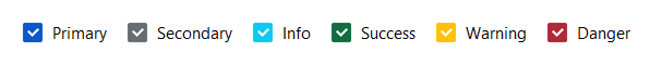
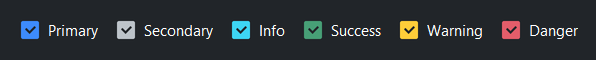
Accent colors#
bs.Checkbox("Primary",   accent="primary",   value=True)
bs.Checkbox("Secondary", accent="secondary", value=True)
bs.Checkbox("Info",      accent="info",      value=True)
bs.Checkbox("Success",   accent="success",   value=True)
bs.Checkbox("Warning",   accent="warning",   value=True)
bs.Checkbox("Danger",    accent="danger",    value=True)
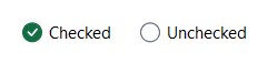
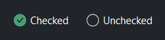
Custom state icons#
Use on_icon= and off_icon= to show different icons for the checked
and unchecked states. Set show_indicator=False to replace the box
entirely with the icon pair.
bs.Checkbox("Checked",
    on_icon="check-circle-fill", off_icon="circle",
    show_indicator=False, accent="success", value=True)
bs.Checkbox("Unchecked",
    on_icon="check-circle-fill", off_icon="circle",
    show_indicator=False, accent="success", value=False)
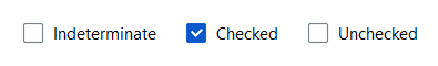
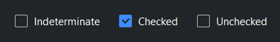
Tristate#
Set tristate=True to enable a third indeterminate state (dash indicator).
When no value= is given, the checkbox starts indeterminate. value
returns None in that state.
bs.Checkbox("Indeterminate", tristate=True)
bs.Checkbox("Checked",       tristate=True, value=True)
bs.Checkbox("Unchecked",     tristate=True, value=False)

chk = bs.Checkbox("Option", tristate=True)
print(chk.value)   # → None (indeterminate)
chk.checked = True
print(chk.value)   # → True
Reactive binding#
Bind a Signal with signal=. The checkbox and signal stay in sync.
When signal= is provided, value= is ignored — seed the Signal
directly.
agreed = bs.Signal(False)
bs.Checkbox("I agree to the terms", signal=agreed)
agreed.subscribe(lambda v: submit_btn.disabled = not v)
Custom values#
Use checked_value= and unchecked_value= when the logical values
are not True/False.
bs.Checkbox("Theme", checked_value="dark", unchecked_value="light")
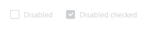
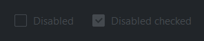
Disabled#
bs.Checkbox("Cannot change", disabled=True)
bs.Checkbox("Locked on", value=True, disabled=True)
Events#
chk = bs.Checkbox("Option")

# Fires on every toggle
chk.on_change(lambda e: print("changed:", chk.checked))

# Fires only when checked
chk.on_check(lambda e: print("checked"))

# Fires only when unchecked
chk.on_uncheck(lambda e: print("unchecked"))

# As a Stream
chk.on_change().debounce(200).listen(lambda e: save())
Widget sizing#
All widgets accept self-placement kwargs via **kwargs. The parent
container determines which options apply — stack-based parents use stack
kwargs, grid-based parents use grid kwargs. Unrecognised keys are
silently ignored.
Stack#
Used inside VStack, HStack, App, and other stack containers.
|
Fill direction: |
|
Grow to consume extra space in the parent. |
|
Alignment when the widget does not fill the available slot:
|
|
External spacing in pixels. Accepts an integer (equal on all
sides), a 2-tuple |
|
Horizontal external spacing (left and right). Accepts an integer
or a 2-tuple |
|
Vertical external spacing (top and bottom). Accepts an integer
or a 2-tuple |
Grid#
Used inside a Grid container.
|
Zero-based row and column indices. |
|
Number of rows or columns to span. |
|
Alignment and fill within the grid cell. Any combination of
|
|
External spacing in pixels. Accepts an integer, a 2-tuple
|
|
Horizontal external spacing. Accepts an integer or |
|
Vertical external spacing. Accepts an integer or |
API#
The complete reference for Checkbox lives on the
Widgets API page. At a glance:
A labeled checkbox — checked or unchecked. |
Full Example#
 1
 2with bs.App(title="Checkbox Demo", padding=20, gap=16) as app:
 3
 4    # Basic
 5    bs.Label("Basic", font="heading-sm")
 6    bs.Checkbox("Unchecked", value=False)
 7    bs.Checkbox("Checked",   value=True)
 8
 9    # Accent colors
10    bs.Label("Accent Colors", font="heading-sm")
11    with bs.HStack(gap=16):
12        for accent in ("primary", "secondary", "info", "success", "warning", "danger"):
13            bs.Checkbox(accent.title(), accent=accent, value=True)
14
15    # Custom state icons
16    bs.Label("Custom State Icons", font="heading-sm")
17    with bs.HStack(gap=24):
18        bs.Checkbox("Checked",
19            on_icon="check-circle-fill", off_icon="circle",
20            show_indicator=False, accent="success", value=True)
21        bs.Checkbox("Unchecked",
22            on_icon="check-circle-fill", off_icon="circle",
23            show_indicator=False, accent="success", value=False)
24        bs.Checkbox("Favorite",
25            on_icon="star-fill", off_icon="star",
26            accent="warning", value=True)
27
28    # Reactive binding
29    bs.Label("Reactive Binding", font="heading-sm")
30    with bs.VStack(gap=6):
31        agreed = bs.Signal(False)
32        bs.Checkbox("I agree to the terms", signal=agreed)
33        status_lbl = bs.Label("Status: not agreed", accent="secondary", font="caption")
34
35        def _update_status(v):
36            status_lbl.text = "Status: agreed" if v else "Status: not agreed"
37
38        agreed.subscribe(_update_status)
39
40    # Custom values
41    bs.Label("Custom Values", font="heading-sm")
42    with bs.VStack(gap=6):
43        theme_sig = bs.Signal("light")
44        bs.Checkbox(
45            "Dark mode",
46            signal=theme_sig,
47            checked_value="dark",
48            unchecked_value="light",
49        )
50        theme_lbl = bs.Label("Theme: light", accent="secondary", font="caption")
51        theme_sig.subscribe(lambda v: setattr(theme_lbl, 'text', f"Theme: {v}"))
52
53    # Disabled
54    bs.Label("Disabled", font="heading-sm")
55    with bs.HStack(gap=16):
56        bs.Checkbox("Disabled unchecked", disabled=True)
57        bs.Checkbox("Disabled checked", value=True, disabled=True)
58
59    # Events
60    bs.Label("Events", font="heading-sm")
61    with bs.VStack(gap=6):
62        event_lbl = bs.Label("Toggle the checkbox…", accent="secondary", font="caption")
63        event_chk = bs.Checkbox("Toggle me")
64
65        def _on_change(e):
66            state = "checked" if event_chk.checked else "unchecked"
67            event_lbl.text = f"State: {state}"
68
69        event_chk.on_change(_on_change)
70
71app.run()