Tabs#
A tabbed container that shows one page at a time. Add named tabs with .add(),
place child widgets inside each page using the returned context manager, then
switch between pages by clicking tabs or calling select().
Usage#
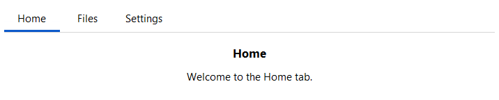
Adding tabs#
Call .add(key, label=) once per tab. Use the returned TabPage as a
context manager — child widgets created inside the with block are placed on
that tab’s page.
tabs = bs.Tabs(fill="both", expand=True)

with tabs.add("home", label="Home"):
    bs.Label("Home page content")

with tabs.add("settings", label="Settings"):
    bs.Label("Settings page content")
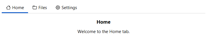
Tab icons#
Pass icon= to show an icon alongside the tab label.
with tabs.add("home", label="Home", icon="house"):
    bs.Label("Home")

with tabs.add("files", label="Files", icon="folder"):
    bs.Label("Files")
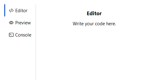
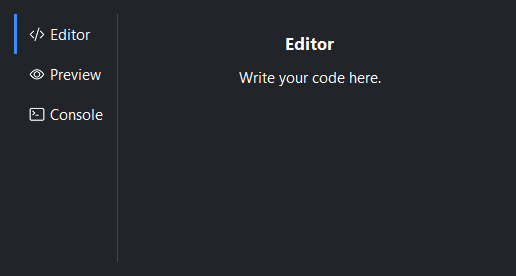
Orientation#
orient='vertical' places the tab strip on the left side with pages to the
right. The default is 'horizontal' (tabs above content).
tabs = bs.Tabs(orient="vertical", fill="both", expand=True)

with tabs.add("editor", label="Editor"):
    bs.Label("Editor panel")

with tabs.add("preview", label="Preview"):
    bs.Label("Preview panel")
Tab width#
tab_width='stretch' distributes the full tab bar width equally among all
tabs. Pass an integer to fix every tab to that pixel width. The default sizes
each tab to its content.
bs.Tabs(tab_width="stretch")   # equal-width tabs filling the bar
bs.Tabs(tab_width=120)         # fixed 120 px per tab
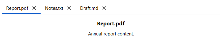
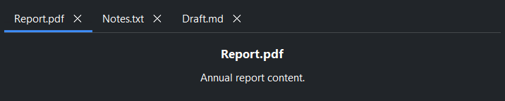
Closable tabs#
allow_close=True shows a close button on every tab. 'hover' reveals
it only on mouse-over. Individual tabs can override this with the closable=
argument of add().
# All tabs closable
tabs = bs.Tabs(allow_close=True)

# Per-tab override
with tabs.add("pinned", label="Pinned", closable=False):
    bs.Label("This tab cannot be closed.")

with tabs.add("doc", label="Document", closable=True):
    bs.Label("Close button always visible.")
Page layout modes#
Each tab page has an independent internal layout via the layout= argument
of add(). The default is 'vstack'.
# Grid layout
with tabs.add("form", label="Form", layout="grid",
              columns=["auto", 1], gap=8, sticky_items="ew"):
    bs.Label("Username")
    bs.TextField()
    bs.Label("Password")
    bs.PasswordField()
Tab visibility#
Hide a tab without removing it, then restore it later.
tabs.hide_tab("settings")   # tab disappears from the strip
tabs.show_tab("settings")   # tab reappears

tabs.forget_tab("temp")     # remove tab and page permanently
Events#
on_change fires when the selected tab changes. on_tab_close fires when
a close button is clicked. on_tab_add fires when the add-tab button is
clicked.
def on_change(event):
    print("switched to:", tabs.current)

tabs.on_change(on_change)

# Stream form — compose with operators
tabs.on_change().listen(lambda e: print(tabs.current))
Introspection#
tabs.current        # key of the active tab, or None
tabs.tab_keys()     # ('home', 'files', 'settings')
tabs.select("files")
Widget sizing#
All widgets accept self-placement kwargs via **kwargs. The parent
container determines which options apply — stack-based parents use stack
kwargs, grid-based parents use grid kwargs. Unrecognised keys are
silently ignored.
Stack#
Used inside VStack, HStack, App, and other stack containers.
|
Fill direction: |
|
Grow to consume extra space in the parent. |
|
Alignment when the widget does not fill the available slot:
|
|
External spacing in pixels. Accepts an integer (equal on all
sides), a 2-tuple |
|
Horizontal external spacing (left and right). Accepts an integer
or a 2-tuple |
|
Vertical external spacing (top and bottom). Accepts an integer
or a 2-tuple |
Grid#
Used inside a Grid container.
|
Zero-based row and column indices. |
|
Number of rows or columns to span. |
|
Alignment and fill within the grid cell. Any combination of
|
|
External spacing in pixels. Accepts an integer, a 2-tuple
|
|
Horizontal external spacing. Accepts an integer or |
|
Vertical external spacing. Accepts an integer or |
See also#
PageStack —
page navigation without a visible tab strip.
Accordion —
collapsible sections, all visible simultaneously in a vertical list.
SplitView —
resizable split container showing multiple panes at once.
API#
The complete reference for Tabs and its
TabPage handles lives on the
Widgets API page. At a glance:
Full Example#
 1
 2with bs.App(title="Tabs", size=(680, 520), padding=20, gap=28) as app:
 3
 4    # ── Horizontal (default) ──────────────────────────────────────────────────
 5    with bs.VStack(fill="x", gap=6):
 6        bs.Label("Horizontal (default)", font="heading-md")
 7
 8        tabs = bs.Tabs(fill="x")
 9        with tabs.add("home", label="Home", padding=16, gap=8):
10            bs.Label("Home", font="heading-md")
11            bs.Label("Welcome to the Home tab.")
12        with tabs.add("files", label="Files", padding=16, gap=8):
13            bs.Label("Files", font="heading-md")
14            bs.Label("Manage your files here.")
15        with tabs.add("settings", label="Settings", padding=16, gap=8):
16            bs.Label("Settings", font="heading-md")
17            bs.Label("Adjust your preferences.")
18
19    # ── Icons ─────────────────────────────────────────────────────────────────
20    with bs.VStack(fill="x", gap=6):
21        bs.Label("Icons", font="heading-md")
22
23        tabs2 = bs.Tabs(fill="x")
24        with tabs2.add("home", label="Home", icon="house", padding=16, gap=8):
25            bs.Label("Home tab with icon.")
26        with tabs2.add("files", label="Files", icon="folder", padding=16, gap=8):
27            bs.Label("Files tab with icon.")
28        with tabs2.add("settings", label="Settings", icon="gear", padding=16, gap=8):
29            bs.Label("Settings tab with icon.")
30
31    # ── Stretch tab width ─────────────────────────────────────────────────────
32    with bs.VStack(fill="x", gap=6):
33        bs.Label("tab_width='stretch'", font="heading-md")
34
35        tabs3 = bs.Tabs(tab_width="stretch", fill="x")
36        with tabs3.add("alpha", label="Alpha", padding=16, gap=8):
37            bs.Label("Each tab shares the full bar width equally.")
38        with tabs3.add("beta", label="Beta", padding=16, gap=8):
39            bs.Label("Beta page.")
40        with tabs3.add("gamma", label="Gamma", padding=16, gap=8):
41            bs.Label("Gamma page.")
42
43app.run()