SelectButton#
A button that opens a dropdown value list and displays the current selection.
Usage#
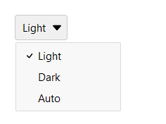
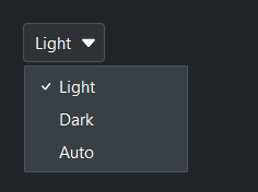
Basic#
Pass a list of options. The button displays the currently selected value.
bs.SelectButton(["Light", "Dark", "Auto"], value="Light")
Option values#
Like Select, an option’s label can differ from its value — pass a
(text, value) tuple or a {"text": ..., "value": ...} dict. value=,
.value, and the change event are in value-space.
mode = bs.SelectButton([("Light theme", "light"), ("Dark theme", "dark")], value="dark")
mode.value             # -> "dark"          (the value)
mode.text              # -> "Dark theme"    (the displayed label)
mode.selection         # -> {"text": "Dark theme", "value": "dark"}   (the full record)
mode.on_change(lambda e: apply_theme(e.value))
Options are a data bag — alongside the recognized keys (text, value,
and the per-option icon/disabled), any other key you add rides along and is
returned by .selection (see Select for details). A per-option icon
renders beside that menu item’s label, and disabled greys out a single option
so it can’t be chosen — distinct from the widget-level disabled= that locks
the whole control.
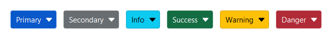
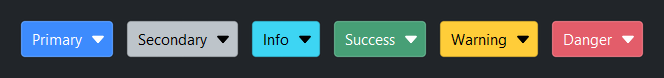
Accent colors#
bs.SelectButton(["Primary"],   accent="primary",   value="Primary")
bs.SelectButton(["Secondary"], accent="secondary", value="Secondary")
bs.SelectButton(["Info"],      accent="info",      value="Info")
bs.SelectButton(["Success"],   accent="success",   value="Success")
bs.SelectButton(["Warning"],   accent="warning",   value="Warning")
bs.SelectButton(["Danger"],    accent="danger",    value="Danger")
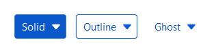
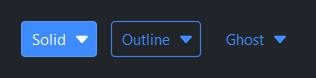
Style variants#
bs.SelectButton(["Solid"],   accent="primary", variant="solid")
bs.SelectButton(["Outline"], accent="primary", variant="outline")
bs.SelectButton(["Ghost"],   accent="primary", variant="ghost")
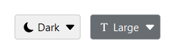
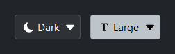
With icon#
bs.SelectButton(["Light", "Dark", "Auto"],
                value="Dark", icon="moon-fill")
bs.SelectButton(["Small", "Medium", "Large"],
                value="Large", icon="fonts", accent="secondary")
Reactive binding#
Bind a Signal[str] with signal=. The button and signal stay in
sync. When signal= is provided, value= is ignored — seed the
Signal directly.
theme = bs.Signal("light")
bs.SelectButton(["Light", "Dark", "Auto"], signal=theme)
theme.subscribe(lambda v: bs.set_theme(v.lower()))
Disabled#
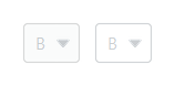
bs.SelectButton(["A", "B", "C"], value="B", disabled=True)
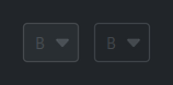
bs.SelectButton(["A", "B", "C"], value="B", disabled=True,
accent="primary", variant="outline")
Events#
btn = bs.SelectButton(["Small", "Medium", "Large"], value="Medium")

btn.on_change(lambda e: print("selected:", btn.value))

# As a Stream
btn.on_change().listen(lambda e: apply_size(btn.value))
Programmatic control#
btn = bs.SelectButton(["A", "B", "C"], value="A")

btn.value = "C"                 # change selection
btn.disabled = True             # lock the button
btn.options = ["X", "Y", "Z"]   # replace the choice list (rebuilds the dropdown)
Widget sizing#
All widgets accept self-placement kwargs via **kwargs. The parent
container determines which options apply — stack-based parents use stack
kwargs, grid-based parents use grid kwargs. Unrecognised keys are
silently ignored.
Stack#
Used inside VStack, HStack, App, and other stack containers.
|
Fill direction: |
|
Grow to consume extra space in the parent. |
|
Alignment when the widget does not fill the available slot:
|
|
External spacing in pixels. Accepts an integer (equal on all
sides), a 2-tuple |
|
Horizontal external spacing (left and right). Accepts an integer
or a 2-tuple |
|
Vertical external spacing (top and bottom). Accepts an integer
or a 2-tuple |
Grid#
Used inside a Grid container.
|
Zero-based row and column indices. |
|
Number of rows or columns to span. |
|
Alignment and fill within the grid cell. Any combination of
|
|
External spacing in pixels. Accepts an integer, a 2-tuple
|
|
Horizontal external spacing. Accepts an integer or |
|
Vertical external spacing. Accepts an integer or |
API#
The complete reference for SelectButton lives on the
Widgets API page. At a glance:
A button that opens a dropdown value list — a button-styled alternative to |
Full Example#
 1
 2with bs.App(title="SelectButton Demo", padding=20, gap=16) as app:
 3
 4    # Basic
 5    bs.Label("Basic", font="heading-sm")
 6    with bs.HStack(gap=8):
 7        bs.SelectButton(["Light", "Dark", "Auto"], value="Light")
 8        bs.SelectButton(["Small", "Medium", "Large"], value="Medium")
 9
10    # Accent colors
11    bs.Label("Accent Colors", font="heading-sm")
12    with bs.HStack(gap=8):
13        for accent in ("primary", "secondary", "info", "success", "warning", "danger"):
14            bs.SelectButton(["On", "Off"], value="On", accent=accent)
15
16    # Style variants
17    bs.Label("Style Variants", font="heading-sm")
18    with bs.HStack(gap=8):
19        for variant in ("solid", "outline", "ghost"):
20            bs.SelectButton(["A", "B", "C"], value="A",
21                            accent="primary", variant=variant)
22
23    # With icon
24    bs.Label("With Icon", font="heading-sm")
25    with bs.HStack(gap=8):
26        bs.SelectButton(["Light", "Dark", "Auto"],
27                        value="Dark", icon="moon-fill")
28        bs.SelectButton(["Small", "Medium", "Large"],
29                        value="Large", icon="fonts", accent="secondary")
30
31    # Disabled
32    bs.Label("Disabled", font="heading-sm")
33    with bs.HStack(gap=8):
34        bs.SelectButton(["A", "B", "C"], value="B", disabled=True)
35        bs.SelectButton(["A", "B", "C"], value="B", disabled=True,
36                        accent="primary", variant="outline")
37
38app.run()