Toasts & Notifications#
bootstack has three transient message surfaces, each for a distinct job:
bs.toast()— a passive message that fades on its own, in a screen corner.bs.Notification— a persistent corner message the user closes.bs.Snackbar— an in-app message with a single action, at the window’s bottom edge.
They share one look (a compact card with an icon, message, and severity color) but differ in where they sit, how long they stay, and whether they ask for a response. Pick by the job, not the appearance.
Choosing a surface#
Surface |
Use it for |
Lifetime |
Anchored to |
Action |
|---|---|---|---|---|
|
“FYI” that needs no response (Saved, Copied) |
Auto-dismiss |
A monitor corner |
None |
|
News that should wait to be seen (Backup finished) |
Until closed |
A monitor corner |
Close only |
|
Feedback on an action just taken, maybe reversible |
Auto-dismiss |
The window’s bottom |
One (Undo) |
A rule of thumb: reach for toast() first. Upgrade to Notification when
the message must persist, and to Snackbar when it offers a single response.
Anything that blocks the user until answered is a dialog
(Dialogs & Alerts), not a message.
Toast#
bs.toast() shows a message and returns immediately — it
is fire-and-forget. It floats in a corner of the monitor the app window is on,
stacks under any toasts already there, and fades after duration. There is no
close button: a toast is passive by definition.
At its simplest a toast is just its message on one line. The icon and the title are both optional — add an icon to lead the message, or a title for a two-line card:
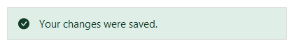
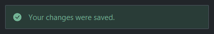
bs.toast("Your changes were saved.")                          # message only
bs.toast("Battery at 12%.", icon="battery-half", accent="warning")  # icon + message
bs.toast("Could not reach the server.", title="Sync failed",  # title + message
         accent="danger")
The accent colors the icon and text (in a readable, dark-tinted shade) and gives
the card a soft tint; omit it for a neutral toast. corner= overrides the
default placement (bottom-right, top-right on Linux):
bs.toast("Pinned to the top-left.", corner="top-left", duration=6000)
Notification#
bs.Notification is the persistent sibling: same
corner, same stacking, but it does not auto-dismiss. It carries a close
button and stays until the user dismisses it or your code does. Build it, then
show() — keep the handle if you want to dismiss() it later (e.g. when a
job it announced is superseded). The title is the headline:
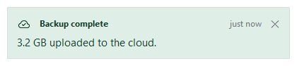
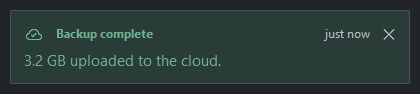
note = bs.Notification(
    "Backup complete",
    message="3.2 GB uploaded to the cloud.",
    detail="just now",
    icon="cloud-check",
    accent="success",
).show()

# later, when it no longer applies
note.dismiss()
A notification is message-only — it informs, it does not ask. If you need the user to do something, that is a snackbar action or a dialog.
Snackbar#
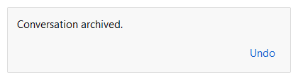
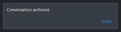
bs.Snackbar belongs to the app, not the screen: it
sits at the bottom edge of the window and moves with it. It is for brief feedback
on something that just happened, optionally with a single way to respond — the
classic “Message archived. [Undo]”. Only one snackbar shows at a time; a new
one replaces it. Use the bs.snackbar() verb for the
common one-liner, or the class when you want to dismiss() it yourself:
bs.snackbar("Conversation archived.", action="Undo", on_action=restore)
bs.snackbar("Copied to clipboard.")                       # no action
The action fires on_action and then dismisses. Unlike a toast, a snackbar’s
surface stays neutral — severity coloring is the corner surfaces’ job; the
accent here only tints the action button. align= moves it along the
bottom edge ('left', 'center', or 'right').
Reacting to dismissal#
All three take an on_dismiss callback, fired with no arguments whenever the
message goes away — by timeout, the close button, the snackbar action, or a
manual dismiss():
bs.toast("Synced.", on_dismiss=lambda: print("gone"))
Widget sizing#
All widgets accept self-placement kwargs via **kwargs. The parent
container determines which options apply — stack-based parents use stack
kwargs, grid-based parents use grid kwargs. Unrecognised keys are
silently ignored.
Stack#
Used inside VStack, HStack, App, and other stack containers.
|
Fill direction: |
|
Grow to consume extra space in the parent. |
|
Alignment when the widget does not fill the available slot:
|
|
External spacing in pixels. Accepts an integer (equal on all
sides), a 2-tuple |
|
Horizontal external spacing (left and right). Accepts an integer
or a 2-tuple |
|
Vertical external spacing (top and bottom). Accepts an integer
or a 2-tuple |
Grid#
Used inside a Grid container.
|
Zero-based row and column indices. |
|
Number of rows or columns to span. |
|
Alignment and fill within the grid cell. Any combination of
|
|
External spacing in pixels. Accepts an integer, a 2-tuple
|
|
Horizontal external spacing. Accepts an integer or |
|
Vertical external spacing. Accepts an integer or |
API#
The verbs and classes live on the Widgets API page. At a glance:
Show a passive toast that dismisses itself, and return immediately. |
|
A persistent corner message the user closes themselves. |
|
A transient message at the app window's bottom edge with one action. |
|
Show a snackbar at the window's bottom edge, and return immediately. |
Full Example#
 1
 2
 3with bs.App(title="Transient messages", size=(560, 360), padding=20, gap=12) as app:
 4    bs.Label("Transient messages", font="heading-lg")
 5    bs.Label("Three surfaces, each for a different job.", accent="secondary")
 6
 7    with bs.GroupBox("toast() — passive, auto-dismiss", fill="x"):
 8        with bs.HStack(gap=8):
 9            bs.Button("Saved", accent="success",
10                      on_click=lambda: bs.toast("Your changes were saved.",
11                                                icon="check-circle", accent="success"))
12            bs.Button("Low battery", accent="warning",
13                      on_click=lambda: bs.toast("Battery at 12%.",
14                                                icon="battery-half", accent="warning"))
15
16    with bs.GroupBox("Notification — persistent, closes on demand", fill="x"):
17        bs.Button("Notify",
18                  on_click=lambda: bs.Notification(
19                      "Backup complete",
20                      message="3.2 GB uploaded to the cloud.",
21                      detail="just now", icon="cloud-check", accent="success",
22                  ).show())
23
24    with bs.GroupBox("Snackbar — one action, window bottom edge", fill="x"):
25        with bs.HStack(gap=8):
26            bs.Button("Archive",
27                      on_click=lambda: bs.snackbar("Conversation archived.",
28                                                   action="Undo",
29                                                   on_action=lambda: bs.toast("Restored.")))
30            bs.Button("Copy",
31                      on_click=lambda: bs.snackbar("Copied to clipboard."))
32
33app.run()