RangeSlider#
A two-handle track for selecting a low/high value range.
Usage#
Basic#
bs.RangeSlider(20, 80)
bs.RangeSlider(0, 50, min_value=0, max_value=100)
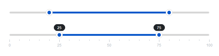
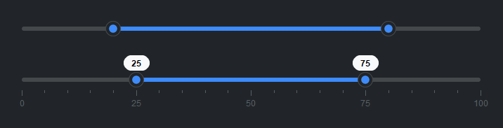
Show value badges#
Set show_value=True to display floating badges on both handles.
bs.RangeSlider(20, 80, show_value=True)
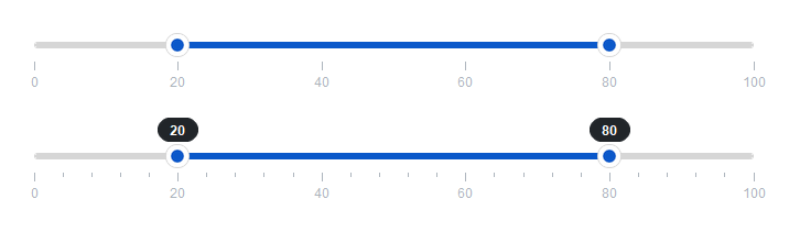
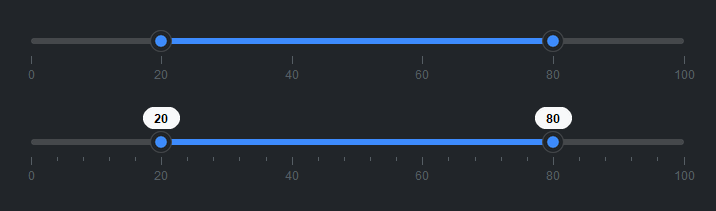
Tick marks#
Use tick_step= to add major tick marks. minor_ticks= adds
subdivisions between them.
bs.RangeSlider(20, 80, tick_step=20)
bs.RangeSlider(20, 80, tick_step=20, minor_ticks=4, show_value=True)
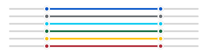
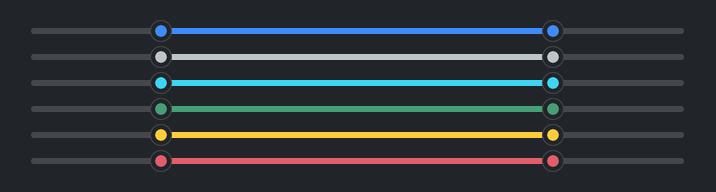
Accent colors#
bs.RangeSlider(20, 80, accent="primary")
bs.RangeSlider(20, 80, accent="secondary")
bs.RangeSlider(20, 80, accent="info")
bs.RangeSlider(20, 80, accent="success")
bs.RangeSlider(20, 80, accent="warning")
bs.RangeSlider(20, 80, accent="danger")
Reactive binding#
Bind Signal[float] instances to each handle independently.
lo = bs.Signal(25.0)
hi = bs.Signal(75.0)
bs.RangeSlider(low_signal=lo, high_signal=hi)
lo.subscribe(lambda v: print(f"Low: {v}"))
hi.subscribe(lambda v: print(f"High: {v}"))
Reading the range#
Access both handles at once via .value, or individually via
.low_value and .high_value.
rs = bs.RangeSlider(20, 80)
lo, hi = rs.value      # → (20.0, 80.0)
rs.low_value  = 30     # move low handle
rs.high_value = 70     # move high handle
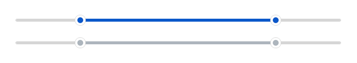
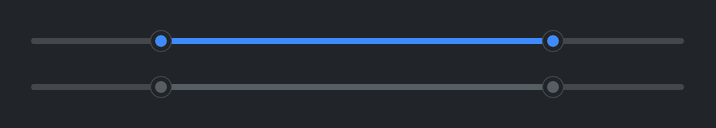
Disabled#
bs.RangeSlider(20, 80, disabled=True)
Widget sizing#
All widgets accept self-placement kwargs via **kwargs. The parent
container determines which options apply — stack-based parents use stack
kwargs, grid-based parents use grid kwargs. Unrecognised keys are
silently ignored.
Stack#
Used inside VStack, HStack, App, and other stack containers.
|
Fill direction: |
|
Grow to consume extra space in the parent. |
|
Alignment when the widget does not fill the available slot:
|
|
External spacing in pixels. Accepts an integer (equal on all
sides), a 2-tuple |
|
Horizontal external spacing (left and right). Accepts an integer
or a 2-tuple |
|
Vertical external spacing (top and bottom). Accepts an integer
or a 2-tuple |
Grid#
Used inside a Grid container.
|
Zero-based row and column indices. |
|
Number of rows or columns to span. |
|
Alignment and fill within the grid cell. Any combination of
|
|
External spacing in pixels. Accepts an integer, a 2-tuple
|
|
Horizontal external spacing. Accepts an integer or |
|
Vertical external spacing. Accepts an integer or |
See also#
Slider — single-handle slider
NumberField — numeric input with typed entry
API#
The complete reference for RangeSlider lives on the
Widgets API page. At a glance:
A two-handle slider for selecting a low/high value range. |
Full Example#
 1
 2with bs.App(title="RangeSlider Demo", padding=20, gap=16) as app:
 3
 4    # Basic
 5    bs.Label("Basic", font="heading-sm")
 6    bs.RangeSlider(20, 80, fill="x")
 7
 8    # Value badges
 9    bs.Label("Value Badges", font="heading-sm")
10    bs.RangeSlider(20, 80, show_value=True, fill="x")
11
12    # Tick marks
13    bs.Label("Tick Marks", font="heading-sm")
14    bs.RangeSlider(20, 80, tick_step=20, fill="x")
15    bs.RangeSlider(20, 80, tick_step=20, minor_ticks=4, show_value=True, fill="x")
16
17    # Accent colors
18    bs.Label("Accent Colors", font="heading-sm")
19    with bs.VStack(gap=6, fill="x"):
20        for accent in ("primary", "secondary", "info", "success", "warning", "danger"):
21            bs.RangeSlider(20, 80, accent=accent, fill="x")
22
23    # Disabled
24    bs.Label("Disabled", font="heading-sm")
25    bs.RangeSlider(20, 80, disabled=True, fill="x")
26
27app.run()