SplitView#
A resizable split container. Panes are separated by draggable sashes that can be moved at runtime to redistribute space.
Usage#
Basic split#
Call .add() once per pane. Use the returned value as a context manager
to place children inside that pane.
sv = bs.SplitView(fill="both", expand=True)
with sv.add():
    bs.Label("Pane 1")
with sv.add():
    bs.Label("Pane 2")
Orientation#
orient='horizontal' (default) places panes side-by-side with a
vertical sash. orient='vertical' stacks panes top-to-bottom with a
horizontal sash.
# Side-by-side (default)
sv = bs.SplitView(orient="horizontal", fill="both", expand=True)

# Stacked
sv = bs.SplitView(orient="vertical", fill="both", expand=True)
Pane weight#
weight= controls how space is distributed among panes when the
container is resized. A pane with weight=2 takes twice the space of
one with weight=1.
sv = bs.SplitView(fill="both", expand=True)
with sv.add(weight=1):   # one third
    ...
with sv.add(weight=2):   # two thirds
    ...
Three or more panes#
Call .add() for each pane. Each pair of adjacent panes gets its own
independently draggable sash.
sv = bs.SplitView(fill="both", expand=True)
with sv.add(weight=1):
    bs.Label("Left")
with sv.add(weight=2):
    bs.Label("Center")
with sv.add(weight=1):
    bs.Label("Right")
Managing panes#
add() returns a SplitPane
handle. Give it a key= to address the pane later — look one up with
item(), enumerate them all with panes, and drop one with remove().
The pane’s weight is a live property, so you can re-balance the split at
runtime; for an exact sash position in pixels use sash_position().
sv = bs.SplitView(fill="both", expand=True)
with sv.add(key="sidebar", weight=1):
    bs.Label("Sidebar")
with sv.add(key="main", weight=3):
    bs.Label("Main")

sv.item("sidebar").weight = 2     # re-balance live
sv.sash_position(0, 200)          # or place the sash exactly
sv.remove("sidebar")              # drop a pane (and its content)
Pane layout#
Each pane supports an independent internal layout via layout=.
sv = bs.SplitView(fill="both", expand=True)

# Default: children stacked top-to-bottom
with sv.add(layout="vstack", gap=8):
    bs.Label("Row 1")
    bs.Label("Row 2")

# Children placed left-to-right
with sv.add(layout="hstack", gap=8):
    bs.Label("Col A")
    bs.Label("Col B")

# Grid layout
with sv.add(layout="grid", columns=["auto", 1], gap=8, sticky_items="ew"):
    bs.Label("Name")
    bs.TextField()
Sash thickness#
sash_thickness= sets the width (horizontal) or height (vertical) of
the draggable sash in pixels.
bs.SplitView(sash_thickness=2)   # hairline sash
bs.SplitView(sash_thickness=10)  # wide, easy-to-grab sash
Sash control#
Read and set sash positions programmatically. Positions are measured in pixels from the left (horizontal) or top (vertical) edge.
sv = bs.SplitView(fill="both", expand=True)
with sv.add(): ...
with sv.add(): ...

sv.sash_positions           # [240]  — current positions
sv.sash_position(0, 300)    # move first sash to 300 px
Widget sizing#
All widgets accept self-placement kwargs via **kwargs. The parent
container determines which options apply — stack-based parents use stack
kwargs, grid-based parents use grid kwargs. Unrecognised keys are
silently ignored.
Stack#
Used inside VStack, HStack, App, and other stack containers.
|
Fill direction: |
|
Grow to consume extra space in the parent. |
|
Alignment when the widget does not fill the available slot:
|
|
External spacing in pixels. Accepts an integer (equal on all
sides), a 2-tuple |
|
Horizontal external spacing (left and right). Accepts an integer
or a 2-tuple |
|
Vertical external spacing (top and bottom). Accepts an integer
or a 2-tuple |
Grid#
Used inside a Grid container.
|
Zero-based row and column indices. |
|
Number of rows or columns to span. |
|
Alignment and fill within the grid cell. Any combination of
|
|
External spacing in pixels. Accepts an integer, a 2-tuple
|
|
Horizontal external spacing. Accepts an integer or |
|
Vertical external spacing. Accepts an integer or |
See also#
ScrollView —
scrollable container.
API#
The complete reference for SplitView and its
SplitPane handles lives on the
Widgets API page. At a glance:
Full Example#
1
2with bs.App(title="SplitView", size=(680, 680), padding=20, gap=16) as app:
3
4 # ── Horizontal split (default) ─────────────────────────────────────────
5 with bs.VStack(fill="x", gap=0):
6 bs.Label("Horizontal", font="heading-md")
7
8 sv = bs.SplitView(fill="both", expand=True)
9 with sv.add(weight=1, padding=12, gap=8, fill_items="x"):
10 bs.Label("Navigation", font="heading-md")
11 bs.Separator(fill="x")
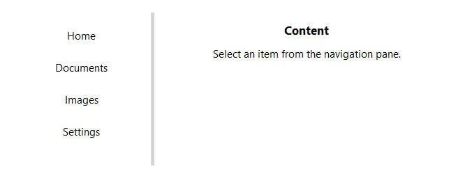
12 for item in ("Home", "Documents", "Images", "Settings", "Help"):
13 bs.Button(item, variant="ghost", fill="x")
14 with sv.add(weight=2, padding=12, gap=8):
15 bs.Label("Content", font="heading-md")
16 bs.Label("Select an item from the navigation pane.")
17
18 # ── Vertical split ─────────────────────────────────────────────────────
19 with bs.VStack(fill="x", gap=0):
20 bs.Label("Vertical", font="heading-md")
21
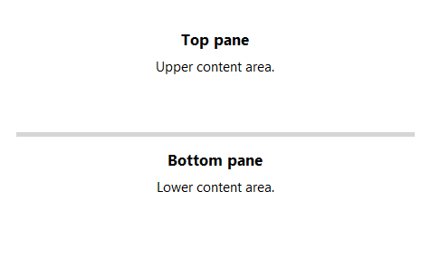
22 sv2 = bs.SplitView(orient="vertical", fill="x")
23 with sv2.add(weight=1, padding=12, gap=4):
24 bs.Label("Top pane", font="heading-md")
25 bs.Label("Upper content area.")
26 with sv2.add(weight=1, padding=12, gap=4):
27 bs.Label("Bottom pane", font="heading-md")
28 bs.Label("Lower content area.")
29
30app.run()