Accordion#
A list of collapsible sections, optionally limited to one open at a time.
Each section is an Expander
added via add().
Usage#
Basic accordion#
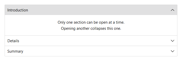
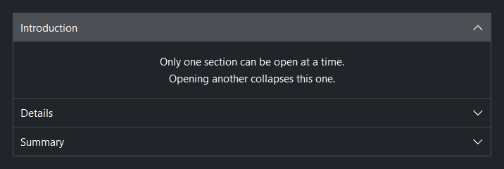
add(title) returns an AccordionSection context manager. Place child
widgets inside it. By default only one section can be open at a time —
opening a second one collapses the first.
acc = bs.Accordion()
with acc.add("Introduction", expanded=True):
    bs.Label("First section body.")
with acc.add("Details"):
    bs.Label("Opening this collapses Introduction.")
with acc.add("Summary"):
    bs.Label("Third section.")
Multiple open at once#
allow_multiple=True lets any number of sections be open simultaneously.
acc = bs.Accordion(allow_multiple=True)
with acc.add("Section A", expanded=True):
    bs.Label("A is open.")
with acc.add("Section B", expanded=True):
    bs.Label("B is also open.")
Prevent full collapse#
allow_collapse_all=False keeps at least one section expanded at all
times. The first section added is expanded by default.
acc = bs.Accordion(allow_collapse_all=False)
with acc.add("Always one open"):
    bs.Label("Cannot be the last one closed.")
Separators#
show_separators=True (default) draws a divider line between sections.
Set show_separators=False to remove the dividers.
acc = bs.Accordion(show_separators=False)
with acc.add("Alpha", expanded=True):
    bs.Label("Body.")
with acc.add("Beta"):
    bs.Label("Body.")
Border#
show_border=True (default) wraps the entire accordion in a bordered
frame. Set show_border=False to render without an outer border.
acc = bs.Accordion(show_border=False)
with acc.add("One", expanded=True):
    bs.Label("No outer border.")
with acc.add("Two"):
    bs.Label("Body.")
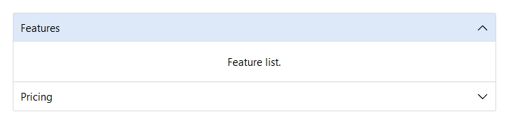
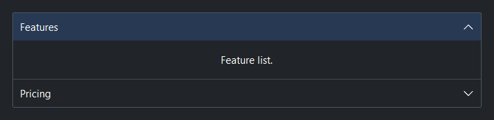
Accent#
accent= applies a color token to every section header.
Valid values: 'primary', 'secondary', 'info', 'success',
'warning', 'danger', 'default'.
acc = bs.Accordion(accent="primary")
with acc.add("Features", expanded=True):
    bs.Label("Feature list.")
with acc.add("Pricing"):
    bs.Label("Pricing details.")
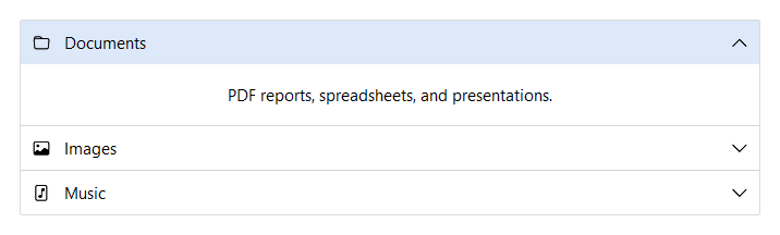
Icons#
Pass icon= to add() to display an icon to the left of the section
title.
acc = bs.Accordion(accent="primary")
with acc.add("Documents", icon="folder"):
    bs.Label("Files here.")
with acc.add("Images", icon="image"):
    bs.Label("Images here.")
with acc.add("Music", icon="file-music"):
    bs.Label("Music here.")
Section layout#
Each section body supports the same layout=, gap=, fill_items=,
and other layout kwargs as a standalone
Expander.
acc = bs.Accordion()
with acc.add("Form", layout="grid", columns=["auto", 1],
             gap=8, sticky_items="ew"):
    bs.Label("Name")
    bs.TextField()
    bs.Label("Email")
    bs.TextField()
Managing sections#
acc = bs.Accordion()
with acc.add("Alpha", expanded=True):
    bs.Label("Body.")

acc.expand("expander_0")     # expand by auto-assigned key
acc.collapse("expander_0")
acc.expand_all()
acc.collapse_all()
acc.keys()                   # tuple of all section keys in order
Events#
on_change() fires whenever any section expands or collapses.
acc = bs.Accordion()

acc.on_change(lambda e: print("section changed"))

# Stream (chainable)
acc.on_change().listen(lambda e: print("changed"))
Widget sizing#
All widgets accept self-placement kwargs via **kwargs. The parent
container determines which options apply — stack-based parents use stack
kwargs, grid-based parents use grid kwargs. Unrecognised keys are
silently ignored.
Stack#
Used inside VStack, HStack, App, and other stack containers.
|
Fill direction: |
|
Grow to consume extra space in the parent. |
|
Alignment when the widget does not fill the available slot:
|
|
External spacing in pixels. Accepts an integer (equal on all
sides), a 2-tuple |
|
Horizontal external spacing (left and right). Accepts an integer
or a 2-tuple |
|
Vertical external spacing (top and bottom). Accepts an integer
or a 2-tuple |
Grid#
Used inside a Grid container.
|
Zero-based row and column indices. |
|
Number of rows or columns to span. |
|
Alignment and fill within the grid cell. Any combination of
|
|
External spacing in pixels. Accepts an integer, a 2-tuple
|
|
Horizontal external spacing. Accepts an integer or |
|
Vertical external spacing. Accepts an integer or |
See also#
API#
The complete reference for Accordion and its
AccordionSection handles lives on the
Widgets API page. At a glance:
A list of collapsible sections, optionally limited to one open at a time. |
|
A handle for one accordion section — both a layout context and a live controller. |
Full Example#
 1
 2with bs.App(title="Accordion", size=(680, 950), padding=20, gap=16) as app:
 3
 4    # ── Single open (default) ─────────────────────────────────────────────────
 5    with bs.VStack(fill="x", gap=0):
 6        bs.Label("Single open (default)", font="heading-md")
 7
 8    acc = bs.Accordion()
 9    with acc.add("Introduction", expanded=True):
10        bs.Label("Only one section can be open at a time.")
11        bs.Label("Opening another collapses this one.")
12    with acc.add("Details"):
13        bs.Label("Opening this collapses Introduction.")
14    with acc.add("Summary"):
15        bs.Label("Third section body.")
16
17    # ── Multiple open ─────────────────────────────────────────────────────────
18    with bs.VStack(fill="x", gap=0):
19        bs.Label("allow_multiple=True", font="heading-md")
20
21    acc2 = bs.Accordion(allow_multiple=True)
22    with acc2.add("Section A", expanded=True):
23        bs.Label("Multiple sections can be open simultaneously.")
24    with acc2.add("Section B", expanded=True):
25        bs.Label("A and B both start expanded.")
26    with acc2.add("Section C"):
27        bs.Label("C starts collapsed.")
28
29    # ── Accent ────────────────────────────────────────────────────────────────
30    with bs.VStack(fill="x", gap=0):
31        bs.Label("accent=", font="heading-md")
32
33    with bs.Accordion(accent='primary').add('Primary', expanded=True):
34        bs.Label("All headers share the same accent selection color.")
35
36    # ── Icons ────────────────────────────────────────────────────────────────
37    with bs.VStack(fill="x", gap=0):
38        bs.Label("icon=", font="heading-md")
39
40    bicon = bs.Accordion(accent='info')
41    with bicon.add('Documents', icon='folder'):
42        bs.Label("Documents here")
43    with bicon.add('Images', icon='image'):
44        bs.Label("Images here")
45    with bicon.add('Music', icon='file-music'):
46        bs.Label("Music here")
47
48app.run()