ProgressBar#
A horizontal or vertical progress indicator. Use the determinate mode to show a fixed fill proportional to a known value, or the indeterminate mode for operations whose duration is unknown.
Usage#
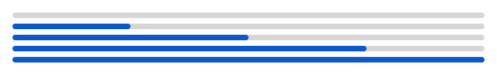
Determinate progress#
Set value between 0 and max_value (default 100) to control the
fill level. The bar fills proportionally.
bs.ProgressBar(value=0)    # empty
bs.ProgressBar(value=50)   # half full
bs.ProgressBar(value=100)  # complete
Read or update the value at any time via the value property:
bar = bs.ProgressBar(value=0)
bar.value = 42
print(bar.value)   # 42.0
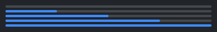
Indeterminate mode#
Use mode='indeterminate' for operations of unknown duration. Call
start() to begin the animation and stop() to end it.
bar = bs.ProgressBar(mode="indeterminate")
bar.start()      # begins looping animation
# ... do work ...
bar.stop()
step(amount) advances the fill by amount (default 1.0) when you
want manual control instead of an animation:
bar = bs.ProgressBar(value=0)
bar.step(10)   # value → 10
bar.step(10)   # value → 20
Signal binding#
Pass a Signal to keep the bar in sync with a reactive value:
progress = bs.Signal(0.0)
bs.ProgressBar(signal=progress)
progress.value = 75   # bar updates automatically
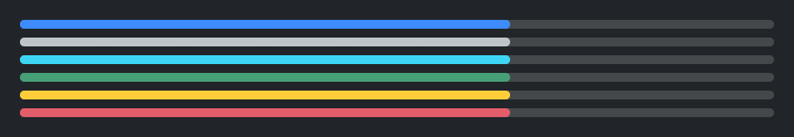
Accent colors#
bs.ProgressBar(value=65, accent="primary")
bs.ProgressBar(value=65, accent="success")
bs.ProgressBar(value=65, accent="warning")
bs.ProgressBar(value=65, accent="danger")

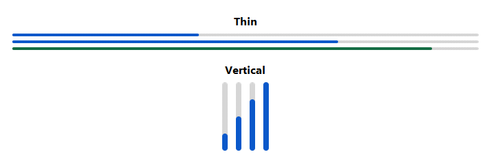
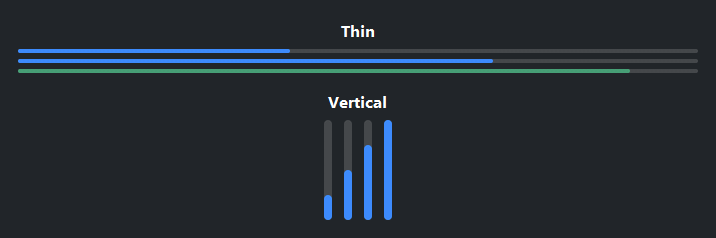
Thin variant#
variant='thin' reduces the bar height for compact layouts or subtle
progress indicators:
bs.ProgressBar(value=70, accent="primary", variant="thin")
Vertical orientation#
bs.ProgressBar(value=60, orient="vertical")
Custom max value#
Set max_value to match your data’s natural scale:
bs.ProgressBar(value=750, max_value=1000, accent="info")
Widget sizing#
All widgets accept self-placement kwargs via **kwargs. The parent
container determines which options apply — stack-based parents use stack
kwargs, grid-based parents use grid kwargs. Unrecognised keys are
silently ignored.
Stack#
Used inside VStack, HStack, App, and other stack containers.
|
Fill direction: |
|
Grow to consume extra space in the parent. |
|
Alignment when the widget does not fill the available slot:
|
|
External spacing in pixels. Accepts an integer (equal on all
sides), a 2-tuple |
|
Horizontal external spacing (left and right). Accepts an integer
or a 2-tuple |
|
Vertical external spacing (top and bottom). Accepts an integer
or a 2-tuple |
Grid#
Used inside a Grid container.
|
Zero-based row and column indices. |
|
Number of rows or columns to span. |
|
Alignment and fill within the grid cell. Any combination of
|
|
External spacing in pixels. Accepts an integer, a 2-tuple
|
|
Horizontal external spacing. Accepts an integer or |
|
Vertical external spacing. Accepts an integer or |
API#
The complete reference for ProgressBar lives on
the Widgets API page. At a glance:
A progress indicator bar. |
Full Example#
 1
 2with bs.App(title="ProgressBar Demo", padding=20, gap=0) as app:
 3    with bs.Grid(columns=[1, 1], gap=(32, 20), sticky_items="new", fill="x", expand=True):
 4
 5        # Quadrant 1 — Determinate progress
 6        with bs.VStack(gap=8):
 7            bs.Label("Determinate Progress", font="heading-sm")
 8            for pct in (0, 25, 50, 75, 100):
 9                bs.ProgressBar(value=pct, fill="x")
10
11        # Quadrant 2 — Accent colors
12        with bs.VStack(gap=8):
13            bs.Label("Accent Colors", font="heading-sm")
14            for accent in ("primary", "secondary", "info", "success", "warning", "danger"):
15                bs.ProgressBar(value=65, accent=accent, fill="x")
16
17        # Quadrant 3 — Thin variant
18        with bs.VStack(gap=8):
19            bs.Label("Thin Variant", font="heading-sm")
20            bs.ProgressBar(value=40, variant="thin", fill="x")
21            bs.ProgressBar(value=70, accent="primary", variant="thin", fill="x")
22            bs.ProgressBar(value=90, accent="success", variant="thin", fill="x")
23
24        # Quadrant 4 — Vertical orientation
25        with bs.VStack(gap=8):
26            bs.Label("Vertical Orientation", font="heading-sm")
27            with bs.HStack(gap=12):
28                for pct in (25, 50, 75, 100):
29                    bs.ProgressBar(value=pct, orient="vertical")
30
31app.run()