Tooltip#
A small popup that appears when the mouse hovers over a widget. Tooltips can follow the mouse or anchor to a specific edge of the target.
Usage#
Basic#
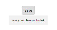
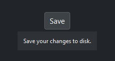
Pass any bootstack widget as the first argument followed by text. The tooltip appears after 250 ms on hover and hides on mouse leave or click.
btn = bs.Button("Save")
bs.Tooltip(btn, "Save your changes to disk")
Anchor positioning#
By default the tooltip follows the mouse. Pass anchor_point to pin the
tooltip to a specific edge of the target widget. window_point sets which
edge of the tooltip aligns to the anchor — when omitted it defaults to the
opposite of anchor_point.
btn = bs.Button("More info")

# Above the button
bs.Tooltip(btn, "Anchored above", anchor_point="n", window_point="s")

# Below the button
bs.Tooltip(btn, "Anchored below", anchor_point="s", window_point="n")

# To the right
bs.Tooltip(btn, "Anchored right", anchor_point="e", window_point="w")
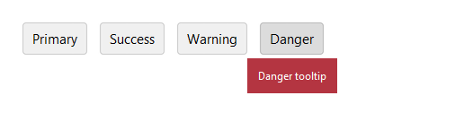
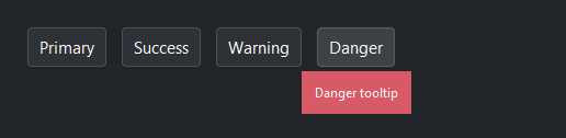
Accent colors#
Color-code tooltips by intent with accent=.
bs.Tooltip(btn, "Required field", accent="danger")
bs.Tooltip(btn, "Saved successfully", accent="success")
bs.Tooltip(btn, "New in this release", accent="info")
Text wrapping and alignment#
Set wrap_width (pixels) to limit line length. Use justify= to
control alignment inside the tooltip.
bs.Tooltip(
    btn,
    "This tooltip has a longer explanation that wraps to multiple lines.",
    wrap_width=220,
)

bs.Tooltip(btn, "Centered\ntooltip text", justify="center")
Hover delay#
Adjust the delay with delay (milliseconds). Pass 0 for instant
display.
bs.Tooltip(btn, "Appears instantly", delay=0)
bs.Tooltip(btn, "Appears after one second", delay=1000)
Auto-flip#
By default (auto_flip=True) the tooltip flips axes to stay fully on
screen. Pass 'vertical' or 'horizontal' to restrict flipping to one
axis, or False to disable it entirely.
bs.Tooltip(btn, "Never flips", auto_flip=False)
bs.Tooltip(btn, "Flips vertically only", auto_flip="vertical")
Removing a tooltip#
Call destroy() to remove the tooltip and unbind all event handlers from
the target widget.
tip = bs.Tooltip(btn, "Temporary help text")
# … later …
tip.destroy()
Widget sizing#
All widgets accept self-placement kwargs via **kwargs. The parent
container determines which options apply — stack-based parents use stack
kwargs, grid-based parents use grid kwargs. Unrecognised keys are
silently ignored.
Stack#
Used inside VStack, HStack, App, and other stack containers.
|
Fill direction: |
|
Grow to consume extra space in the parent. |
|
Alignment when the widget does not fill the available slot:
|
|
External spacing in pixels. Accepts an integer (equal on all
sides), a 2-tuple |
|
Horizontal external spacing (left and right). Accepts an integer
or a 2-tuple |
|
Vertical external spacing (top and bottom). Accepts an integer
or a 2-tuple |
Grid#
Used inside a Grid container.
|
Zero-based row and column indices. |
|
Number of rows or columns to span. |
|
Alignment and fill within the grid cell. Any combination of
|
|
External spacing in pixels. Accepts an integer, a 2-tuple
|
|
Horizontal external spacing. Accepts an integer or |
|
Vertical external spacing. Accepts an integer or |
API#
The complete reference for Tooltip lives on the
Widgets API page. At a glance:
A hover tooltip attached to a target widget. |
Full Example#
 1
 2with bs.App(title="Tooltip", size=(660, 440), padding=20, gap=14) as app:
 3
 4    bs.Label("Basic", font="heading-md")
 5    with bs.HStack(gap=8):
 6        b1 = bs.Button("Hover me")
 7        bs.Tooltip(b1, "This is a helpful tooltip.")
 8
 9        b2 = bs.Button("Instant")
10        bs.Tooltip(b2, "Appears immediately.", delay=0)
11
12        b3 = bs.Button("Slow (1 s)")
13        bs.Tooltip(b3, "Appears after a 1-second delay.", delay=1000)
14
15    bs.Label("Accent colors", font="heading-md")
16    with bs.HStack(gap=8):
17        b4 = bs.Button("Default")
18        bs.Tooltip(b4, "Default accent")
19
20        b5 = bs.Button("Primary")
21        bs.Tooltip(b5, "Primary accent", accent="primary")
22
23        b6 = bs.Button("Info")
24        bs.Tooltip(b6, "Info accent", accent="info")
25
26        b7 = bs.Button("Success")
27        bs.Tooltip(b7, "Success accent", accent="success")
28
29        b8 = bs.Button("Warning")
30        bs.Tooltip(b8, "Warning accent", accent="warning")
31
32        b9 = bs.Button("Danger")
33        bs.Tooltip(b9, "Danger accent", accent="danger")
34
35    bs.Label("Anchored positioning", font="heading-md")
36    with bs.HStack(gap=8):
37        b10 = bs.Button("Above")
38        bs.Tooltip(b10, "Anchored above the button",
39                   anchor_point="n", window_point="s")
40
41        b11 = bs.Button("Below")
42        bs.Tooltip(b11, "Anchored below the button",
43                   anchor_point="s", window_point="n")
44
45        b12 = bs.Button("Right")
46        bs.Tooltip(b12, "Anchored to the right",
47                   anchor_point="e", window_point="w")
48
49        b13 = bs.Button("Left")
50        bs.Tooltip(b13, "Anchored to the left",
51                   anchor_point="w", window_point="e")
52
53    bs.Label("Text wrapping and alignment", font="heading-md")
54    with bs.HStack(gap=8):
55        b14 = bs.Button("Wrapped text")
56        bs.Tooltip(
57            b14,
58            "This tooltip has a longer explanation that wraps across multiple lines.",
59            wrap_width=200,
60        )
61
62        b15 = bs.Button("Center aligned")
63        bs.Tooltip(
64            b15,
65            "Centered\ntooltip text",
66            justify="center",
67            wrap_width=180,
68        )
69
70app.run()