

StatusBar#
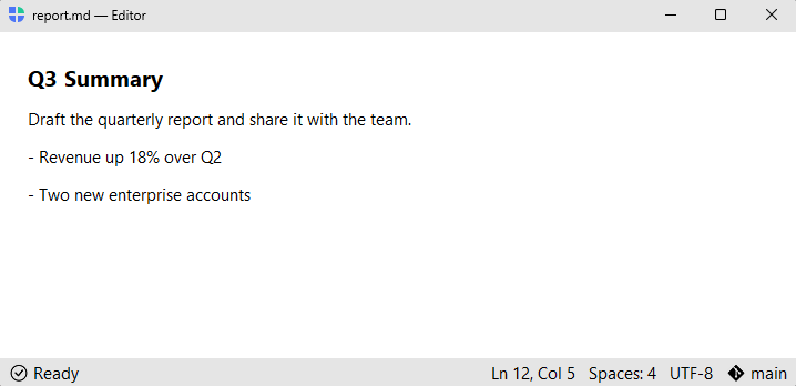
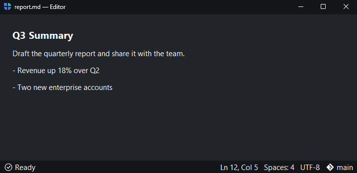
A horizontal band of passive status segments — counts, sync state, cursor position, a ready message.
Usage#
By convention the status bar reads as a quiet display strip — for interactive
controls (buttons, a search box) use a
Toolbar instead. Nothing enforces it, but the
default 'chrome' surface and compact density are tuned for passive status.
Segments add left-to-right; an add_spacer() (or side="right") splits the
band into a left and a right cluster.
Text segments#
add_text() adds a text segment, optionally with an icon= and a font=
token.
sb = bs.StatusBar(horizontal="stretch")
sb.add_text("Ready", icon="check-circle")
sb.add_text("Ln 12, Col 5", font="caption")
Left and right clusters#
Pass side="right" to push a segment to the right cluster (the first one
inserts the flexible spacer automatically). Call add_spacer() explicitly to
split the band at a chosen point.
sb.add_text("Ready", icon="check-circle")   # left
sb.add_text("Errors: 0", icon="x-circle", side="right")   # right cluster
sb.add_text("Warnings: 2", icon="exclamation-triangle", side="right")
sb.add_text("UTF-8", side="right")
sb.add_text("main", icon="git", side="right")


Reactive segments#
Pass textsignal= to bind a segment to a Signal —
the text follows the signal’s value and updates live as it changes, ideal for a
running count or sync state.
issues = bs.Signal("0 issues")
sb.add_text(textsignal=issues, icon="exclamation-triangle")

issues.set("3 issues")   # the segment updates automatically
Embedding widgets#
Pass a widget class to add_widget() (with side= to choose the
cluster) and the band builds it, or create any widget with parent=statusbar
to add it to the left cluster. Useful for a slim progress indicator or a badge.
sb = bs.StatusBar(horizontal="stretch")
sb.add_text("Syncing", icon="arrow-repeat")
bs.ProgressBar(parent=sb, value=65)
sb.add_text("main", icon="git", side="right")


Clearing segments#
clear() removes every segment, resetting the band to empty — useful when you
rebuild the status from scratch.
sb.clear()
Surface#
surface= sets the band’s background token — the default 'chrome' is a
quiet, recessed band; 'card' lifts it from the page.
sb = bs.StatusBar(horizontal="stretch", surface="card")
sb.add_text("Card surface", icon="layers")
sb.add_text("3 warnings", icon="exclamation-triangle", side="right")
sb.add_text("main", icon="git", side="right")


Pinning to a window#
Use horizontal="stretch" with side="bottom" to pin a status bar to the
bottom of any App or Window.
with bs.App(title="My App", size=(800, 500)) as app:
    sb = bs.StatusBar(horizontal="stretch", side="bottom")
    sb.add_text("Ready", icon="check-circle")
    sb.add_text("main", icon="git", side="right")

    with bs.Column(grow=True, padding=16):
        bs.Label("Document", font="heading-lg")
app.run()
Status bar inside AppShell#
AppShell includes a built-in
status band along the bottom. Access it via shell.statusbar and call the
same add_* methods — the band appears on the first segment added.
with bs.AppShell(title="My App") as shell:
    shell.statusbar.add_text("Ready", icon="check-circle")
    shell.statusbar.add_text("2 unread", side="right")
    ...
Widget sizing#
All widgets accept self-placement kwargs via **kwargs. The parent
container determines which options apply — Column / Row parents use
the layout kwargs below, grid-based parents use grid kwargs.
Column (vertical layout)
Used inside a Column, App, or any other container with a column layout.
Children are arranged top-to-bottom, so horizontal aligns each child across
the width and grow shares the vertical space. (vertical does not apply —
the order of the children sets their top-to-bottom position.)
|
Cross-axis placement of the widget: |
|
Claim and fill a share of the leftover vertical space (the layout
direction). |
|
External spacing in pixels. Accepts an integer (equal on all
sides), a 2-tuple |
|
Horizontal external spacing (left and right). Accepts an integer
or a 2-tuple |
|
Vertical external spacing (top and bottom). Accepts an integer
or a 2-tuple |
Row (horizontal layout)
Used inside a Row or any other container with a row layout. Children are
arranged left-to-right, so vertical aligns each child across the height and
grow shares the horizontal space. (horizontal does not apply — the order
of the children sets their left-to-right position.)
|
Cross-axis placement of the widget: |
|
Claim and fill a share of the leftover horizontal space (the layout
direction). |
|
External spacing in pixels. Accepts an integer (equal on all
sides), a 2-tuple |
|
Horizontal external spacing (left and right). Accepts an integer
or a 2-tuple |
|
Vertical external spacing (top and bottom). Accepts an integer
or a 2-tuple |
Grid
Used inside a Grid container.
|
Zero-based row and column indices. |
|
Number of rows or columns to span. |
|
Horizontal placement within the grid cell: |
|
Vertical placement within the grid cell: |
|
External spacing in pixels. Accepts an integer, a 2-tuple
|
|
Horizontal external spacing. Accepts an integer or |
|
Vertical external spacing. Accepts an integer or |
See also#
Toolbar —
the interactive sibling for buttons and controls in the window chrome.
AppShell —
full application scaffold with a built-in status bar, toolbars, and sidebar.
API#
The complete reference for StatusBar lives on the
Widgets API page. At a glance:
A horizontal status band of passive segments — counts, sync state, a ready message. |
Full Example#
 1
 2with bs.App(title="StatusBar demo", minsize=(720, 360), padding=16) as app:
 3
 4    with bs.Column(grow=True, horizontal_items="stretch", gap=16):
 5
 6        # ── Text segments + clusters ───────────────────────────────────────
 7        with bs.Column(gap=4):
 8            bs.Label("Segments and clusters", font="heading-sm")
 9            sb1 = bs.StatusBar(horizontal="stretch")
10            sb1.add_text("Ready", icon="check-circle")
11            sb1.add_text("Ln 12, Col 5", side="right")
12            sb1.add_text("UTF-8", side="right")
13            sb1.add_text("main", icon="git", side="right")
14
15        # ── Reactive (textsignal) ──────────────────────────────────────────
16        with bs.Column(gap=4):
17            bs.Label("Reactive (textsignal)", font="heading-sm")
18            issues = bs.Signal("0 issues")
19            seen = {"n": 0}
20
21            sb2 = bs.StatusBar(horizontal="stretch")
22            sb2.add_text(textsignal=issues, icon="exclamation-triangle")
23            sb2.add_text("Saved", icon="cloud-check", side="right")
24
25            def add_issue():
26                seen["n"] += 1
27                issues.set(f"{seen['n']} issues")
28
29            bs.Button("Add issue", icon="plus", on_click=add_issue)
30
31        # ── Embedded widget ────────────────────────────────────────────────
32        with bs.Column(gap=4):
33            bs.Label("Embedded widget", font="heading-sm")
34            sb3 = bs.StatusBar(horizontal="stretch")
35            sb3.add_text("Syncing", icon="arrow-repeat")
36            sb3.add_widget(bs.ProgressBar, value=65)
37            sb3.add_text("main", icon="git", side="right")
38
39        # ── Surface ────────────────────────────────────────────────────────
40        with bs.Column(gap=4):
41            bs.Label("Card surface", font="heading-sm")
42            sb4 = bs.StatusBar(horizontal="stretch", surface="card")
43            sb4.add_text("Card surface", icon="layers")
44            sb4.add_text("3 warnings", icon="exclamation-triangle", side="right")
45
46app.run()