Form#
bs.Form builds a data-entry layout from a dict or an explicit list of field
definitions. Fields are placed on a grid; GroupItem creates labeled sections and
TabsItem creates a tabbed layout.
Usage#
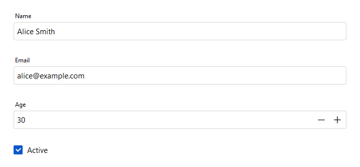
Auto-generated fields#
Pass a dict to data=. Keys become field labels; value types determine the
editor widget automatically:
bs.Form(
    data={
        "name": "Alice Smith",     # str  → text entry
        "email": "alice@example.com",
        "age": 30,                 # int  → numeric entry
        "active": True,            # bool → checkbox
    },
)
The returned value dict has the same keys as data, filled with
the user’s current input.
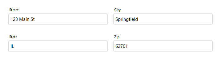
Multiple columns#
Use col_count= to distribute fields across multiple columns:
bs.Form(
    data={
        "street": "",
        "city": "",
        "state": "",
        "zip": "",
    },
    col_count=2,
)
Explicit fields#
Use FieldItem for full control over
each field — label, type hint, editor, and grid placement:
bs.Form(
    items=[
        bs.FieldItem(key="username", label="Username"),
        bs.FieldItem(key="password", label="Password", dtype="password"),
        bs.FieldItem(key="role", label="Role",
                     editor="select",
                     editor_options={"values": ["Admin", "Editor", "Viewer"]}),
    ],
)
Editor types#
The editor= argument on FieldItem
forces a specific widget regardless of the field’s value type. Editor names match
the corresponding bs.* widget class name in lowercase:
Editor |
Public widget |
Notes |
|---|---|---|
|
Single-line text input. Default for |
|
|
Numeric input with stepper buttons. Default for |
|
|
Masked text input. Default for |
|
|
Date picker with calendar popup. Default for |
|
|
Multi-line text editor. |
|
|
Drop-down list. Requires |
|
|
Numeric spinner field. |
|
|
Checkbox control. Default for |
|
|
Toggle switch. |
|
|
Horizontal slider. |
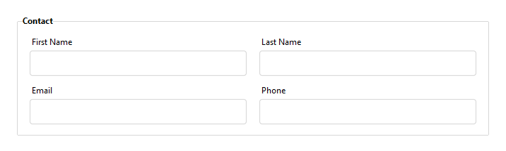
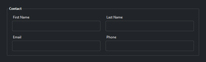
Grouped fields#
Use GroupItem to create a labeled
section with its own column layout:
bs.Form(
    items=[
        bs.GroupItem(
            label="Personal Info",
            col_count=2,
            items=[
                bs.FieldItem(key="first_name", label="First Name"),
                bs.FieldItem(key="last_name",  label="Last Name"),
                bs.FieldItem(key="email",      label="Email"),
                bs.FieldItem(key="phone",      label="Phone"),
            ],
        ),
    ],
)
Groups can be nested and placed in specific grid cells using column=,
row=, and columnspan=.
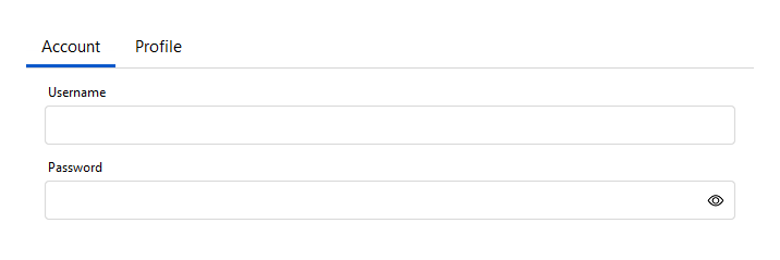
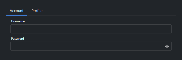
Tabbed layouts#
Use TabsItem with
TabItem to organize fields into tabs:
bs.Form(
    items=[
        bs.TabsItem(tabs=[
            bs.TabItem(
                label="Account",
                items=[
                    bs.FieldItem(key="username", label="Username"),
                    bs.FieldItem(key="password", label="Password", dtype="password"),
                ],
            ),
            bs.TabItem(
                label="Profile",
                items=[
                    bs.FieldItem(key="bio",     label="Bio",     editor="textarea"),
                    bs.FieldItem(key="website", label="Website"),
                ],
            ),
        ]),
    ],
)
Validation#
Call validate() to run validation rules on all fields. Access individual
field widgets via field(key) to attach rules:
form = bs.Form(data={"email": "", "username": ""})

form.field("email").add_validation_rule(
    "email", message="Enter a valid email address.", trigger="blur"
)
form.field("username").add_validation_rule(
    "stringLength", min=3, message="At least 3 characters.", trigger="blur"
)

if form.validate():
    submit(form.value)
Reactive updates#
Use on_data_change= at construction time, or call on_data_change()
after construction. Both receive the current form data as a dict:
# constructor kwarg
bs.Form(
    data={"title": "", "description": ""},
    on_data_change=lambda data: preview(data),
)

# event shorthand — returns a Subscription
form = bs.Form(data={"title": "", "description": ""})
form.on_data_change(lambda data: preview(data))

# composable Stream
form.on_data_change().debounce(300).listen(lambda data: preview(data))
Reading and writing values#
form = bs.Form(data={"name": "Alice", "age": 30})

# Read all values
values = form.value        # {'name': 'Alice', 'age': 30}
values = form.get()        # equivalent

# Write all values
form.value = {"name": "Bob", "age": 25}
form.set({"name": "Bob", "age": 25})   # equivalent

# Read / write a single field
name = form.get_field_value("name")
form.set_field_value("name", "Carol")

# Reactive access
sig = form.field_signal("age")
sig.subscribe(lambda v: print(f"age changed: {v}"))
Widget sizing#
All widgets accept self-placement kwargs via **kwargs. The parent
container determines which options apply — stack-based parents use stack
kwargs, grid-based parents use grid kwargs. Unrecognised keys are
silently ignored.
Stack#
Used inside VStack, HStack, App, and other stack containers.
|
Fill direction: |
|
Grow to consume extra space in the parent. |
|
Alignment when the widget does not fill the available slot:
|
|
External spacing in pixels. Accepts an integer (equal on all
sides), a 2-tuple |
|
Horizontal external spacing (left and right). Accepts an integer
or a 2-tuple |
|
Vertical external spacing (top and bottom). Accepts an integer
or a 2-tuple |
Grid#
Used inside a Grid container.
|
Zero-based row and column indices. |
|
Number of rows or columns to span. |
|
Alignment and fill within the grid cell. Any combination of
|
|
External spacing in pixels. Accepts an integer, a 2-tuple
|
|
Horizontal external spacing. Accepts an integer or |
|
Vertical external spacing. Accepts an integer or |
See also#
Form Dialog — FormDialog embeds a Form in a dialog window with
built-in OK / Cancel buttons.
API#
The complete reference for Form and its item types —
FieldItem, GroupItem, TabsItem, TabItem, and the FormItem
union — lives on the Widgets API page. At a glance:
Data-entry form built from data or explicit field definitions. |
|
A single field in a |
|
A labeled group of fields with its own column layout, placed in a |
|
A tab container holding one or more |
|
A single tab within a |
|
Represent a PEP 604 union type |
Full Example#
 1
 2with bs.App(title="Form Demo", size=(700, 780), padding=20, gap=12) as app:
 3
 4    # Auto-generated fields from a data dict
 5    bs.Label("Auto-Generated Fields", font="heading-sm")
 6    bs.Form(
 7        data={
 8            "name": "Alice Smith",
 9            "email": "alice@example.com",
10            "age": 30,
11            "active": True,
12        },
13        fill="x",
14    )
15
16    # Multi-column layout
17    bs.Label("Multiple Columns", font="heading-sm")
18    bs.Form(
19        data={
20            "street": "123 Main St",
21            "city": "Springfield",
22            "state": "IL",
23            "zip": "62701",
24        },
25        col_count=2,
26        fill="x",
27    )
28
29    # Grouped fields with GroupItem
30    bs.Label("Grouped Fields", font="heading-sm")
31    bs.Form(
32        items=[
33            bs.GroupItem(
34                label="Contact",
35                col_count=2,
36                items=[
37                    bs.FieldItem(key="first_name", label="First Name"),
38                    bs.FieldItem(key="last_name",  label="Last Name"),
39                    bs.FieldItem(key="email",       label="Email"),
40                    bs.FieldItem(key="phone",       label="Phone"),
41                ],
42            ),
43        ],
44        fill="x",
45    )
46
47    # Tabbed layout with TabsItem
48    bs.Label("Tabbed Layout", font="heading-sm")
49    bs.Form(
50        items=[
51            bs.TabsItem(tabs=[
52                bs.TabItem(
53                    label="Account",
54                    items=[
55                        bs.FieldItem(key="username", label="Username"),
56                        bs.FieldItem(key="password", label="Password", dtype="password"),
57                    ],
58                ),
59                bs.TabItem(
60                    label="Profile",
61                    items=[
62                        bs.FieldItem(key="bio",     label="Bio",     editor="textarea"),
63                        bs.FieldItem(key="website", label="Website"),
64                    ],
65                ),
66            ]),
67        ],
68        fill="x",
69    )
70
71app.run()