

GroupBox#
A labelled container that groups related content inside a bordered frame.
The title is embedded in the top border line, giving the classic fieldset
look familiar from HTML <fieldset> and desktop dialog panels.
Usage#
A group box is a layout container with a titled border — the same
layout=/gap=/padding= as a Column, framed with a
caption set into the top edge. Reach for it to label a group of fields; an
unlabelled Card when you just need a surface.
Accent borders#
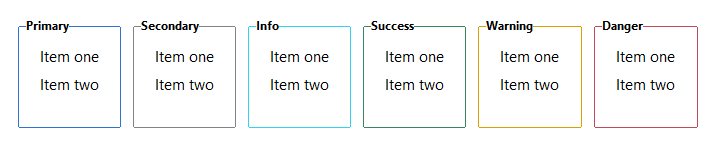
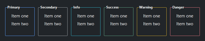
Pass an accent= token to color the border and title label. The title text
automatically inherits the accent color.
for accent in ("primary", "secondary", "info", "success", "warning", "danger"):
    with bs.GroupBox(accent.title(), accent=accent, padding=10, gap=4):
        bs.Label("Item one")
        bs.Label("Item two")
Layout modes#
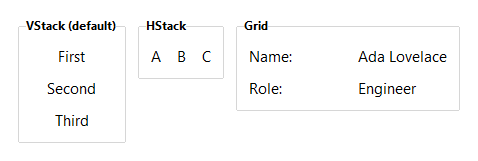
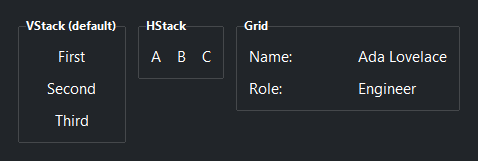
layout='column' (default) stacks children vertically. 'row' places
them side by side. 'grid' arranges children in a column-row grid.
# Default vertical column
with bs.GroupBox("Column (default)", gap=8):
    bs.Label("First")
    bs.Label("Second")
    bs.Label("Third")

# Horizontal row
with bs.GroupBox("Row", layout="row", gap=12, vertical_items="center"):
    bs.Label("A")
    bs.Label("B")
    bs.Label("C")

# Grid — two columns, key/value pairs
with bs.GroupBox("Grid", layout="grid", columns=[1, 1], gap=8, horizontal_items="stretch"):
    bs.Label("Name:")  ; bs.Label("Ada Lovelace")
    bs.Label("Role:")  ; bs.Label("Engineer")
Child defaults#
Use horizontal_items, vertical_items, and grow_items to apply a
uniform layout behavior to all children without repeating it on each widget.
with bs.GroupBox("Filters", gap=8, horizontal_items="stretch"):
    bs.TextField()   # fills horizontally by default
    bs.TextField()
In context#
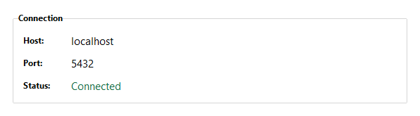
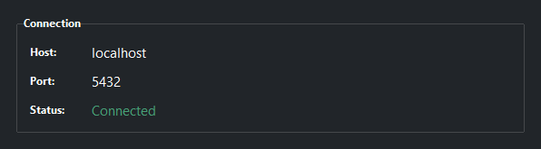
GroupBox is commonly used to visually separate settings panels or summary sections within a larger form or dashboard.
with bs.GroupBox("Connection", accent="primary", padding=12, gap=8):
    with bs.Row(gap=8):
        bs.Label("Host:")
        bs.Label("localhost")
    with bs.Row(gap=8):
        bs.Label("Status:")
        bs.Label("Connected", accent="success")
Widget sizing#
All widgets accept self-placement kwargs via **kwargs. The parent
container determines which options apply — Column / Row parents use
the layout kwargs below, grid-based parents use grid kwargs.
Column (vertical layout)
Used inside a Column, App, or any other container with a column layout.
Children are arranged top-to-bottom, so horizontal aligns each child across
the width and grow shares the vertical space. (vertical does not apply —
the order of the children sets their top-to-bottom position.)
|
Cross-axis placement of the widget: |
|
Claim and fill a share of the leftover vertical space (the layout
direction). |
|
External spacing in pixels. Accepts an integer (equal on all
sides), a 2-tuple |
|
Horizontal external spacing (left and right). Accepts an integer
or a 2-tuple |
|
Vertical external spacing (top and bottom). Accepts an integer
or a 2-tuple |
Row (horizontal layout)
Used inside a Row or any other container with a row layout. Children are
arranged left-to-right, so vertical aligns each child across the height and
grow shares the horizontal space. (horizontal does not apply — the order
of the children sets their left-to-right position.)
|
Cross-axis placement of the widget: |
|
Claim and fill a share of the leftover horizontal space (the layout
direction). |
|
External spacing in pixels. Accepts an integer (equal on all
sides), a 2-tuple |
|
Horizontal external spacing (left and right). Accepts an integer
or a 2-tuple |
|
Vertical external spacing (top and bottom). Accepts an integer
or a 2-tuple |
Grid
Used inside a Grid container.
|
Zero-based row and column indices. |
|
Number of rows or columns to span. |
|
Horizontal placement within the grid cell: |
|
Vertical placement within the grid cell: |
|
External spacing in pixels. Accepts an integer, a 2-tuple
|
|
Horizontal external spacing. Accepts an integer or |
|
Vertical external spacing. Accepts an integer or |
See also#
Column,
Row, and
Grid are the plain (no border) layout
containers. Use GroupBox when you want a labelled border around a group
of related content.
API#
The complete reference for GroupBox lives on the
Widgets API page. At a glance:
A labeled container that groups related content inside a bordered frame. |
Full Example#
 1
 2with bs.App(title="GroupBox Demo", padding=20, gap=16) as app:
 3
 4    # Accent borders
 5    bs.Label("Accent Borders", font="heading-sm")
 6    with bs.Row(gap=12):
 7        for accent in ("default", "primary", "secondary", "success", "warning", "danger"):
 8            with bs.GroupBox(accent.title(), accent=accent, padding=10, gap=4):
 9                bs.Label("Item one")
10                bs.Label("Item two")
11
12    # Layout modes
13    bs.Label("Layout Modes", font="heading-sm")
14    with bs.Row(gap=12):
15
16        with bs.GroupBox("Column (default)", padding=10, gap=8):
17            bs.Label("First")
18            bs.Label("Second")
19            bs.Label("Third")
20
21        with bs.GroupBox("Row", layout="row", padding=10, gap=12, vertical_items="center"):
22            bs.Label("A")
23            bs.Label("B")
24            bs.Label("C")
25
26        with bs.GroupBox("Grid", layout="grid", columns=[1, 1], padding=10, gap=8, vertical_items="center"):
27            bs.Label("Name:")
28            bs.Label("Ada Lovelace")
29            bs.Label("Role:")
30            bs.Label("Engineer")
31
32    # In context
33    bs.Label("In Context", font="heading-sm")
34    with bs.Row(gap=12):
35
36        with bs.GroupBox("Connection", accent="primary", padding=12, gap=8):
37            with bs.Row(gap=8, vertical_items="center"):
38                bs.Label("Host:")
39                bs.Label("localhost")
40            with bs.Row(gap=8, vertical_items="center"):
41                bs.Label("Port:")
42                bs.Label("5432")
43            with bs.Row(gap=8, vertical_items="center"):
44                bs.Label("Status:")
45                bs.Label("Connected", accent="success")
46
47        with bs.GroupBox("Alerts", accent="warning", padding=12, gap=6):
48            bs.Label("Disk usage above 80%", accent="warning")
49            bs.Label("2 services degraded", accent="danger")
50            bs.Label("Backup completed", accent="success")
51
52app.run()