Select#
A single-selection dropdown field with optional search filtering.
Usage#
Basic#
bs.Select(["Red", "Green", "Blue"])
bs.Select(["Red", "Green", "Blue"], value="Green")
Option values#
An option’s displayed label can differ from its stored value. Each option is a
plain string, a (text, value) tuple, or a {"text": ..., "value": ...}
dict. value=, .value, and the change event all work in value-space —
the value, not the label. The label currently shown is available as .text.
theme = bs.Select(
    [("Light theme", "light"), ("Dark theme", "dark"), {"text": "Follow system", "value": "auto"}],
    value="dark",
)
theme.value            # -> "dark"          (the value)
theme.text             # -> "Dark theme"    (the displayed label)
theme.value = "auto"   # selects "Follow system"
theme.on_change(lambda e: apply_theme(e.value))

theme.options          # -> [{"text": "Light theme", "value": "light"}, ...]
Setting .value to something that is not one of the options raises
ValueError (unless allow_custom_values=True, where a typed value is kept
as its own text).
Carrying extra data (the data bag)#
The dict form is a data bag — alongside the recognized keys (text,
value, and the per-option icon/disabled), any other key you add rides
along as carried data. Read the whole selected record, indexed by key, via
.selection:
country = bs.Select(options=[
    {"text": "Canada", "value": "CA", "phone": "+1"},
    {"text": "Japan",  "value": "JP", "phone": "+81"},
], value="JP")

country.value             # -> "JP"
country.selection         # -> {"text": "Japan", "value": "JP", "phone": "+81"}
country.selection["phone"]  # -> "+81"

country.on_change(lambda e: dial(country.selection["phone"]))
.selection is the selected option’s full dict (the same shape you’d get from a
ListView row), or None when nothing is selected. Unrecognized keys are
accepted, not validated — the dict route is opt-in, so a mistyped key rides
along silently rather than raising.
Two of the recognized keys change how an option is presented: icon renders a
glyph beside the option’s label in the popup, and disabled greys the row out
and makes it non-selectable (keyboard navigation and search auto-select skip it
too). Per-option disabled is independent of the widget-level disabled=
that locks the whole control:
bs.Select(options=[
    {"text": "Free",       "value": "free",  "icon": "gift"},
    {"text": "Pro",        "value": "pro",   "icon": "star"},
    {"text": "Enterprise", "value": "ent",   "icon": "buildings", "disabled": True},
], value="free")
Setting a disabled option’s value programmatically still works — disabled only
blocks user selection.
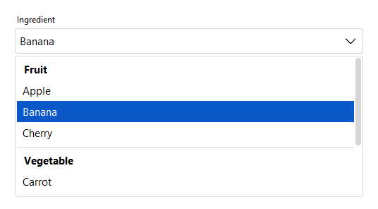
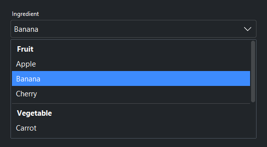
Grouping#
Pass group_by="field" to cluster the popup under section headers, where
field is any key your options carry — often a category that already lives in
your data. Grouping is purely presentational: value, .selection, and
.options are unaffected, and the grouping field rides along in the data bag.
bs.Select(
    options=[
        {"text": "Apple",    "value": "apple",    "category": "Fruit"},
        {"text": "Banana",   "value": "banana",   "category": "Fruit"},
        {"text": "Carrot",   "value": "carrot",   "category": "Vegetable"},
        {"text": "Basil",    "value": "basil",    "category": "Herb"},
    ],
    group_by="category",
    label="Ingredient",
)
Groups appear in first-appearance order; an option that lacks the field renders
without a header. Header text is shown verbatim — it is never re-cased or
otherwise transformed, so .selection still returns the original value
({..., "category": "Fruit"}).
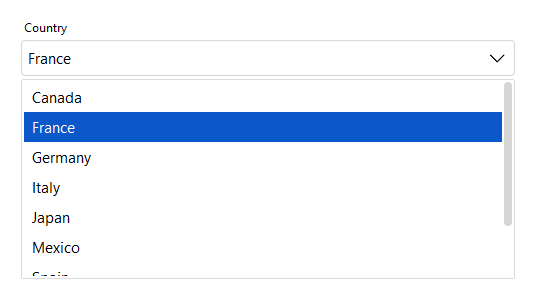
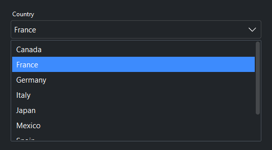
Limiting the popup height#
The popup grows to fit its options up to a built-in cap, then scrolls. Set
max_visible_items= to cap it at roughly that many option rows — handy for long
lists. Group headers and separators count toward the height, so the number is
approximate.
countries = ["Canada", "France", "Germany", "Japan", "United States", "..."]
bs.Select(countries, label="Country", max_visible_items=8)
Label and message#
bs.Select(
    ["Option A", "Option B", "Option C"],
    label="Choose an option",
    message="Select the option that best applies.",
)
Required#
bs.Select(["Red", "Green", "Blue"], label="Color", required=True)
Searchable#
Set searchable=True to filter options as the user types.
countries = ["Canada", "France", "Germany", "Japan", "United States"]
bs.Select(countries, label="Country", searchable=True)
Custom values#
Set allow_custom_values=True to accept typed values not in the list.
bs.Select(["Red", "Green", "Blue"], allow_custom_values=True)
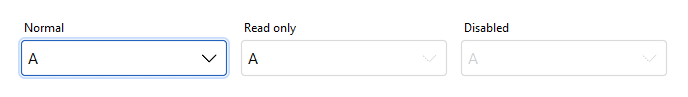
States#
bs.Select(["A", "B", "C"], value="A", label="Normal")
bs.Select(["A", "B", "C"], value="A", label="Read only",  read_only=True)
bs.Select(["A", "B", "C"], value="A", label="Disabled",   disabled=True)
Reactive binding#
Bind a Signal[str] with signal=. The field and signal stay in sync.
color = bs.Signal("Red")
bs.Select(["Red", "Green", "Blue"], signal=color)
color.subscribe(lambda v: apply_color(v))
Updating options at runtime#
Assign to .options to replace the list dynamically.
sel = bs.Select(["A", "B", "C"])
sel.options = ["X", "Y", "Z"]
Widget sizing#
All widgets accept self-placement kwargs via **kwargs. The parent
container determines which options apply — stack-based parents use stack
kwargs, grid-based parents use grid kwargs. Unrecognised keys are
silently ignored.
Stack#
Used inside VStack, HStack, App, and other stack containers.
|
Fill direction: |
|
Grow to consume extra space in the parent. |
|
Alignment when the widget does not fill the available slot:
|
|
External spacing in pixels. Accepts an integer (equal on all
sides), a 2-tuple |
|
Horizontal external spacing (left and right). Accepts an integer
or a 2-tuple |
|
Vertical external spacing (top and bottom). Accepts an integer
or a 2-tuple |
Grid#
Used inside a Grid container.
|
Zero-based row and column indices. |
|
Number of rows or columns to span. |
|
Alignment and fill within the grid cell. Any combination of
|
|
External spacing in pixels. Accepts an integer, a 2-tuple
|
|
Horizontal external spacing. Accepts an integer or |
|
Vertical external spacing. Accepts an integer or |
API#
The complete reference for Select lives on the
Widgets API page. At a glance:
A single-selection dropdown field. |
Full Example#
 1
 2COUNTRIES = [
 3    "Canada", "France", "Germany", "Italy", "Japan",
 4    "Mexico", "Spain", "United Kingdom", "United States",
 5]
 6
 7with bs.App(title="Select Demo", padding=20, gap=16) as app:
 8
 9    # Basic
10    bs.Label("Basic", font="heading-sm")
11    bs.Select(["Red", "Green", "Blue"], fill="x")
12    bs.Select(["Red", "Green", "Blue"], value="Green", fill="x")
13
14    # Label and message
15    bs.Label("Label and Message", font="heading-sm")
16    bs.Select(
17        ["Option A", "Option B", "Option C"],
18        label="Choose an option",
19        message="Select the option that best applies.",
20        fill="x",
21    )
22
23    # Required
24    bs.Label("Required", font="heading-sm")
25    bs.Select(["Red", "Green", "Blue"], label="Color", required=True, fill="x")
26
27    # Searchable
28    bs.Label("Searchable", font="heading-sm")
29    bs.Select(COUNTRIES, label="Country", searchable=True, fill="x")
30
31    # Custom values
32    bs.Label("Custom Values", font="heading-sm")
33    bs.Select(
34        ["Red", "Green", "Blue"],
35        label="Color (custom allowed)",
36        allow_custom_values=True,
37        fill="x",
38    )
39
40    # Grouping — cluster the popup under headers by an option field
41    bs.Label("Grouping", font="heading-sm")
42    bs.Select(
43        options=[
44            {"text": "Apple",    "value": "apple",    "category": "Fruit"},
45            {"text": "Banana",   "value": "banana",   "category": "Fruit"},
46            {"text": "Carrot",   "value": "carrot",   "category": "Vegetable"},
47            {"text": "Broccoli", "value": "broccoli", "category": "Vegetable"},
48            {"text": "Basil",    "value": "basil",    "category": "Herb"},
49        ],
50        group_by="category",
51        label="Ingredient",
52        fill="x",
53    )
54
55    # Capped popup height — long list scrolls after ~6 rows
56    bs.Label("Limited Popup Height", font="heading-sm")
57    bs.Select(COUNTRIES, label="Country (max 6 visible)", max_visible_items=6, fill="x")
58
59    # States
60    bs.Label("States", font="heading-sm")
61    with bs.HStack(gap=8, fill="x", fill_items="x", expand_items=True):
62        bs.Select(["A", "B", "C"], value="A", label="Normal")
63        bs.Select(["A", "B", "C"], value="A", label="Read only",  read_only=True)
64        bs.Select(["A", "B", "C"], value="A", label="Disabled",   disabled=True)
65
66    # Reactive binding
67    bs.Label("Reactive Binding", font="heading-sm")
68    with bs.VStack(gap=6, fill="x"):
69        color = bs.Signal("Red")
70        bs.Select(["Red", "Green", "Blue"], label="Color", signal=color, fill="x")
71        color_lbl = bs.Label("Selected: Red", accent="secondary", font="caption")
72        color.subscribe(lambda v: setattr(color_lbl, 'text', f"Selected: {v}"))
73
74    # Runtime option updates
75    bs.Label("Runtime Updates", font="heading-sm")
76    with bs.VStack(gap=6, fill="x"):
77        sel = bs.Select(["Alpha", "Beta", "Gamma"], fill="x")
78        with bs.HStack(gap=8):
79            bs.Button("Set ABC", variant="outline",
80                on_click=lambda: setattr(sel, 'options', ["A", "B", "C"]))
81            bs.Button("Set 1-2-3", variant="outline",
82                on_click=lambda: setattr(sel, 'options', ["1", "2", "3"]))
83
84app.run()