ScrollView#
A canvas-backed scrollable container. Place child widgets inside the context block; they are stacked vertically inside the scrollable area by default. Mouse-wheel scrolling is automatically enabled for all descendants.
Usage#
Basic vertical scroll#
Children are packed top-to-bottom inside the scrollable area. Add
fill="both", expand=True to let the ScrollView fill its parent and
provide a height boundary for scrolling to begin.
with bs.VStack(fill="both", expand=True, gap=8):
    bs.Label("Log output", font="heading-md")
    with bs.ScrollView(scroll_direction="vertical", fill="both", expand=True):
        for line in log_lines:
            bs.Label(line)
You can also constrain the height directly with height=:
with bs.ScrollView(height=200, fill="x"):
    for i in range(30):
        bs.Label(f"Item {i}")
Scroll direction#
scroll_direction= controls which axis scrolls. 'vertical' (default
for most use cases), 'horizontal', or 'both'.
# Vertical only
with bs.ScrollView(scroll_direction="vertical", fill="both", expand=True):
    ...

# Horizontal — useful for wide content like a row of cards
with bs.ScrollView(scroll_direction="horizontal", fill="x"):
    with bs.HStack(gap=8, padding=8):
        for card in cards:
            bs.Card(...)

# Both axes
with bs.ScrollView(scroll_direction="both", fill="both", expand=True):
    ...
Note
Shift + scroll wheel scrolls horizontally on all platforms.
Scrollbar visibility#
scrollbar_visibility= controls when the scrollbars appear.
|
Scrollbars are always visible (default). |
|
Scrollbars are always hidden; scrolling still works via mouse wheel. |
|
Scrollbars appear when the mouse enters the widget. |
|
Scrollbars appear while scrolling, then auto-hide after
|
# Always-visible scrollbar (default)
bs.ScrollView(scrollbar_visibility="always")

# Hidden scrollbar — content scrolls via mouse wheel
bs.ScrollView(scrollbar_visibility="never")

# Scrollbar appears on hover
bs.ScrollView(scrollbar_visibility="hover")

# Scrollbar appears during scroll, hides after 1.5 s
bs.ScrollView(scrollbar_visibility="scroll", autohide_delay=1500)
Scrollbar style#
scrollbar_variant= selects the bar style — 'default' (the standard
rounded bar, used here) or 'thin' (a slim square bar that suits compact
lists, panels, and popups). The list-style widgets (ListView, Tree, Gallery) default to 'thin'; ScrollView keeps the standard
bar by default since it is a general-purpose container.
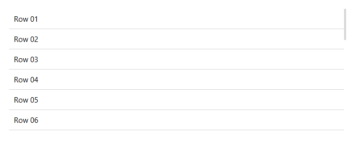
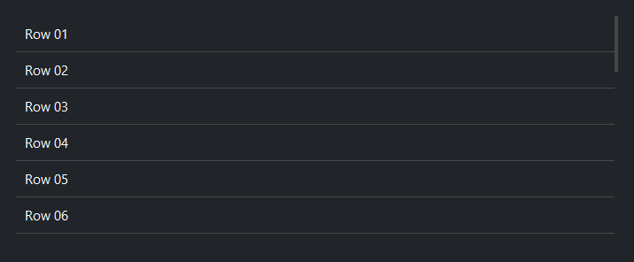
with bs.ScrollView(scrollbar_variant="thin", fill="both", expand=True):
    for i in range(30):
        bs.Label(f"Row {i:02d}")
Border#
show_border=True draws a 1 px border around the ScrollView frame.
Pair it with padding= to prevent content from sitting flush against
the border.
with bs.ScrollView(show_border=True, padding=4, fill="both", expand=True):
    for i in range(30):
        bs.Label(f"Row {i}")
Programmatic scroll control#
Navigate content without user interaction:
sv = bs.ScrollView(fill="both", expand=True)
with sv:
    ...

sv.scroll_to_top()        # jump to top
sv.scroll_to_bottom()     # jump to bottom
sv.scroll_to_left()       # jump to left edge
sv.scroll_to_right()      # jump to right edge

sv.yview_moveto(0.5)      # 50 % of the way down
sv.xview_moveto(0.25)     # 25 % of the way across
Mouse-wheel scrolling#
Mouse-wheel scrolling is enabled automatically for the canvas and all descendants. To toggle it programmatically:
sv.disable_scrolling()    # pause scrolling
sv.enable_scrolling()     # resume
After adding a large batch of widgets dynamically (outside the context
block), call refresh_bindings() to ensure all new descendants are
wired up:
sv = bs.ScrollView()
with sv:
    bs.Label("Static row")

# Later, add more rows dynamically
with sv:
    for i in range(100):
        bs.Label(f"Dynamic row {i}")
sv.refresh_bindings()
Widget sizing#
All widgets accept self-placement kwargs via **kwargs. The parent
container determines which options apply — stack-based parents use stack
kwargs, grid-based parents use grid kwargs. Unrecognised keys are
silently ignored.
Stack#
Used inside VStack, HStack, App, and other stack containers.
|
Fill direction: |
|
Grow to consume extra space in the parent. |
|
Alignment when the widget does not fill the available slot:
|
|
External spacing in pixels. Accepts an integer (equal on all
sides), a 2-tuple |
|
Horizontal external spacing (left and right). Accepts an integer
or a 2-tuple |
|
Vertical external spacing (top and bottom). Accepts an integer
or a 2-tuple |
Grid#
Used inside a Grid container.
|
Zero-based row and column indices. |
|
Number of rows or columns to span. |
|
Alignment and fill within the grid cell. Any combination of
|
|
External spacing in pixels. Accepts an integer, a 2-tuple
|
|
Horizontal external spacing. Accepts an integer or |
|
Vertical external spacing. Accepts an integer or |
See also#
VStack —
non-scrolling vertical container.
HStack —
non-scrolling horizontal container.
Card and
GroupBox —
framed containers that can be combined with ScrollView.
API#
The complete reference for ScrollView lives on the
Widgets API page. At a glance:
A canvas-based scrollable container. |
Full Example#
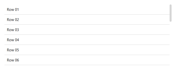
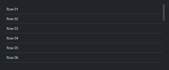
1
2with bs.App(title="ScrollView", size=(680, 500), padding=20, gap=16) as app:
3
4 # ── Vertical scroll ────────────────────────────────────────────────────
5 with bs.VStack(fill="x", gap=0):
6 bs.Label("Vertical", font="heading-md")
7
8 with bs.ScrollView(
9 scroll_direction="vertical",
10 scrollbar_visibility="always",
11 fill="both", expand=True
12 ):
13 for i in range(1, 30):
14 with bs.HStack(fill="x", padding=8):
15 bs.Label(f"Row {i:02d}")
16 bs.Separator(fill="x")
17
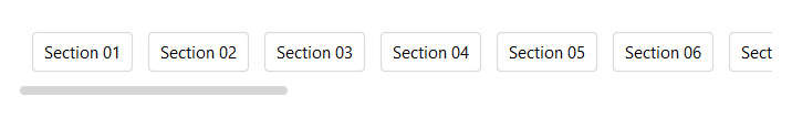
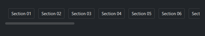
18 # ── Horizontal scroll ──────────────────────────────────────────────────
19 with bs.VStack(fill="x", gap=0):
20 bs.Label("Horizontal (with border)", font="heading-md")
21
22 with bs.ScrollView(
23 scroll_direction="horizontal",
24 scrollbar_visibility="always",
25 fill="x",
26 height=100,
27 padding=3,
28 show_border=True,
29 ):
30 with bs.HStack(gap=8, padding=8):
31 for i in range(1, 25):
32 bs.Button(f"Section {i:02d}", variant="outline")
33
34app.run()