ButtonGroup#
A row (or column) of visually-connected buttons sharing a common accent and
variant. Buttons are added one at a time via add().
Usage#
Basic usage#
Create a group and add buttons with add(). The group handles layout and
shared styling automatically.
bg = bs.ButtonGroup()
bg.add("Save")
bg.add("Cancel")
bg.add("Reset")
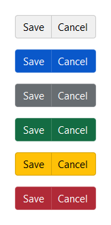
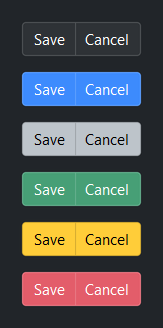
Accent colors#
Set accent= on the group to apply a color intent to every button. Each
button inherits the group accent unless you override it individually via
**kwargs in add().
bg = bs.ButtonGroup(accent="primary")
bg.add("Save")
bg.add("Cancel")
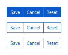
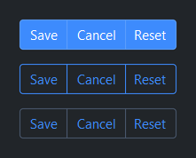
Style variants#
Use variant= to control visual weight across the whole group.
bs.ButtonGroup(accent="primary", variant="solid")    # default
bs.ButtonGroup(accent="primary", variant="outline")
bs.ButtonGroup(accent="primary", variant="ghost")
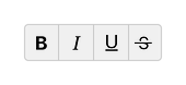
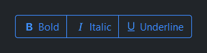
Icons#
Pass icon= to add() to show a Bootstrap Icon alongside the label.
bg = bs.ButtonGroup(accent="primary", variant="outline")
bg.add("Bold",      icon="type-bold")
bg.add("Italic",    icon="type-italic")
bg.add("Underline", icon="type-underline")
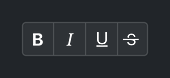
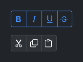
Icon-only#
Omit the label to show only the icon — icon_only is inferred
automatically, same as for Button.
bg = bs.ButtonGroup(variant="outline", accent="primary")
bg.add(icon="type-bold")
bg.add(icon="type-italic")
bg.add(icon="type-underline")
bg.add(icon="type-strikethrough")
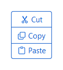
Vertical orientation#
Pass 'vertical' as the first argument (or orient='vertical') to stack
buttons top-to-bottom instead of left-to-right.
bg = bs.ButtonGroup("vertical", accent="primary", variant="outline")
bg.add("Cut",   icon="scissors")
bg.add("Copy",  icon="copy")
bg.add("Paste", icon="clipboard")
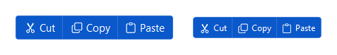
Compact density#
Use density='compact' to reduce button padding — useful inside toolbars.
bg = bs.ButtonGroup(accent="primary", density="compact")
bg.add("Cut",   icon="scissors")
bg.add("Copy",  icon="copy")
bg.add("Paste", icon="clipboard")
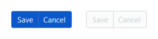
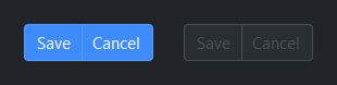
Disabled state#
Set disabled=True to make all buttons in the group non-interactive at
once. Toggle the disabled property at runtime to re-enable.
bg = bs.ButtonGroup(accent="primary", disabled=True)
bg.add("Save")
bg.add("Cancel")

# Toggle at runtime
bg.disabled = False
Handling clicks#
Use on_click() on the group to handle any button press in one place.
The handler receives a ButtonGroupClickEvent with key, text, and icon
for the clicked button.
bg = bs.ButtonGroup(accent="primary")
bg.add("Save",   icon="save",  key="save")
bg.add("Cancel", icon="x-lg", key="cancel")
bg.add("Delete", icon="trash", key="delete")

def handle_click(e):
    print(e.key, e.text, e.icon)

bg.on_click(handle_click)

# As a subscription (cancellable)
sub = bg.on_click(handle_click)
sub.cancel()

# As a Stream (composable)
bg.on_click().listen(handle_click)
Managing items#
add() and add_all() return the key(s) assigned to each button.
Keys are auto-generated ('widget_0', 'widget_1', …) unless you
provide them explicitly. Use keys with remove(), update_item(),
query_item(), and item().
bg = bs.ButtonGroup(accent="primary")

# Add one at a time
bg.add("Save",   icon="save",  key="save")
bg.add("Cancel", icon="x-lg", key="cancel")

# Or all at once
bg.add_all([
    dict(label="Cut",   icon="scissors", key="cut"),
    dict(label="Copy",  icon="copy",     key="copy"),
    dict(label="Paste", icon="clipboard"),
])

# Inspect
print(bg.keys)         # ('save', 'cancel', 'cut', 'copy', 'widget_0')
print(len(bg))         # 5
print("save" in bg)    # True

# Query a button's current value
bg.query_item("save", "text")          # 'Save'

# Reconfigure after creation
bg.update_item("save", text="Saving…", state="disabled")

# Remove a button
bg.remove("cancel")

# Access the underlying button widget
btn = bg.item("save")
Widget sizing#
All widgets accept self-placement kwargs via **kwargs. The parent
container determines which options apply — stack-based parents use stack
kwargs, grid-based parents use grid kwargs. Unrecognised keys are
silently ignored.
Stack#
Used inside VStack, HStack, App, and other stack containers.
|
Fill direction: |
|
Grow to consume extra space in the parent. |
|
Alignment when the widget does not fill the available slot:
|
|
External spacing in pixels. Accepts an integer (equal on all
sides), a 2-tuple |
|
Horizontal external spacing (left and right). Accepts an integer
or a 2-tuple |
|
Vertical external spacing (top and bottom). Accepts an integer
or a 2-tuple |
Grid#
Used inside a Grid container.
|
Zero-based row and column indices. |
|
Number of rows or columns to span. |
|
Alignment and fill within the grid cell. Any combination of
|
|
External spacing in pixels. Accepts an integer, a 2-tuple
|
|
Horizontal external spacing. Accepts an integer or |
|
Vertical external spacing. Accepts an integer or |
See also#
Button — standalone button
ToggleGroup — button group with selection state tracking
API#
The complete reference for ButtonGroup lives on
the Widgets API page. At a glance:
A row (or column) of visually-connected buttons sharing accent and variant. |
Full Example#
 1
 2with bs.App(title="ButtonGroup Demo", padding=20, gap=16) as app:
 3
 4    # Accent colors
 5    bs.Label("Accent Colors", font="heading-sm")
 6    with bs.HStack(gap=8):
 7        for accent in ("default", "primary", "secondary", "success", "warning", "danger"):
 8            bg = bs.ButtonGroup(accent=accent)
 9            bg.add("A")
10            bg.add("B")
11
12    # Style variants
13    bs.Label("Style Variants", font="heading-sm")
14    with bs.HStack(gap=8):
15        for variant in ("solid", "outline", "ghost"):
16            bg = bs.ButtonGroup(variant=variant)
17            bg.add("Save")
18            bg.add("Cancel")
19
20    # Icons
21    bs.Label("Icons", font="heading-sm")
22    bg = bs.ButtonGroup(accent="primary", variant="outline")
23    bg.add("Bold",      icon="type-bold")
24    bg.add("Italic",    icon="type-italic")
25    bg.add("Underline", icon="type-underline")
26
27    # Icon-only (icon_only inferred when no label is provided)
28    bs.Label("Icon Only", font="heading-sm")
29    with bs.HStack(gap=8):
30        bg1 = bs.ButtonGroup(variant="outline", accent="primary")
31        bg1.add(icon="type-bold")
32        bg1.add(icon="type-italic")
33        bg1.add(icon="type-underline")
34        bg1.add(icon="type-strikethrough")
35
36        bg2 = bs.ButtonGroup()
37        bg2.add(icon="scissors")
38        bg2.add(icon="copy")
39        bg2.add(icon="clipboard")
40
41    # Vertical orientation
42    bs.Label("Vertical Orientation", font="heading-sm")
43    bg = bs.ButtonGroup("vertical", accent="primary", variant="outline")
44    bg.add("Cut",   icon="scissors")
45    bg.add("Copy",  icon="copy")
46    bg.add("Paste", icon="clipboard")
47
48    # Compact density
49    bs.Label("Compact Density", font="heading-sm")
50    with bs.HStack(gap=8):
51        bg1 = bs.ButtonGroup(accent="primary")
52        bg1.add("Cut",   icon="scissors")
53        bg1.add("Copy",  icon="copy")
54        bg1.add("Paste", icon="clipboard")
55
56        bg2 = bs.ButtonGroup(accent="primary", density="compact")
57        bg2.add("Cut",   icon="scissors")
58        bg2.add("Copy",  icon="copy")
59        bg2.add("Paste", icon="clipboard")
60
61    # Disabled
62    bs.Label("Disabled", font="heading-sm")
63    with bs.HStack(gap=8):
64        bg1 = bs.ButtonGroup(accent="primary")
65        bg1.add("Save")
66        bg1.add("Cancel")
67
68        bg2 = bs.ButtonGroup(accent="primary", disabled=True)
69        bg2.add("Save")
70        bg2.add("Cancel")
71
72    # Handling clicks (group-level on_click — e.data has key, text, icon)
73    bs.Label("Handling Clicks", font="heading-sm")
74    bg = bs.ButtonGroup(accent="primary")
75    bg.add("Save",   icon="save",  key="save")
76    bg.add("Cancel", icon="x-lg", key="cancel")
77    bg.add("Delete", icon="trash", key="delete")
78    last = bs.Signal("(none)")
79    bg.on_click(lambda e: last.set(e.key))
80    bs.Label(textsignal=last, accent="secondary")
81
82app.run()