RadioGroup#
A group of mutually exclusive radio buttons.
Usage#
Basic#
Pass a list of strings — the label and value are the same for each option.
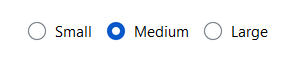
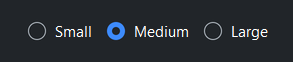
bs.RadioGroup(["Small", "Medium", "Large"], value="Medium")
Use (text, value) tuples — or {"text": ..., "value": ...} dicts — when
the display text should differ from the stored value.
size = bs.RadioGroup([("Small", "s"), ("Medium", "m"), ("Large", "l")], value="m")
size.value      # -> "m"        (the selected value)
size.text       # -> "Medium"   (the selected label)
size.selection  # -> {"text": "Medium", "value": "m"}   (the full record)
Options are a data bag — alongside the recognized keys (text, value,
and the per-option icon/disabled), any other key you add (e.g.
{"text": "Medium", "value": "m", "px": 16}) rides along and is returned by
.selection (see Select for details). A per-option icon renders
beside that button’s label, and disabled greys out a single option so it
can’t be chosen — distinct from the group-level disabled= that locks every
button.
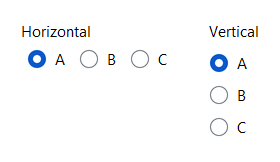
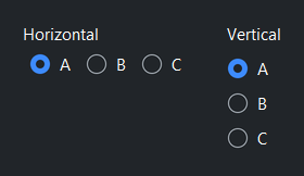
Orientation#
bs.RadioGroup(["A", "B", "C"], orient="horizontal")  # default
bs.RadioGroup(["A", "B", "C"], orient="vertical")
Accent colors#
bs.RadioGroup(["Primary"],   accent="primary",   value="Primary")
bs.RadioGroup(["Secondary"], accent="secondary", value="Secondary")
bs.RadioGroup(["Info"],      accent="info",      value="Info")
bs.RadioGroup(["Success"],   accent="success",   value="Success")
bs.RadioGroup(["Warning"],   accent="warning",   value="Warning")
bs.RadioGroup(["Danger"],    accent="danger",    value="Danger")


Title#
A title= adds a label rendered above the group. title is also a live
property — assign to it to change the label later, or set it to None to
remove it.
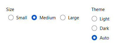
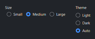
bs.RadioGroup(
    [("Small", "s"), ("Medium", "m"), ("Large", "l")],
    title="Size", value="m",
)
bs.RadioGroup(
    [("Light", "light"), ("Dark", "dark"), ("Auto", "auto")],
    title="Theme", orient="vertical", value="auto",
)
Reactive binding#
Bind a Signal with signal=. The group and signal stay in sync.
When signal= is provided, value= is ignored — seed the Signal
directly.
size = bs.Signal("m")

bs.RadioGroup([("Small", "s"), ("Medium", "m"), ("Large", "l")], signal=size)

size.subscribe(lambda v: apply_size(v))
Runtime options#
Add, remove, and reconfigure options after construction. configure_item()
updates a single option in place — relabel it, or enable/disable just that one.
(Toggling the group-level disabled resets every option, so apply per-option
states after it.)
group = bs.RadioGroup(["A", "B"])
group.add("C")                        # label and value both "C"
group.add("Delta", value="d")         # separate label and value
group.remove("A")

group.configure_item("d", label="Δ Delta")   # relabel one option
group.configure_item("C", disabled=True)      # disable just this option

"d" in group                          # membership test, by value
len(group)                            # number of options
Disabled#
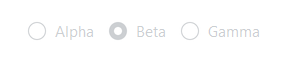
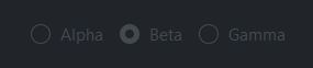
bs.RadioGroup(["Alpha", "Beta", "Gamma"], value="Beta", disabled=True)
Events#
group = bs.RadioGroup(["S", "M", "L"])

# Fires whenever the selection changes
group.on_change(lambda e: print("selected:", group.value))

# As a Stream
group.on_change().listen(lambda e: update_preview(group.value))
Programmatic control#
group = bs.RadioGroup(["A", "B", "C"], value="A")

group.value = "B"             # select programmatically
group.disabled = True         # lock the group
group.title = "Choose one"    # update the label live
Widget sizing#
All widgets accept self-placement kwargs via **kwargs. The parent
container determines which options apply — stack-based parents use stack
kwargs, grid-based parents use grid kwargs. Unrecognised keys are
silently ignored.
Stack#
Used inside VStack, HStack, App, and other stack containers.
|
Fill direction: |
|
Grow to consume extra space in the parent. |
|
Alignment when the widget does not fill the available slot:
|
|
External spacing in pixels. Accepts an integer (equal on all
sides), a 2-tuple |
|
Horizontal external spacing (left and right). Accepts an integer
or a 2-tuple |
|
Vertical external spacing (top and bottom). Accepts an integer
or a 2-tuple |
Grid#
Used inside a Grid container.
|
Zero-based row and column indices. |
|
Number of rows or columns to span. |
|
Alignment and fill within the grid cell. Any combination of
|
|
External spacing in pixels. Accepts an integer, a 2-tuple
|
|
Horizontal external spacing. Accepts an integer or |
|
Vertical external spacing. Accepts an integer or |
API#
The complete reference for RadioGroup lives on the
Widgets API page. At a glance:
A group of mutually exclusive radio buttons. |
Full Example#
 1
 2with bs.App(title="RadioGroup Demo", padding=20, gap=16) as app:
 3
 4    # Basic
 5    bs.Label("Basic", font="heading-sm")
 6    bs.RadioGroup(["Small", "Medium", "Large"], value="Medium")
 7
 8    # Accent colors
 9    bs.Label("Accent Colors", font="heading-sm")
10    with bs.HStack(gap=16):
11        for accent in ("primary", "secondary", "info", "success", "warning", "danger"):
12            bs.RadioGroup(["On"], accent=accent, value="On", title=accent.title())
13
14    # Orientation
15    bs.Label("Orientation", font="heading-sm")
16    with bs.HStack(gap=32):
17        bs.RadioGroup(["A", "B", "C"], value="A", title="Horizontal")
18        bs.RadioGroup(["A", "B", "C"], value="A", title="Vertical", orient="vertical")
19
20    # With title
21    bs.Label("With Title", font="heading-sm")
22    with bs.HStack(gap=32):
23        bs.RadioGroup(
24            [("Small", "s"), ("Medium", "m"), ("Large", "l")], title="Size", value="m",
25        )
26        bs.RadioGroup(
27            [("Light", "light"), ("Dark", "dark"), ("Auto", "auto")],
28            title="Theme", orient="vertical", value="auto",
29        )
30
31    # Disabled
32    bs.Label("Disabled", font="heading-sm")
33    bs.RadioGroup(["Alpha", "Beta", "Gamma"], value="Beta", disabled=True)
34
35app.run()