MenuButton#
A button that opens a dropdown menu when clicked.
Usage#
Basic#
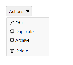
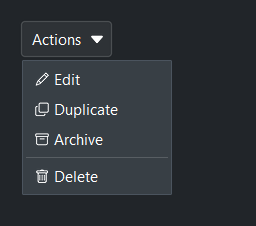
Pass a label= for button text and use add_item() to populate the menu.
Items can have an icon= and an on_click= callback.
mb = bs.MenuButton("Actions")
mb.add_item("Edit",      icon="pencil",  on_click=edit)
mb.add_item("Duplicate", icon="copy",    on_click=duplicate)
mb.add_item("Archive",   icon="archive", on_click=archive)
mb.add_separator()
mb.add_item("Delete",    icon="trash",   on_click=delete)
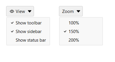
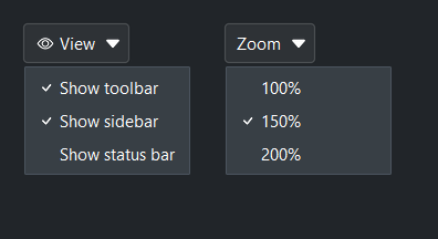
Checkbox and radio items#
add_check_item() adds a toggle item; add_radio_item() adds a mutually
exclusive choice item. Both return the item key that can be used with
update_item() later.
mb = bs.MenuButton("View", icon="eye")
mb.add_check_item("Show toolbar",   value=True)
mb.add_check_item("Show sidebar",   value=True)
mb.add_check_item("Show status bar")

mb2 = bs.MenuButton("Zoom")
mb2.add_radio_item("100%", value=100)
mb2.add_radio_item("150%", value=150, selected=True)
mb2.add_radio_item("200%", value=200)
Global item callback#
Pass on_select= to register a single callback for every item click.
The callback receives a dict with type, text, and value keys.
def on_action(event):
    print("selected:", event["text"], "→", event["value"])

mb = bs.MenuButton("Actions", on_select=on_action)
mb.add_item("Delete", value="delete")
mb.add_item("Archive", value="archive")
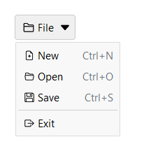
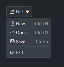
Keyboard shortcuts#
Pass shortcut= to display a key hint on the right side of an item.
This is a display label only — it does not bind a keyboard handler.
Three forms are accepted:
Modifier pattern —
"Mod+S","Mod+Shift+N","F5"— translated to the platform-correct string automatically ("Ctrl+S"on Windows,"⌘S"on macOS). No registration required.Registered key — a name previously passed to
get_shortcuts().register()(e.g."save"). Resolved via the Shortcuts service.Literal string — anything else is shown as-is (e.g.
"Ctrl+S").
Keyboard bindings must be set up separately via the Shortcuts service.
Shortcuts are most useful when MenuButton is used in a menubar context:
mb = bs.MenuButton("File", icon="folder2")
mb.add_item("New",  icon="file-earmark-plus",  shortcut="Mod+N", on_click=new_file)
mb.add_item("Open", icon="folder2-open",       shortcut="Mod+O", on_click=open_file)
mb.add_item("Save", icon="floppy",             shortcut="Mod+S", on_click=save_file)
mb.add_separator()
mb.add_item("Exit", icon="box-arrow-right", on_click=app.quit)
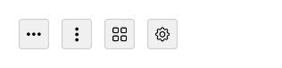
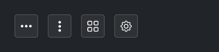
Icon button#
Omit label= to get an icon-only button — icon_only is inferred
automatically when icon= is set and no label is provided. Set
show_arrow=False to hide the chevron.
bs.MenuButton(icon="three-dots",          show_arrow=False)
bs.MenuButton(icon="three-dots-vertical", show_arrow=False)
bs.MenuButton(icon="grid",                show_arrow=False)
bs.MenuButton(icon="gear",                show_arrow=False)
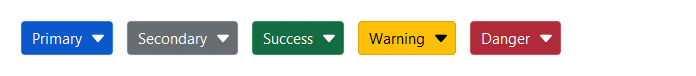
Accent colors#
Use accent= to apply a color intent to the button face.
bs.MenuButton("Primary",   accent="primary")
bs.MenuButton("Secondary", accent="secondary")
bs.MenuButton("Success",   accent="success")
bs.MenuButton("Warning",   accent="warning")
bs.MenuButton("Danger",    accent="danger")
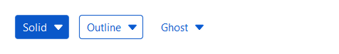
Style variants#
variant= controls the visual weight of the button. 'ghost' (default) blends
into the background; 'outline' adds a border; 'solid' fills the button with
the accent color.
bs.MenuButton("Solid",   accent="primary", variant="solid")
bs.MenuButton("Outline", accent="primary", variant="outline")
bs.MenuButton("Ghost",   accent="primary", variant="ghost")
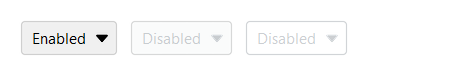
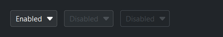
Disabled state#
Set disabled=True to prevent the button from being clicked. The menu
will not open while the button is disabled. The disabled property can
also be toggled after construction.
mb_a = bs.MenuButton("Enabled")
mb_b = bs.MenuButton("Disabled", disabled=True)
mb_c = bs.MenuButton("Disabled", accent="primary", variant="outline", disabled=True)

mb_b.disabled = False   # re-enable later
Dynamic item management#
Items can be added, updated, or removed at any time after construction.
mb = bs.MenuButton("Actions")
key = mb.add_item("Archive")

mb.update_item(key, disabled=True)   # grey out the item
mb.remove_item(key)                  # remove it entirely
Widget sizing#
All widgets accept self-placement kwargs via **kwargs. The parent
container determines which options apply — stack-based parents use stack
kwargs, grid-based parents use grid kwargs. Unrecognised keys are
silently ignored.
Stack#
Used inside VStack, HStack, App, and other stack containers.
|
Fill direction: |
|
Grow to consume extra space in the parent. |
|
Alignment when the widget does not fill the available slot:
|
|
External spacing in pixels. Accepts an integer (equal on all
sides), a 2-tuple |
|
Horizontal external spacing (left and right). Accepts an integer
or a 2-tuple |
|
Vertical external spacing (top and bottom). Accepts an integer
or a 2-tuple |
Grid#
Used inside a Grid container.
|
Zero-based row and column indices. |
|
Number of rows or columns to span. |
|
Alignment and fill within the grid cell. Any combination of
|
|
External spacing in pixels. Accepts an integer, a 2-tuple
|
|
Horizontal external spacing. Accepts an integer or |
|
Vertical external spacing. Accepts an integer or |
See also#
CommandBar —
horizontal strip for grouping buttons and menus.
SelectButton —
button-styled value picker (non-editable dropdown list).
Button —
standalone action button.
API#
The complete reference for MenuButton lives on the
Widgets API page. At a glance:
A button that opens a dropdown menu when clicked. |
Full Example#
 1
 2
 3def _make_file_menu(parent):
 4    mb = bs.MenuButton("File", icon="folder2", parent=parent)
 5    mb.add_item("New",   icon="file-earmark-plus", shortcut="Ctrl+N")
 6    mb.add_item("Open",  icon="folder2-open",       shortcut="Ctrl+O")
 7    mb.add_item("Save",  icon="floppy",             shortcut="Ctrl+S")
 8    mb.add_separator()
 9    mb.add_item("Exit",  icon="box-arrow-right")
10    return mb
11
12
13def _make_view_menu(parent):
14    mb = bs.MenuButton("View", icon="eye", parent=parent)
15    mb.add_check_item("Show toolbar",  value=True)
16    mb.add_check_item("Show sidebar",  value=True)
17    mb.add_check_item("Show status bar")
18    mb.add_separator()
19    mb.add_item("Zoom in",  icon="zoom-in",  shortcut="Ctrl++")
20    mb.add_item("Zoom out", icon="zoom-out", shortcut="Ctrl+-")
21    return mb
22
23
24with bs.App(title="MenuButton Demo", padding=20, gap=16) as app:
25
26    # Basic
27    bs.Label("Basic", font="heading-sm")
28    with bs.HStack(gap=8):
29        _make_file_menu(None)
30        _make_view_menu(None)
31
32    # Accents
33    bs.Label("Accent Colors", font="heading-sm")
34    with bs.HStack(gap=8):
35        for accent in ("primary", "secondary", "success", "warning", "danger"):
36            mb = bs.MenuButton(accent.capitalize(), accent=accent)
37            mb.add_item("Option A")
38            mb.add_item("Option B")
39
40    # Style variants
41    bs.Label("Style Variants", font="heading-sm")
42    with bs.HStack(gap=8):
43        for variant in ("solid", "outline", "ghost"):
44            mb = bs.MenuButton(variant.capitalize(), accent="primary", variant=variant)
45            mb.add_item("Option A")
46            mb.add_item("Option B")
47
48    # With icon
49    bs.Label("With Icon", font="heading-sm")
50    with bs.HStack(gap=8):
51        mb = bs.MenuButton("Share", icon="share")
52        mb.add_item("Copy link",    icon="link-45deg")
53        mb.add_item("Send email",   icon="envelope")
54        mb.add_item("Export PDF",   icon="file-pdf")
55
56        mb2 = bs.MenuButton(icon="gear", show_arrow=False)
57        mb2.add_item("Settings",  icon="sliders")
58        mb2.add_item("Profile",   icon="person")
59        mb2.add_separator()
60        mb2.add_item("Sign out",  icon="box-arrow-right", disabled=True)
61
62    # Icon-only (inferred — no label provided)
63    bs.Label("Icon-Only", font="heading-sm")
64    with bs.HStack(gap=8):
65        for icon in ("three-dots", "three-dots-vertical", "grid"):
66            mb = bs.MenuButton(icon=icon, show_arrow=False)
67            mb.add_item("Option A")
68            mb.add_item("Option B")
69
70    # Density
71    bs.Label("Density", font="heading-sm")
72    with bs.HStack(gap=8, anchor_items="center"):
73        mb_d = bs.MenuButton("Default", density="default")
74        mb_d.add_item("Option A")
75        mb_d.add_item("Option B")
76
77        mb_c = bs.MenuButton("Compact", density="compact")
78        mb_c.add_item("Option A")
79        mb_c.add_item("Option B")
80
81    # Disabled
82    bs.Label("Disabled", font="heading-sm")
83    with bs.HStack(gap=8):
84        mb = bs.MenuButton("Actions", disabled=True)
85        mb.add_item("Option A")
86
87        mb2 = bs.MenuButton("Primary", accent="primary", variant="outline", disabled=True)
88        mb2.add_item("Option A")
89
90app.run()