ListView#
A virtual-scrolling list for efficiently displaying large datasets. Only visible rows are rendered, making it suitable for thousands of records.
Usage#
Item fields#
Each record is a plain dict. The displayed fields are:
Key |
Description |
|---|---|
|
Unique identifier. Auto-generated if absent. |
|
Primary text, rendered in bold. |
|
Secondary text shown below the title. |
|
Icon name displayed on the left. |
|
Short label displayed on the right. |
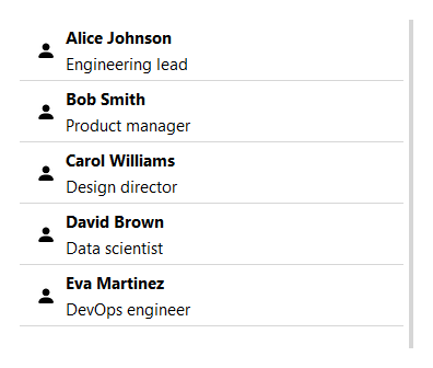
bs.ListView(items=[
    {
        "id":    1,
        "title": "Alice Johnson",
        "text":  "Engineering lead",
        "icon":  "person-fill",
    },
])
Carrying extra data#
The keys above are a view over the record, not the record itself. Extra keys
are still carried through and handed back — selection and the item
events return the full record dict, including the undisplayed fields:
lv = bs.ListView(items=[
    {"id": 1, "title": "Alice", "icon": "person-fill", "tags": ["vip"]},
], selection_mode="multi")
lv.on_item_click(lambda e: print(e["tags"]))   # → ['vip']
The default source is in-memory, so a field can hold any Python object; back the list with a persistent source and the same storage tiers apply. See Carrying extra data for the details.
Data source#
For database or API-backed data, pass a DataSourceProtocol implementation:
from bootstack.data import MemoryDataSource

ds = MemoryDataSource().load(records)
bs.ListView(data_source=ds)
Mutate the source directly — even from a background thread — and the list refreshes itself, no manual reload needed:
lv = bs.ListView(data_source=ds)
ds.insert({"title": "New item"})   # the list updates on its own
See Observing changes for the data source’s change broadcasting.
Mutate records at runtime with the CRUD methods:
lv = bs.ListView(items=[{"id": 1, "title": "Draft"}])
lv.update_item(1, {"title": "Published"})
lv.delete_item(1)
lv.insert_item({"title": "Another"})
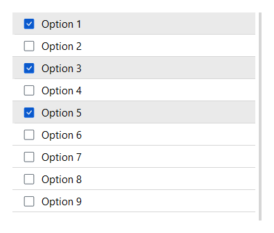
Selection#
selection_mode controls how many items can be selected at once.
show_selection_controls adds checkboxes (multi) or radio buttons (single):
bs.ListView(items=records, selection_mode="single")
bs.ListView(items=records, selection_mode="multi", show_selection_controls=True)
By default a click selects the row. Pass select_on_click=False to decouple
the two — a click then activates the row (open it, say) without changing the
selection, which the user drives separately via the checkboxes:
bs.ListView(items=records, selection_mode="multi",
            show_selection_controls=True, select_on_click=False)
Read the current selection via selection. In "multi" mode it returns a
list of the full record dicts; in "single" mode the selected record dict (or
None). Non-displayed fields ride along in each record:
lv = bs.ListView(items=records, selection_mode="multi")
lv.on_select(lambda e: print(lv.selection))
Set the selection programmatically by record id — select_items replaces
the selection in single mode and adds in multi mode; deselect_items removes:
lv.select_items([3, 7])   # by record id
lv.deselect_items([3])
lv.select_all()           # multi mode only
lv.clear_selection()
Row features#
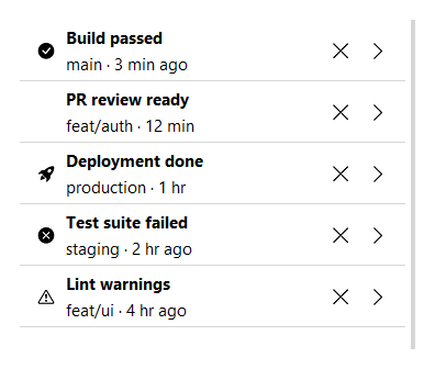
allow_remove adds a × button to each item. show_chevron adds a
right-pointing chevron, useful for navigation lists. allow_reorder
adds a drag handle so the user can reorder items by dragging:
bs.ListView(items=records, allow_remove=True)
bs.ListView(items=records, show_chevron=True)
bs.ListView(items=records, allow_reorder=True)
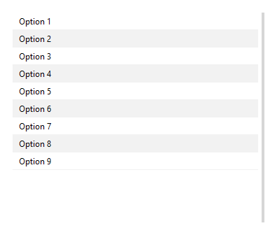
Striped rows and density#
striped=True alternates row backgrounds. density='compact' reduces
row height:
bs.ListView(items=records, striped=True)
bs.ListView(items=records, density="compact")
Scrollbar#
The scrollbar is shown by default. Pass show_scrollbar=False to hide it
(mousewheel scrolling still works):
bs.ListView(items=records, show_scrollbar=False)
Events#
Item events hand the handler the record dict for the affected row directly,
so you read its fields with e["field"] (plus drag/move metadata such as
e["id"] and e["target_index"]).
All on_* methods return a Subscription when called with a handler, or
a Stream when called without one. Call .cancel() on the subscription
to unsubscribe:
lv = bs.ListView(items=records, selection_mode="single")

sub = lv.on_item_click(lambda e: print("clicked:", e["title"]))
lv.on_select(lambda e: print("selected:", lv.selection))
lv.on_item_delete(lambda e: print("deleted:", e["id"]))

sub.cancel()   # unsubscribe
For reorderable lists, listen for drag completion:
lv = bs.ListView(items=records, allow_reorder=True)
lv.on_item_drag_end(lambda e: print("moved to:", e["target_index"]))
Scrolling#
lv.scroll_to_top()
lv.scroll_to_bottom()
Accent#
accent colors the selection highlight and drag indicator:
bs.ListView(items=records, selection_mode="multi", accent="primary")
bs.ListView(items=records, selection_mode="multi", accent="success")
Widget sizing#
All widgets accept self-placement kwargs via **kwargs. The parent
container determines which options apply — stack-based parents use stack
kwargs, grid-based parents use grid kwargs. Unrecognised keys are
silently ignored.
Stack#
Used inside VStack, HStack, App, and other stack containers.
|
Fill direction: |
|
Grow to consume extra space in the parent. |
|
Alignment when the widget does not fill the available slot:
|
|
External spacing in pixels. Accepts an integer (equal on all
sides), a 2-tuple |
|
Horizontal external spacing (left and right). Accepts an integer
or a 2-tuple |
|
Vertical external spacing (top and bottom). Accepts an integer
or a 2-tuple |
Grid#
Used inside a Grid container.
|
Zero-based row and column indices. |
|
Number of rows or columns to span. |
|
Alignment and fill within the grid cell. Any combination of
|
|
External spacing in pixels. Accepts an integer, a 2-tuple
|
|
Horizontal external spacing. Accepts an integer or |
|
Vertical external spacing. Accepts an integer or |
API#
The complete reference for ListView lives on the
Widgets API page. At a glance:
A virtual-scrolling list for efficiently displaying large datasets. |
Full Example#
 1
 2TEAM = [
 3    {"id": 1, "title": "Alice Johnson",  "text": "Engineering lead",  "icon": "person-fill"},
 4    {"id": 2, "title": "Bob Smith",      "text": "Product manager",   "icon": "person-fill"},
 5    {"id": 3, "title": "Carol Williams", "text": "Design director",   "icon": "person-fill"},
 6    {"id": 4, "title": "David Brown",    "text": "Data scientist",    "icon": "person-fill"},
 7    {"id": 5, "title": "Eva Martinez",   "text": "DevOps engineer",   "icon": "person-fill"},
 8    {"id": 6, "title": "Frank Lee",      "text": "QA engineer",       "icon": "person-fill"},
 9    {"id": 7, "title": "Grace Kim",      "text": "Tech lead",         "icon": "person-fill"},
10    {"id": 8, "title": "Henry Patel",    "text": "Backend engineer",  "icon": "person-fill"},
11]
12
13ALERTS = [
14    {"id": 1, "title": "Build passed",     "text": "main · 3 min ago",   "icon": "check-circle-fill"},
15    {"id": 2, "title": "PR review ready",  "text": "feat/auth · 12 min", "icon": "git-pull-request"},
16    {"id": 3, "title": "Deployment done",  "text": "production · 1 hr",  "icon": "rocket-takeoff-fill"},
17    {"id": 4, "title": "Test suite failed","text": "staging · 2 hr ago", "icon": "x-circle-fill"},
18    {"id": 5, "title": "Coverage drop",    "text": "dev · 3 hr ago",     "icon": "exclamation-circle"},
19    {"id": 6, "title": "Lint warnings",    "text": "feat/ui · 4 hr ago", "icon": "exclamation-triangle"},
20]
21
22SIMPLE = [
23    {"id": i, "text": f"Option {i}"}
24    for i in range(1, 27)
25]
26
27with bs.App(title="ListView Demo", padding=20, gap=16, minsize=(800, 700)) as app:
28    with bs.Grid(columns=2, gap=20, fill="both", expand=True, sticky_items="nsew"):
29
30        # Column 1: Item fields
31        with bs.VStack(gap=6):
32            bs.Label("Item Fields", font="heading-sm")
33            bs.ListView(items=TEAM, fill="both", expand=True)
34
35        # Column 2: Multi-selection with controls
36        with bs.VStack(gap=6):
37            bs.Label("Multi Selection", font="heading-sm")
38            sel_list = bs.ListView(
39                items=SIMPLE,
40                selection_mode="multi",
41                show_selection_controls=True,
42                accent="primary",
43                fill="both", expand=True,
44            )
45
46        # Column 3: Chevron + remove button
47        with bs.VStack(gap=6):
48            bs.Label("Chevron + Remove", font="heading-sm")
49            bs.ListView(items=ALERTS, show_chevron=True, allow_remove=True, fill="both", expand=True)
50
51        # Column 4: Compact + striped
52        with bs.VStack(gap=6):
53            bs.Label("Compact + Striped", font="heading-sm")
54            bs.ListView(items=SIMPLE, striped=True, density="compact", fill="both", expand=True)
55
56# Pre-select after window is shown so TTK renders the selected state correctly
57for item_id in (1, 3, 5):
58    sel_list.data_source.select(item_id)
59sel_list.reload()
60
61app.run()