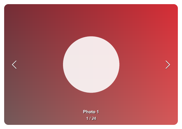
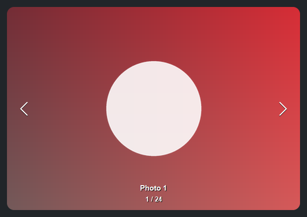
Carousel#
Shows one image slide at a time, with prev/next navigation. Carousel is the
focus-on-one counterpart to Gallery — it steps through a
collection of image records one slide at a time, with overlaid chevrons, a slide
indicator, an optional caption, transitions, and autoplay.
It pairs naturally with Gallery.on_item_activate to open a full-size pop-up
viewer: a Carousel over the same items, starting at the activated slide.
Usage#
Slides#
Each record names the image through image_field (an Image, a file path, or a PIL image) and, optionally, a
caption through caption_field:
items = [
    {"id": 1, "image": "beach.jpg",  "name": "Beach"},
    {"id": 2, "image": "sunset.jpg", "name": "Sunset"},
]

bs.Carousel(items=items, caption_field="name")
fit controls how each image scales into the stage — the same modes as
Picture, defaulting to 'contain' so the whole image shows.
corner_radius rounds the slide.
Transitions#
transition animates the change between slides — 'slide' (default), 'fade',
or 'none':
bs.Carousel(items=items, transition="slide")   # default
bs.Carousel(items=items, transition="fade")
Indicator and arrows#
indicator selects the slide indicator — 'dots' (default), 'count', or
'none'. Set show_arrows=False to hide the chevrons:
bs.Carousel(items=items, indicator="count")
bs.Carousel(items=items, show_arrows=False, indicator="dots")
With more than eight slides, 'dots' automatically switches to a
current / total counter — a long row of dots is neither readable nor
clickable:
Autoplay#
autoplay=True advances the slides on a timer; interval sets the dwell time
per slide and loop wraps past the ends. Control playback with play and
pause:
carousel = bs.Carousel(items=items, autoplay=True, interval=3000)
carousel.pause()
carousel.play()
Reacting to changes#
on_change fires when the active slide changes; on_item_click fires when the
current slide is clicked — the hook for closing a pop-up viewer or opening a
detail view:
carousel.on_change(lambda r: print("now showing", r["name"]))
carousel.on_item_click(lambda r: open_detail(r))
Full-size viewer from a Gallery#
A common pattern is to let a thumbnail Gallery open a larger
view: double-clicking a thumbnail pops up a window with a full-size carousel of
the same photos, starting on the one you picked. There is no special widget for
this — you compose a Gallery and a Carousel. Because both read the same
records, the only work is finding the activated record’s slide position:
photos = [
    {"id": 1, "image": "beach.jpg",  "name": "Beach"},
    {"id": 2, "image": "sunset.jpg", "name": "Sunset"},
    # ...
]

def open_viewer(record):
    # the record's id is its identity, not its position — find the index
    start = next(i for i, p in enumerate(photos) if p["id"] == record["id"])
    with bs.Window(title=record["name"], size=(900, 650),
                   modal=True, center_on_parent=True) as win:
        viewer = bs.Carousel(items=photos, index=start, fill="both", expand=True)
        viewer.on_item_click(lambda r: win.close())   # click the photo to close
    win.show()

gallery = bs.Gallery(items=photos, selection_mode="single")
gallery.on_item_activate(open_viewer)
Widget sizing#
All widgets accept self-placement kwargs via **kwargs. The parent
container determines which options apply — stack-based parents use stack
kwargs, grid-based parents use grid kwargs. Unrecognised keys are
silently ignored.
Stack#
Used inside VStack, HStack, App, and other stack containers.
|
Fill direction: |
|
Grow to consume extra space in the parent. |
|
Alignment when the widget does not fill the available slot:
|
|
External spacing in pixels. Accepts an integer (equal on all
sides), a 2-tuple |
|
Horizontal external spacing (left and right). Accepts an integer
or a 2-tuple |
|
Vertical external spacing (top and bottom). Accepts an integer
or a 2-tuple |
Grid#
Used inside a Grid container.
|
Zero-based row and column indices. |
|
Number of rows or columns to span. |
|
Alignment and fill within the grid cell. Any combination of
|
|
External spacing in pixels. Accepts an integer, a 2-tuple
|
|
Horizontal external spacing. Accepts an integer or |
|
Vertical external spacing. Accepts an integer or |
See also#
API#
The complete reference for Carousel lives on the
Widgets API page. At a glance:
Shows one image slide at a time, with prev/next navigation. |
Full Example#
 1
 2_DIR = tempfile.gettempdir()
 3_PALETTE = [
 4    (220, 90, 90), (90, 170, 110), (90, 130, 220), (210, 160, 70), (160, 110, 200),
 5]
 6
 7
 8def _slide(i: int) -> str:
 9    path = os.path.join(_DIR, f"bs_carousel_{i}.png")
10    w, h = 480, 300
11    base = _PALETTE[i % len(_PALETTE)]
12    img = PILImage.new("RGB", (w, h))
13    px = img.load()
14    for y in range(h):
15        for x in range(w):
16            px[x, y] = (
17                int(base[0] * (0.5 + 0.5 * x / w)),
18                int(base[1] * (0.5 + 0.5 * y / h)),
19                int(base[2] * (0.6 + 0.4 * y / h)),
20            )
21    ss = 4
22    layer = PILImage.new("RGBA", (w * ss, h * ss), (0, 0, 0, 0))
23    r = 70 * ss
24    cx, cy = w * ss // 2, h * ss // 2
25    ImageDraw.Draw(layer).ellipse([cx - r, cy - r, cx + r, cy + r], fill=(255, 255, 255, 225))
26    layer = layer.resize((w, h), Resampling.LANCZOS)
27    img = img.convert("RGBA")
28    img.alpha_composite(layer)
29    img.convert("RGB").save(path)
30    return path
31
32
33items = [{"id": i, "image": _slide(i), "name": f"Slide {i + 1}"} for i in range(5)]
34
35with bs.App(title="Carousel", size=(620, 460), padding=16, gap=8) as app:
36    bs.Label("Image carousel — chevrons, arrow keys, or dots", font="heading-md")
37    carousel = bs.Carousel(
38        items=items,
39        image_field="image",
40        caption_field="name",
41        fit="cover",
42        transition="slide",
43        indicator="dots",
44        corner_radius=14,
45        fill="both",
46        expand=True,
47    )
48    carousel.on_change(lambda r: print("slide:", r["name"]))
49    carousel.on_item_click(lambda r: print("clicked:", r["name"]))
50
51app.run()