ToggleGroup#
A group of toggle buttons — single-select or multi-select.
Usage#
Single select#
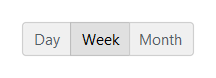
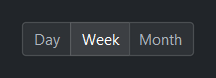
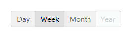
In 'single' mode (default) exactly one button is active at a time.
bs.ToggleGroup(["Day", "Week", "Month"], value="Week")
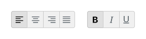
Multi select#
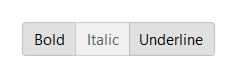
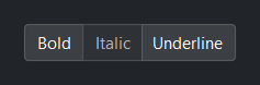
In 'multi' mode any combination of buttons can be active. Pass the
initial selection as a set.
bs.ToggleGroup(["Bold", "Italic", "Underline"],
               mode="multi", value={"Bold", "Underline"})
Decoupled labels and the selected text#
Options accept (text, value) tuples or {"text": ..., "value": ...} dicts,
so a label can differ from its value. value is value-space; text mirrors
it as the selected label(s).
view = bs.ToggleGroup([("Grid view", "grid"), ("List view", "list")], value="grid")
view.value      # -> "grid"        (single mode: the value)
view.text       # -> "Grid view"   (single mode: the label)
view.selection  # -> {"text": "Grid view", "value": "grid"}   (single: one record)

tools = bs.ToggleGroup([("Bold", "b"), ("Italic", "i")], mode="multi", value={"b"})
tools.value      # -> {"b"}          (multi mode: a set of values)
tools.text       # -> {"Bold"}       (multi mode: a set of labels)
tools.selection  # -> [{"text": "Bold", "value": "b"}]   (multi: list of records)
Options are a data bag — alongside the recognized keys (text, value,
and the per-option icon/disabled), any other key you add rides along and is
returned by .selection (see Select for details). A per-option icon
renders beside that button’s label, and disabled greys out a single option so
it can’t be chosen — distinct from the group-level disabled= that locks every
button.
Icon-only options#
Give an option an icon and no text and it renders as an icon-only button —
the widget infers this automatically, so a compact toolbar group needs no
icon_only flag.
bs.ToggleGroup(options=[
    {"icon": "text-left",   "value": "left"},
    {"icon": "text-center", "value": "center"},
    {"icon": "text-right",  "value": "right"},
    {"icon": "justify",     "value": "justify"},
], value="left")
Disabling a single option#
Mark one option disabled to grey it out and make it non-selectable while the
rest of the group stays interactive — distinct from the group-level disabled=
that locks every button.
bs.ToggleGroup(options=[
    ("Day", "day"), ("Week", "week"), ("Month", "month"),
    {"text": "Year", "value": "year", "disabled": True},
], value="week")
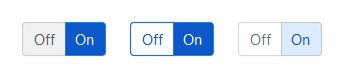
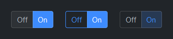
Style variants#
Use variant= to control visual weight.
bs.ToggleGroup(["Off", "On"], accent="primary", variant="solid",   value="On")  # default
bs.ToggleGroup(["Off", "On"], accent="primary", variant="outline", value="On")
bs.ToggleGroup(["Off", "On"], accent="primary", variant="ghost",   value="On")
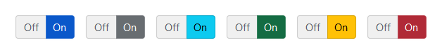
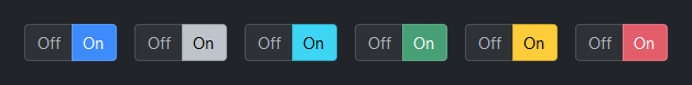
Accent colors#
bs.ToggleGroup(["Off", "On"], accent="primary",   value="On")
bs.ToggleGroup(["Off", "On"], accent="secondary", value="On")
bs.ToggleGroup(["Off", "On"], accent="info",      value="On")
bs.ToggleGroup(["Off", "On"], accent="success",   value="On")
bs.ToggleGroup(["Off", "On"], accent="warning",   value="On")
bs.ToggleGroup(["Off", "On"], accent="danger",    value="On")
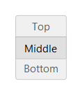
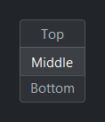
Orientation#
bs.ToggleGroup(["Top", "Middle", "Bottom"], orient="horizontal")           # default
bs.ToggleGroup(["Top", "Middle", "Bottom"], orient="vertical", value="Middle")
Reactive binding#
In single mode the signal holds a str; in multi mode it holds a
set[str]. When signal= is provided, value= is ignored —
seed the Signal directly.
view = bs.Signal("grid")
bs.ToggleGroup(["Grid", "List"], signal=view)
view.subscribe(lambda v: set_layout(v))

# Multi mode
fmt = bs.Signal({"Bold"})
bs.ToggleGroup(["Bold", "Italic", "Underline"], mode="multi", signal=fmt)
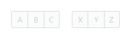
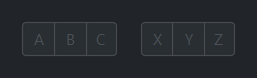
Disabled#
bs.ToggleGroup(["A", "B", "C"], value="B", disabled=True)
bs.ToggleGroup(["X", "Y", "Z"], mode="multi", value={"X", "Z"}, disabled=True)
Events#
group = bs.ToggleGroup(["Grid", "List"], value="Grid")

group.on_change(lambda e: print("selected:", group.value))

# As a Stream
group.on_change().listen(lambda e: refresh(group.value))
Programmatic control#
group = bs.ToggleGroup(["A", "B", "C"], value="A")

group.value = "B"           # single mode — set by value
group.value = {"A", "C"}    # multi mode — set by set
group.disabled = True       # lock the group

group.add("D")              # add an option at runtime
group.remove("B")           # remove one
group.configure_item("C", label="Charlie", disabled=True)  # relabel / disable one

"D" in group                # membership test, by value
len(group)                  # number of options
Widget sizing#
All widgets accept self-placement kwargs via **kwargs. The parent
container determines which options apply — stack-based parents use stack
kwargs, grid-based parents use grid kwargs. Unrecognised keys are
silently ignored.
Stack#
Used inside VStack, HStack, App, and other stack containers.
|
Fill direction: |
|
Grow to consume extra space in the parent. |
|
Alignment when the widget does not fill the available slot:
|
|
External spacing in pixels. Accepts an integer (equal on all
sides), a 2-tuple |
|
Horizontal external spacing (left and right). Accepts an integer
or a 2-tuple |
|
Vertical external spacing (top and bottom). Accepts an integer
or a 2-tuple |
Grid#
Used inside a Grid container.
|
Zero-based row and column indices. |
|
Number of rows or columns to span. |
|
Alignment and fill within the grid cell. Any combination of
|
|
External spacing in pixels. Accepts an integer, a 2-tuple
|
|
Horizontal external spacing. Accepts an integer or |
|
Vertical external spacing. Accepts an integer or |
API#
The complete reference for ToggleGroup lives on the
Widgets API page. At a glance:
A group of toggle buttons — single-select or multi-select. |
Full Example#
 1
 2with bs.App(title="ToggleGroup Demo", padding=20, gap=16) as app:
 3
 4    # Single mode
 5    bs.Label("Single Select", font="heading-sm")
 6    bs.ToggleGroup(["Day", "Week", "Month"], value="Week")
 7
 8    # Multi mode
 9    bs.Label("Multi Select", font="heading-sm")
10    bs.ToggleGroup(["Bold", "Italic", "Underline"], mode="multi", value={"Bold", "Underline"})
11
12    # Style variants — inactive + active per variant
13    bs.Label("Style Variants", font="heading-sm")
14    with bs.HStack(gap=16):
15        for variant in ("solid", "outline", "ghost"):
16            with bs.VStack(gap=4):
17                bs.ToggleGroup(["Off", "On"], accent="primary", variant=variant, value="On")
18
19    # Accent colors
20    bs.Label("Accent Colors", font="heading-sm")
21    with bs.HStack(gap=8):
22        tg = bs.ToggleGroup(value="primary")
23        for accent in ("primary", "secondary", "info", "success", "warning", "danger"):
24            tg.add(accent, accent=accent)
25
26    # Vertical orientation
27    bs.Label("Vertical", font="heading-sm")
28    bs.ToggleGroup(["Top", "Middle", "Bottom"], orient="vertical", value="Middle")
29
30    # Disabled
31    bs.Label("Disabled", font="heading-sm")
32    with bs.HStack(gap=16):
33        bs.ToggleGroup(["A", "B", "C"], value="B", disabled=True)
34        bs.ToggleGroup(["X", "Y", "Z"], mode="multi", value={"X", "Z"}, disabled=True)
35
36app.run()