Slider#
A single-handle track for selecting a numeric value within a range.
Usage#
Basic#
bs.Slider()
bs.Slider(50, min_value=0, max_value=100)
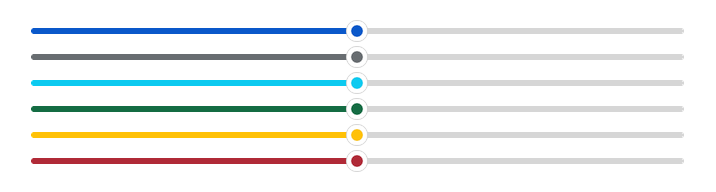
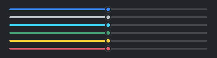
Accent colors#
bs.Slider(50, accent="primary")
bs.Slider(50, accent="secondary")
bs.Slider(50, accent="info")
bs.Slider(50, accent="success")
bs.Slider(50, accent="warning")
bs.Slider(50, accent="danger")
Value badge#
Set show_value=True to display a floating badge with the current value
above the handle.
bs.Slider(50, show_value=True)
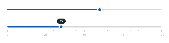
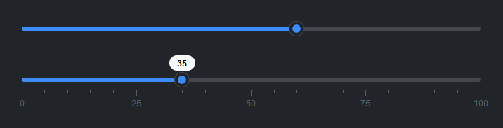
Min / max labels#
Set show_minmax=True to display the minimum and maximum values at the
track ends.
bs.Slider(50, show_minmax=True)
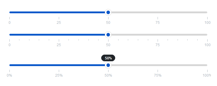
Tick marks#
Use tick_step= to add major tick marks. minor_ticks= adds
subdivisions between them. tick_labels=False hides the numeric labels.
tick_format= controls how tick and badge labels are formatted.
bs.Slider(50, tick_step=25)
bs.Slider(50, tick_step=25, minor_ticks=4)
bs.Slider(0.5, min_value=0, max_value=1, tick_step=0.25, tick_format="{:.0%}", show_value=True)
Reactive binding#
Bind a Signal[float] with signal=. The slider and signal stay in sync.
volume = bs.Signal(50.0)
bs.Slider(signal=volume)
volume.subscribe(lambda v: update_volume(v))
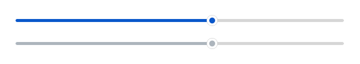
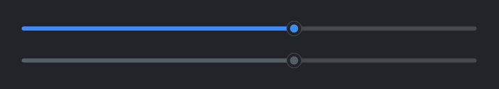
Disabled#
bs.Slider(60, disabled=True)
Widget sizing#
All widgets accept self-placement kwargs via **kwargs. The parent
container determines which options apply — stack-based parents use stack
kwargs, grid-based parents use grid kwargs. Unrecognised keys are
silently ignored.
Stack#
Used inside VStack, HStack, App, and other stack containers.
|
Fill direction: |
|
Grow to consume extra space in the parent. |
|
Alignment when the widget does not fill the available slot:
|
|
External spacing in pixels. Accepts an integer (equal on all
sides), a 2-tuple |
|
Horizontal external spacing (left and right). Accepts an integer
or a 2-tuple |
|
Vertical external spacing (top and bottom). Accepts an integer
or a 2-tuple |
Grid#
Used inside a Grid container.
|
Zero-based row and column indices. |
|
Number of rows or columns to span. |
|
Alignment and fill within the grid cell. Any combination of
|
|
External spacing in pixels. Accepts an integer, a 2-tuple
|
|
Horizontal external spacing. Accepts an integer or |
|
Vertical external spacing. Accepts an integer or |
See also#
RangeSlider — two-handle range selection
NumberField — numeric input with typed entry
API#
The complete reference for Slider lives on the
Widgets API page. At a glance:
A single-handle slider for selecting a numeric value within a range. |
Full Example#
 1
 2with bs.App(title="Slider Demo", padding=20, gap=16) as app:
 3
 4    # Basic
 5    bs.Label("Basic", font="heading-sm")
 6    bs.Slider(fill="x")
 7
 8    # Accent colors
 9    bs.Label("Accent Colors", font="heading-sm")
10    with bs.VStack(gap=6, fill="x"):
11        for accent in ("primary", "secondary", "info", "success", "warning", "danger"):
12            bs.Slider(50, accent=accent, fill="x")
13
14    # Value badge
15    bs.Label("Value Badge", font="heading-sm")
16    bs.Slider(50, show_value=True, fill="x")
17
18    # Min / max labels
19    bs.Label("Min / Max Labels", font="heading-sm")
20    bs.Slider(50, show_minmax=True, fill="x")
21
22    # Tick marks
23    bs.Label("Tick Marks", font="heading-sm")
24    bs.Slider(50, tick_step=25, fill="x")
25    bs.Slider(50, tick_step=25, minor_ticks=4, fill="x")
26    bs.Slider(50, tick_step=25, show_value=True, show_minmax=True, fill="x")
27
28    # Custom tick format
29    bs.Label("Custom Tick Format", font="heading-sm")
30    bs.Slider(
31        0.5,
32        min_value=0.0,
33        max_value=1.0,
34        tick_step=0.25,
35        tick_format="{:.0%}",
36        show_value=True,
37        fill="x",
38    )
39
40    # Disabled
41    bs.Label("Disabled", font="heading-sm")
42    bs.Slider(30, disabled=True, fill="x")
43
44app.run()