Divider#
A thin themed line used to visually divide sections of a layout. Renders
horizontally by default and stretches to fill the available space. (For
invisible flexible space between items, use Spacer
instead.)
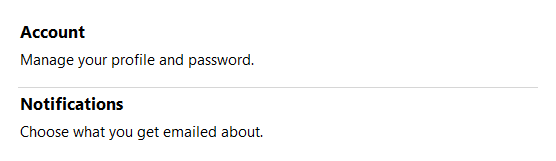
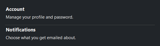
Usage#
A divider is a one-line visual separator — drop it between items in a
Row or Column and it stretches across the layout.
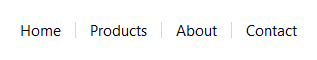
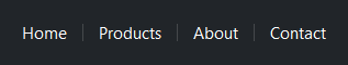
Set orient= for a vertical rule between side-by-side content.
Orientation#
The default orientation is 'horizontal'. Pass orient='vertical' for a
vertical divider; use length= to constrain its height.
# Vertical divider between breadcrumb items
with bs.Row(gap=12, vertical_items="center"):
    bs.Label("Home")
    bs.Divider(orient="vertical", length=16)
    bs.Label("Products")
    bs.Divider(orient="vertical", length=16)
    bs.Label("About")
    bs.Divider(orient="vertical", length=16)
    bs.Label("Contact")
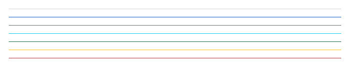
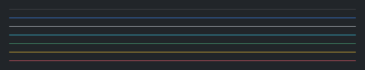
Accent colors#
By default the line color is derived from the active surface. Pass an
accent= token to apply a semantic color.
bs.Divider(accent="default")
bs.Divider(accent="primary")
bs.Divider(accent="secondary")
bs.Divider(accent="info")
bs.Divider(accent="success")
bs.Divider(accent="warning")
bs.Divider(accent="danger")
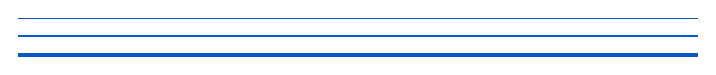
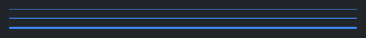
Thickness#
The default thickness is 1 px (theme-controlled). Use thickness= for a
heavier rule.
bs.Divider(accent="primary", thickness=1)
bs.Divider(accent="primary", thickness=2)
bs.Divider(accent="primary", thickness=4)
Widget sizing#
All widgets accept self-placement kwargs via **kwargs. The parent
container determines which options apply — Column / Row parents use
the layout kwargs below, grid-based parents use grid kwargs.
Column (vertical layout)
Used inside a Column, App, or any other container with a column layout.
Children are arranged top-to-bottom, so horizontal aligns each child across
the width and grow shares the vertical space. (vertical does not apply —
the order of the children sets their top-to-bottom position.)
|
Cross-axis placement of the widget: |
|
Claim and fill a share of the leftover vertical space (the layout
direction). |
|
External spacing in pixels. Accepts an integer (equal on all
sides), a 2-tuple |
|
Horizontal external spacing (left and right). Accepts an integer
or a 2-tuple |
|
Vertical external spacing (top and bottom). Accepts an integer
or a 2-tuple |
Row (horizontal layout)
Used inside a Row or any other container with a row layout. Children are
arranged left-to-right, so vertical aligns each child across the height and
grow shares the horizontal space. (horizontal does not apply — the order
of the children sets their left-to-right position.)
|
Cross-axis placement of the widget: |
|
Claim and fill a share of the leftover horizontal space (the layout
direction). |
|
External spacing in pixels. Accepts an integer (equal on all
sides), a 2-tuple |
|
Horizontal external spacing (left and right). Accepts an integer
or a 2-tuple |
|
Vertical external spacing (top and bottom). Accepts an integer
or a 2-tuple |
Grid
Used inside a Grid container.
|
Zero-based row and column indices. |
|
Number of rows or columns to span. |
|
Horizontal placement within the grid cell: |
|
Vertical placement within the grid cell: |
|
External spacing in pixels. Accepts an integer, a 2-tuple
|
|
Horizontal external spacing. Accepts an integer or |
|
Vertical external spacing. Accepts an integer or |
See also#
Spacer — invisible flexible or
fixed space between items (a Divider draws a visible line; a Spacer
opens a gap).
API#
The complete reference for Divider lives on the
Widgets API page. At a glance:
A horizontal or vertical dividing line. |
Full Example#
 1
 2with bs.App(title="Divider Demo", size=(680, 520), padding=20, gap=24, horizontal_items="stretch") as app:
 3
 4    with bs.Column(gap=10, horizontal_items="stretch"):
 5        bs.Label("Accent Colors", font="heading-sm")
 6        for accent in ("default", "primary", "secondary", "info", "success", "warning", "danger"):
 7            bs.Divider(accent=accent)
 8
 9    with bs.Column(gap=10, horizontal_items="stretch"):
10        bs.Label("Thickness", font="heading-sm")
11        for t in (1, 2, 4):
12            bs.Divider(thickness=t, accent="primary")
13
14    with bs.Column(gap=8, horizontal_items="stretch"):
15        bs.Label("Vertical Orientation", font="heading-sm")
16        with bs.Row(gap=12, vertical_items="center"):
17            bs.Label("Home")
18            bs.Divider(orient="vertical", length=16)
19            bs.Label("Products")
20            bs.Divider(orient="vertical", length=16)
21            bs.Label("Contact")
22
23    # Full-width in-context examples
24    with bs.Column(horizontal_items="stretch"):
25        bs.Label("In Context", font="heading-sm")
26        with bs.Row(gap=32):
27            with bs.Column(gap=6, horizontal_items="stretch"):
28                bs.Label("Profile", font="heading-md")
29                bs.Divider()
30                bs.Label("Name: Ada Lovelace")
31                bs.Label("Role: Engineer")
32
33            with bs.Column(gap=6, horizontal_items="stretch"):
34                bs.Label("Danger Zone", font="heading-md")
35                bs.Divider(accent="danger", thickness=2)
36                bs.Label("Irreversible action below", accent="danger")
37
38app.run()