Grid#
A container that arranges children in rows and columns. Children are
auto-placed left-to-right, top-to-bottom by default. Column and row sizes
are defined with columns= and rows=; omitting them lets the grid
size itself to fit its content.
Usage#
Column definitions#
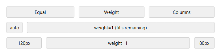
columns= accepts an integer or a list of per-column sizes:
Integer (shorthand) — creates that many equal-weight columns.
columns=3is equivalent tocolumns=[1, 1, 1].Integer weight in a list — relative share of available space (e.g.
1,2). Weight0is equivalent to'auto'— prefer'auto'for clarity.'auto'— sized to the widest child in that column; does not grow.'Npx'— fixed pixel width (e.g.'120px').
# Three equal columns — integer shorthand
bs.Grid(columns=3)

# Same, written explicitly
bs.Grid(columns=[1, 1, 1])

# Label column sizes to content; field column takes the rest
bs.Grid(columns=["auto", 1])

# Fixed sidebar, flexible content, fixed panel
bs.Grid(columns=["120px", 1, "80px"])
Row definitions#
rows= follows the same format as columns=. When omitted, rows are
added automatically as children are placed.
Integer (shorthand) — creates that many equal-weight rows.
rows=3is equivalent torows=[1, 1, 1].Integer weight in a list — relative share of available vertical space.
'auto'— sized to the tallest child in that row; does not grow.'Npx'— fixed pixel height (e.g.'80px').
# Three equal rows — integer shorthand
bs.Grid(rows=3)

# Mixed: two auto-height rows, one that fills remaining space
bs.Grid(rows=["auto", 1, "auto"])
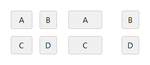
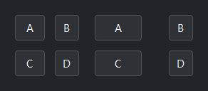
Gap#
gap= sets spacing between cells. An integer applies to both axes;
a 2-tuple (col_gap, row_gap) sets them independently.
bs.Grid(columns=[1, 1], gap=8)            # 8 px between all cells
bs.Grid(columns=[1, 1], gap=(32, 8))      # 32 px between columns, 8 px between rows
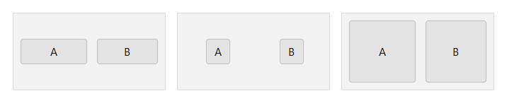
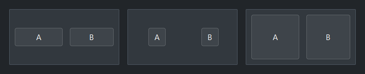
Child alignment — sticky_items#
sticky_items= controls how children fill their cell. Pass any
combination of 'n', 's', 'e', 'w':
'ew'— stretch horizontally, natural height (most common for forms)'nsew'— stretch to fill the entire cell''— center in cell at natural size
Individual children can override the default with their own sticky=.
# stretch horizontally — natural height
with bs.Grid(columns=[1, 1], gap=8, sticky_items="ew", height=80):
    bs.Button("A"); bs.Button("B")

# center in cell at natural size
with bs.Grid(columns=[1, 1], gap=8, sticky_items="", height=80):
    bs.Button("A"); bs.Button("B")

# fill the entire cell
with bs.Grid(columns=[1, 1], gap=8, sticky_items="nsew", height=80):
    bs.Button("A"); bs.Button("B")
Auto-flow#
auto_flow= controls the direction children are placed when auto-flowing
across the grid. Default is 'row' (left-to-right, then next row).
Use 'column' to fill down first, then move to the next column.
The '-dense' variants back-fill gaps left by larger spanning children.
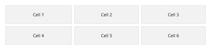
bs.Grid(columns=[1, 1, 1], auto_flow="row")     # 1 2 3 / 4 5 6
bs.Grid(rows=[1, 1, 1], auto_flow="column")      # fills columns first
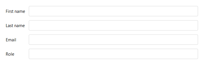
In context#
The most common Grid pattern is a two-column form layout with an 'auto'
label column and a 1-weight field column:
with bs.Grid(columns=["auto", 1], gap=8, sticky_items="ew", fill="x"):
    bs.Label("First name")
    bs.TextField()
    bs.Label("Last name")
    bs.TextField()
    bs.Label("Email")
    bs.TextField()
    bs.Label("Role")
    bs.TextField()
Background#
surface= sets the container background. It accepts a surface token
('content', 'card', 'chrome', 'overlay') or any accent token
('primary', 'success', etc.) with optional modifiers:
with bs.Grid(columns=2, surface="card", padding=12, gap=8):
    bs.Label("Sits on card surface")

with bs.Grid(columns=2, surface="primary[subtle]", padding=12, gap=8):
    bs.Label("Accent-tinted background")
Widget sizing#
All widgets accept self-placement kwargs via **kwargs. The parent
container determines which options apply — stack-based parents use stack
kwargs, grid-based parents use grid kwargs. Unrecognised keys are
silently ignored.
Stack#
Used inside VStack, HStack, App, and other stack containers.
|
Fill direction: |
|
Grow to consume extra space in the parent. |
|
Alignment when the widget does not fill the available slot:
|
|
External spacing in pixels. Accepts an integer (equal on all
sides), a 2-tuple |
|
Horizontal external spacing (left and right). Accepts an integer
or a 2-tuple |
|
Vertical external spacing (top and bottom). Accepts an integer
or a 2-tuple |
Grid#
Used inside a Grid container.
|
Zero-based row and column indices. |
|
Number of rows or columns to span. |
|
Alignment and fill within the grid cell. Any combination of
|
|
External spacing in pixels. Accepts an integer, a 2-tuple
|
|
Horizontal external spacing. Accepts an integer or |
|
Vertical external spacing. Accepts an integer or |
See also#
Card and
GroupBox both support
layout='grid' to arrange their children with the same column/row
options.
API#
The complete reference for Grid lives on the
Widgets API page. At a glance:
A container that arranges children in rows and columns. |
Full Example#
 1
 2with bs.App(title="Grid Demo", size=(720, 820), padding=20, gap=16) as app:
 3
 4    # Column definitions
 5    bs.Label("Column definitions", font="heading-sm")
 6    with bs.Grid(columns=[1, 1, 1], gap=8, show_border=True, padding=8,
 7                 sticky_items="ew", fill="x"):
 8        for label in ("Equal", "weight", "columns"):
 9            bs.Button(label)
10
11    with bs.Grid(columns=["auto", 1, "auto"], gap=8, show_border=True, padding=8,
12                 sticky_items="ew", fill="x"):
13        bs.Button("auto")
14        bs.Button("weight=1  (fills remaining)")
15        bs.Button("auto")
16
17    with bs.Grid(columns=["120px", 1, "80px"], gap=8, show_border=True, padding=8,
18                 sticky_items="ew", fill="x"):
19        bs.Button("120px")
20        bs.Button("weight=1")
21        bs.Button("80px")
22
23    # Gap
24    bs.Label("Gap", font="heading-sm")
25    with bs.Grid(columns=[1, 1], gap=(32, 16), fill="x", sticky_items="new"):
26        with bs.VStack(gap=4):
27            bs.Label("gap=8 (uniform)", font="caption")
28            with bs.Grid(columns=[1, 1], gap=8, show_border=True, padding=8,
29                         sticky_items="ew", fill="x"):
30                for label in ("A", "B", "C", "D"):
31                    bs.Button(label)
32        with bs.VStack(gap=4):
33            bs.Label("gap=(32, 8) (col, row)", font="caption")
34            with bs.Grid(columns=[1, 1], gap=(32, 8), show_border=True, padding=8,
35                         sticky_items="ew", fill="x"):
36                for label in ("A", "B", "C", "D"):
37                    bs.Button(label)
38
39    # sticky_items
40    bs.Label("sticky_items", font="heading-sm")
41    with bs.Grid(columns=[1, 1, 1], gap=(16, 0), fill="x", sticky_items="new"):
42        with bs.VStack(gap=4):
43            bs.Label("sticky='ew'", font="caption")
44            with bs.Grid(columns=[1, 1], gap=8, show_border=True, padding=8,
45                         sticky_items="ew", height=80, fill="x"):
46                bs.Button("A")
47                bs.Button("B")
48        with bs.VStack(gap=4):
49            bs.Label("sticky='' (centered)", font="caption")
50            with bs.Grid(columns=[1, 1], gap=8, show_border=True, padding=8,
51                         sticky_items="", height=80, fill="x"):
52                bs.Button("A")
53                bs.Button("B")
54        with bs.VStack(gap=4):
55            bs.Label("sticky='nsew'", font="caption")
56            with bs.Grid(columns=[1, 1], gap=8, show_border=True, padding=8,
57                         sticky_items="nsew", height=80, fill="x"):
58                bs.Button("A")
59                bs.Button("B")
60
61    # In context — key/value form layout
62    bs.Label("In context", font="heading-sm")
63    with bs.Grid(columns=["auto", 1], gap=8, show_border=True, padding=12,
64                 sticky_items="ew", fill="x"):
65        bs.Label("First name")
66        bs.TextField()
67        bs.Label("Last name")
68        bs.TextField()
69        bs.Label("Email")
70        bs.TextField()
71        bs.Label("Role")
72        bs.TextField()
73
74app.run()