Button#
A clickable action trigger. Accepts the button text as the first positional argument.
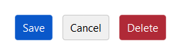
Usage#
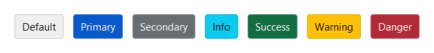
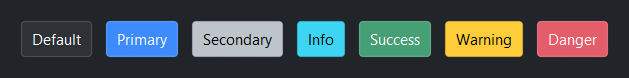
Accent colors#
Use accent= to express intent. The button renders correctly across all
themes without hard-coding any color.
bs.Button("Default")
bs.Button("Primary",   accent="primary")
bs.Button("Secondary", accent="secondary")
bs.Button("Info",      accent="info")
bs.Button("Success",   accent="success")
bs.Button("Warning",   accent="warning")
bs.Button("Danger",    accent="danger")
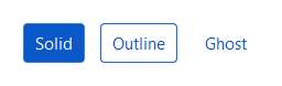
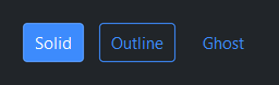
Style variants#
Use variant= to control visual weight. Useful for distinguishing primary
actions from secondary ones.
bs.Button("Solid",   accent="primary", variant="solid")
bs.Button("Outline", accent="primary", variant="outline")
bs.Button("Ghost",   accent="primary", variant="ghost")
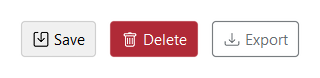
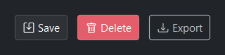
Icons#
Pass any Bootstrap Icons name to icon=.
The icon appears to the left of the text by default.
bs.Button("Save",   icon="save")
bs.Button("Delete", icon="trash",    accent="danger")
bs.Button("Export", icon="download", accent="secondary", variant="outline")
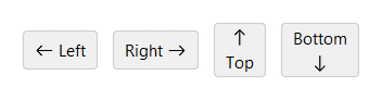
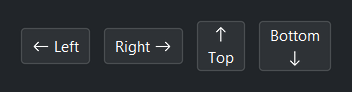
Icon position#
Use icon_position= to control where the icon sits relative to the text.
Defaults to 'left'.
bs.Button("Left",   icon="arrow-left",  icon_position="left")
bs.Button("Right",  icon="arrow-right", icon_position="right")
bs.Button("Top",    icon="arrow-up",    icon_position="top")
bs.Button("Bottom", icon="arrow-down",  icon_position="bottom")
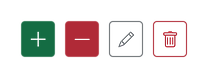
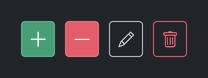
Icon-only#
Omit the text to show only the icon — icon_only is inferred
automatically. Pass icon_only=True explicitly when you want to be
clear about intent.
# icon_only inferred — no text provided
bs.Button(icon="plus-lg",  accent="success")
bs.Button(icon="dash-lg",  accent="danger")
bs.Button(icon="pencil",   accent="secondary", variant="outline")
bs.Button(icon="trash",    accent="danger",    variant="outline")

# explicit form — equivalent, states intent clearly
bs.Button("Delete", icon="trash", icon_only=True, accent="danger")
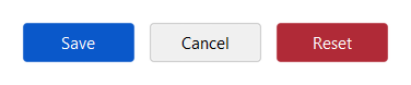
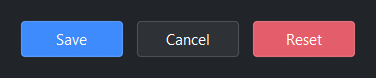
Uniform width#
Use width= (in character units) to make a row of buttons the same width.
bs.Button("Save",   accent="primary", width=10)
bs.Button("Cancel",                   width=10)
bs.Button("Reset",  accent="danger",  width=10)
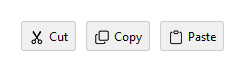
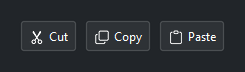
Compact density#
Use density='compact' to reduce padding — useful in toolbars where
space is tight.
bs.Button("Cut",   icon="scissors",  density="compact")
bs.Button("Copy",  icon="copy",      density="compact")
bs.Button("Paste", icon="clipboard", density="compact")
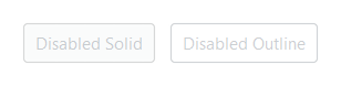
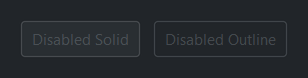
Disabled state#
bs.Button("Disabled Solid",   accent="primary",                    disabled=True)
bs.Button("Disabled Outline", accent="primary", variant="outline", disabled=True)
Reactive text#
Bind a Signal[str] to textsignal= so the button text updates
automatically.
running  = bs.Signal(False)
btn_text = bs.Signal("Start")

running.subscribe(lambda v: btn_text.set("Stop" if v else "Start"))

bs.Button(textsignal=btn_text, accent="primary",
          on_click=lambda: running.set(not running()))

# Or set directly via the .text property
btn = bs.Button("Start", accent="primary")
btn.text = "Stop"
Custom image#
Besides Bootstrap Icon names, image= accepts an image handle for custom
artwork (logos, embedded resources). The public image-handle API is being
finalized for an upcoming release; until then, prefer icon names for button
artwork.
Handling clicks#
Pass a callable to on_click= at construction, or call .on_click()
afterwards. The callback receives no arguments.
# At construction
bs.Button("Save",   accent="primary", on_click=handle_save)
bs.Button("Cancel", on_click=lambda: print("Cancelled"))

# As a subscription (cancellable)
btn = bs.Button("Save", accent="primary")
sub = btn.on_click(handle_save)
sub.cancel()  # unsubscribe

# As a Stream (composable)
btn.on_click().debounce(300).listen(lambda: handle_save())
Widget sizing#
All widgets accept self-placement kwargs via **kwargs. The parent
container determines which options apply — stack-based parents use stack
kwargs, grid-based parents use grid kwargs. Unrecognised keys are
silently ignored.
Stack#
Used inside VStack, HStack, App, and other stack containers.
|
Fill direction: |
|
Grow to consume extra space in the parent. |
|
Alignment when the widget does not fill the available slot:
|
|
External spacing in pixels. Accepts an integer (equal on all
sides), a 2-tuple |
|
Horizontal external spacing (left and right). Accepts an integer
or a 2-tuple |
|
Vertical external spacing (top and bottom). Accepts an integer
or a 2-tuple |
Grid#
Used inside a Grid container.
|
Zero-based row and column indices. |
|
Number of rows or columns to span. |
|
Alignment and fill within the grid cell. Any combination of
|
|
External spacing in pixels. Accepts an integer, a 2-tuple
|
|
Horizontal external spacing. Accepts an integer or |
|
Vertical external spacing. Accepts an integer or |
API#
The complete reference for Button lives on the
Widgets API page. At a glance:
A clickable action trigger. |
Full Example#
 1
 2with bs.App(title="Button Demo", padding=20, gap=16) as app:
 3
 4    # Accent colors
 5    bs.Label("Accent Colors", font="heading-sm")
 6    with bs.HStack(gap=8):
 7        for accent in ("default", "primary", "secondary", "info", "success", "warning", "danger"):
 8            bs.Button(accent.title(), accent=accent)
 9
10    # Style variants
11    bs.Label("Style Variants", font="heading-sm")
12    with bs.HStack(gap=8):
13        bs.Button("Solid",   accent="primary", variant="solid")
14        bs.Button("Outline", accent="primary", variant="outline")
15        bs.Button("Ghost",   accent="primary", variant="ghost")
16
17    # Icons
18    bs.Label("Icons", font="heading-sm")
19    with bs.HStack(gap=8):
20        bs.Button("Save",   icon="save")
21        bs.Button("Delete", icon="trash",    accent="danger")
22        bs.Button("Export", icon="download", accent="secondary", variant="outline")
23
24    # Icon position
25    bs.Label("Icon Position", font="heading-sm")
26    with bs.HStack(gap=8):
27        bs.Button("Left",   icon="arrow-left",  icon_position="left")
28        bs.Button("Right",  icon="arrow-right", icon_position="right")
29        bs.Button("Top",    icon="arrow-up",    icon_position="top")
30        bs.Button("Bottom", icon="arrow-down",  icon_position="bottom")
31
32    # Icon-only (icon_only inferred when no text is provided)
33    bs.Label("Icon Only", font="heading-sm")
34    with bs.HStack(gap=4):
35        bs.Button(icon="plus-lg",  accent="success")
36        bs.Button(icon="dash-lg",  accent="danger")
37        bs.Button(icon="pencil",   accent="secondary", variant="outline")
38        bs.Button(icon="trash",    accent="danger",    variant="outline")
39
40    # Uniform width
41    bs.Label("Uniform Width", font="heading-sm")
42    with bs.HStack(gap=8):
43        bs.Button("Save",   accent="primary", width=10)
44        bs.Button("Cancel",                  width=10)
45        bs.Button("Reset",  accent="danger",  width=10)
46
47    # Reactive text via Signal
48    bs.Label("Reactive Text", font="heading-sm")
49    with bs.HStack(gap=8, anchor_items="center"):
50        running  = bs.Signal(False)
51        btn_text = bs.Signal("Start")
52        running.subscribe(lambda v: btn_text.set("Stop" if v else "Start"))
53        bs.Button(
54            textsignal=btn_text,
55            accent="success",
56            on_click=lambda: running.set(not running()),
57        )
58        bs.Label(textsignal=btn_text, accent="secondary")
59
60    # Compact density
61    bs.Label("Compact Density", font="heading-sm")
62    with bs.HStack(gap=4):
63        bs.Button("Cut",    icon="scissors",  density="compact")
64        bs.Button("Copy",   icon="copy",      density="compact")
65        bs.Button("Paste",  icon="clipboard", density="compact")
66
67    # Disabled
68    bs.Label("Disabled", font="heading-sm")
69    with bs.HStack(gap=8):
70        bs.Button("Disabled Solid",   accent="primary", disabled=True)
71        bs.Button("Disabled Outline", accent="primary", variant="outline", disabled=True)
72
73app.run()