CheckButton
CheckButton is a selection control that represents an option being on, off, or mixed (indeterminate).
Use CheckButton when users can enable multiple options independently (settings, filters, feature flags).
Quick start
Use value to set the initial state.
import bootstack as bs

app = bs.App()

bs.CheckButton(app, text="Enable notifications", value=True).pack(padx=20, pady=6)
bs.CheckButton(app, text="Send anonymous usage data", value=False).pack(padx=20, pady=6)
bs.CheckButton(app, text="Apply to all", value=None).pack(padx=20, pady=6)

app.mainloop()
By default, value=None, which places the checkbutton in an indeterminate state.
When to use
Use CheckButton when:
- multiple selections may be enabled at once
- the value is on/off or mixed
- you need independent option toggles
Consider a different control when...
- only one choice is allowed in a group -> use RadioButton
- you want a dropdown list -> use SelectBox or OptionMenu
- you want a button-like toggle -> use CheckToggle
- you want a dedicated on/off switch -> use Switch
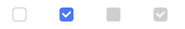
Appearance
Colors and styling
Use semantic color tokens with accent.
bs.CheckButton(app)
bs.CheckButton(app, accent="secondary")
bs.CheckButton(app, accent="success")
bs.CheckButton(app, accent="warning")
bs.CheckButton(app, accent="danger")
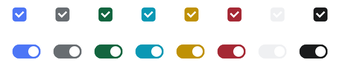
See Design System - Variants for how color tokens apply consistently across widgets.
Examples & patterns
How the value works
CheckButton uses a single logical value.
The value option sets the initial state:
True-> checkedFalse-> uncheckedNone-> indeterminate
Once bound, the signal or variable becomes the source of truth.
Value precedence
The value option is only used during initialization.
After creation, the bound signal or variable controls the widget state.
Common options
text
Label shown next to the indicator.
bs.CheckButton(app, text="Auto-sync")
command
Run a callback when the value toggles.
flag = bs.BooleanVar(value=True)

def on_toggle():
    print("now:", flag.get())

bs.CheckButton(app, text="Send notifications", variable=flag, command=on_toggle).pack(padx=20, pady=20)
state
Disable or enable the widget.
cb = bs.CheckButton(app, text="Locked", state="disabled")
cb.pack()

cb.configure(state="normal")
padding, width, underline
bs.CheckButton(app, text="Wider", padding=(10, 6), width=18).pack(pady=6)
bs.CheckButton(app, text="E_xport", underline=1).pack(pady=6)
Reacting to changes
Use command for immediate callbacks, or subscribe to the signal/variable for reactive updates.
# Using command callback
def on_toggle():
    print("toggled!")

cb = bs.CheckButton(app, text="Option", command=on_toggle)

# Using signal subscription
enabled = bs.Signal(False)
cb = bs.CheckButton(app, text="Option", signal=enabled)
enabled.subscribe(lambda v: print(f"Value: {v}"))
Validation and constraints
Validation is usually minimal for CheckButton.
Use validation when:
- the option is required to proceed
- the indeterminate state must be resolved before submission
- the selection participates in cross-field rules
Behavior
- Click toggles between checked/unchecked.
- Indeterminate behavior depends on your app logic (commonly used for "mixed" parent selections).
- Keyboard navigation follows standard ttk checkbutton behavior (focus + Space to toggle).
Localization
By default, widgets use localize="auto":
- if a translation key exists, it is used
- otherwise, the label is treated as a literal string
bs.CheckButton(app, text="settings.notifications")
bs.CheckButton(app, text="settings.notifications", localize=True)
bs.CheckButton(app, text="Notifications", localize=False)
Safe to pass literal text
With localize="auto", passing literal text is safe when no translation exists.
See Localization for configuring translations and message catalogs.
Reactivity
Prefer a reactive signal=... in v2 apps:
import bootstack as bs

app = bs.App()

v = bs.Signal("no")

cb = bs.CheckButton(
    app,
    text="Enable feature",
    signal=v,
    onvalue="yes",
    offvalue="no",
)
cb.pack(padx=20, pady=20)

app.mainloop()
You can also bind a Tk variable with variable=....
See Signals for reactive programming patterns.
Additional resources
Related widgets
- Switch - dedicated on/off switch control
- RadioButton - choose one option from a group
- RadioGroup - manage a group of radio options as one control
- CheckToggle - button-like toggle presentation
- SelectBox - select one item from a list
- Form - build grouped selection controls declaratively
Framework concepts
- Signals - reactive state management
- Localization - text translation
- Design System - color tokens and variants