Widgets
Widgets in bootstack are framework components, not raw Tk or ttk primitives.
They are designed to work together under a shared design system, consistent interaction patterns, and built-in framework capabilities—so you can compose applications quickly without reinventing UI behavior or visual structure.
What makes bootstack widgets different
Every bootstack widget is built with the assumption that:
-
visual consistency matters
-
behavior should be predictable
-
integration should be automatic
-
common patterns should not require custom glue code
As a result, widgets are opinionated by default.
You get modern behavior and appearance without needing to configure everything manually.
Framework integration
Most widgets integrate with one or more framework capabilities automatically:
-
Design System
Colors, typography, variants, spacing, and visual states are theme-driven. -
Signals & Events
Widgets can react to shared state and emit meaningful events. -
Icons & Images
Icons and images participate in theming, scaling, and caching. -
Validation
Input widgets integrate with validation rules and results. -
Localization
Text can be localized and formatted consistently. -
Layout Properties
Widgets expose declarative layout intent rather than manual geometry hacks.
You typically opt into capabilities by usage—not by wiring.
Opinionated defaults
Widgets ship with defaults chosen to match modern UI expectations:
-
sensible padding and alignment
-
readable typography tokens
-
accessible color contrast
-
consistent hover, focus, and disabled states
-
predictable keyboard and mouse behavior
You can override defaults when needed, but you don’t have to start from zero.
Declarative usage
bootstack encourages declarative composition.
Instead of:
-
mutating widget state imperatively
-
manually syncing related widgets
-
scattering callbacks across the codebase
Prefer:
-
expressing intent in constructors
-
connecting widgets through signals
-
relying on shared capabilities
This keeps applications readable and scalable.
Widget categories
Widgets are organized by intent, not by underlying Tk class:
-
Actions — buttons and controls that initiate behavior
-
Inputs — text, numeric, date, and value entry
-
Selection — toggles, radio groups, calendars, selectors
-
Data Display — lists, tables, meters, badges
-
Layout — structural containers and layout helpers
-
Navigation — tab bars, side navigation, and navigation controls
-
Views — navigational and content-switching components
-
Dialogs — modal and transient interaction flows
-
Overlays — tooltips, toasts, and ephemeral UI
-
Primitives — low-level building blocks when you need them
This categorization reflects how widgets are used, not how they are implemented.
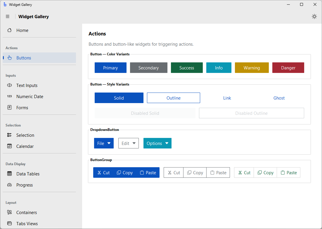
To browse all categories interactively, run:
bootstack gallery
When to use primitives
Primitive widgets exist for advanced or custom scenarios.
If you find yourself reaching for primitives often, consider whether:
-
a higher-level widget already exists
-
a pattern in the Cookbook applies
-
a new composite widget would better serve your use case
bootstack favors composition over customization.
Relationship to ttk
Under the hood, widgets build on ttk where appropriate—but that detail is intentionally abstracted.
You should not need to:
-
understand ttk element layouts
-
manage widget state flags directly
-
manually propagate styling
-
compensate for platform inconsistencies
Those concerns are handled by the framework.
Next steps
-
Browse widgets by category to explore what’s available
-
Read individual widget docs for usage and behavior
-
Learn Capabilities to understand how widgets interact
-
Use Build and Cookbook pages for real application patterns
Widgets are the visible surface of the framework—designed to let you move fast without sacrificing quality.