DateEntry
DateEntry is a form-ready calendar date input that combines a text field with a picker popup.
It behaves like other v2 entry controls (message, validation, localization, events), while making date entry fast and consistent
using a calendar picker when needed. If you are building forms or dialogs, DateEntry is usually your default date input.
Quick start
import bootstack as bs

app = bs.App()

due = bs.DateEntry(
    app,
    label="Due date",
    value="2025-12-31",
    message="Pick a date or type one",
)
due.pack(fill="x", padx=20, pady=10)

app.mainloop()
When to use
Use DateEntry when:
-
users need to enter calendar dates reliably
-
you want both typing and a picker UI
-
validation and formatting should be consistent with other field controls
Consider a different control when:
-
you need time-of-day input — use TimeEntry
-
the value is "date-like" but not an actual calendar date — use TextEntry
-
date selection should be modal (dialog-based) — use DateDialog
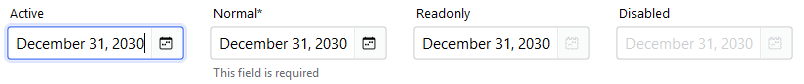
Appearance
accent
bs.DateEntry(app, label="Due date")  # primary (default)
bs.DateEntry(app, label="Due date", accent="secondary")
bs.DateEntry(app, label="Due date", accent="success")
bs.DateEntry(app, label="Due date", accent="warning")
Design System
For a complete list of available colors and styling options, see the Design System documentation.
Examples and patterns
Value model
DateEntry uses the standard text vs committed value model.
| Concept | Meaning |
|---|---|
| Text | Raw, editable string while focused |
| Value | Parsed/validated date committed on blur, Enter, or picker selection |
current = due.value
raw = due.get()
Commit semantics
Parsing, validation, and value_format are applied when the value is committed
(blur/Enter or picker selection), not while typing.
Common options
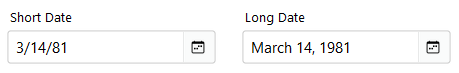
Formatting: value_format
Commit-time formatting shared with other field controls:
bs.DateEntry(app, label="Short Date", value="March 14, 1981", value_format="shortDate").pack()
bs.DateEntry(app, label="ISO Format", value="2025-01-15", value_format="yyyy-MM-dd").pack()
See Guides → Formatting for all date presets and custom ICU patterns.
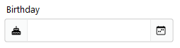
Add-ons
d = bs.DateEntry(app, label="Birthday")
d.insert_addon(bs.Label, position="before", icon="cake-fill")
Events
DateEntry emits the standard field events:
-
<<Input>>/on_input -
<<Changed>>/on_changed -
<<Valid>>,<<Invalid>>,<<Validated>>
def handle_changed(event):
    print("changed:", event.data)

due.on_changed(handle_changed)
Live typing vs commit
Use on_input(...) for live typing, and on_changed(...) for committed values.
Validation
Common validation patterns:
-
required date
-
not in the past
-
within a window (e.g., next 90 days)
d = bs.DateEntry(app, label="Date", required=True)
d.add_validation_rule("required", message="A date is required")
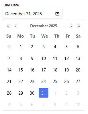
Behavior
Picker behavior
-
Click the calendar button — opens the picker
-
Click a day — commits the date and closes the popup
-
Escape — closes the popup without committing
Localization
DateEntry supports locale-aware date formatting through the value_format option. Dates are displayed according to the current locale's conventions (date order, separators, month names).
Localization
For complete localization configuration and supported formats, see the Localization documentation.
Reactivity
DateEntry integrates with the signals system for reactive data binding. Changes to the field value can automatically propagate to other parts of your application.
Signals
For details on reactive patterns and data binding, see the Signals documentation.
Additional resources
Related widgets
- TimeEntry — time input control
- TextEntry — general field control with validation and formatting
- DateDialog — modal date selection
- Calendar — standalone calendar widget
- Form — build forms from field definitions
Framework concepts
- Formatting — date presets and custom patterns
- Localization — internationalization and formatting
- Signals — reactive data binding