Color & Theming
This guide is the canonical reference for working with color in bootstack: which tokens to use on widgets, how surfaces compose, how themes map tokens to real colors, and how to switch themes (and create your own).
bootstack styling is intent-based, not value-based. Instead of telling a
widget what colour to be, you tell it what role it plays — accent="primary",
accent="danger", surface="chrome" — and the active theme decides what
that means.
# Don't
button.configure(background="#dc3545", foreground="white")

# Do
bs.Button(app, text="Delete", accent="danger")
Change the theme and every accent="danger" widget in the app updates with it.
1. Accent tokens
The accent parameter accepts semantic color tokens. Most visible widgets
accept it.
| Token | Intent |
|---|---|
primary |
Main action, brand colour |
secondary |
Supporting action |
success |
Positive outcome, confirmation |
info |
Informational |
warning |
Caution, attention needed |
danger |
Destructive action, error |
light |
Light background/text |
dark |
Dark background/text |
bs.Button(app, text="Save", accent="primary")
bs.Button(app, text="Cancel", accent="secondary")
bs.Button(app, text="Delete", accent="danger")

bs.Label(status_bar, text="Connected", accent="success")
bs.Progressbar(app, accent="info", value=40)
bs.Entry(app, accent="warning")
Accent by intent, not appearance
Pick the token that matches what the control means — not how you want it
to look. Don't reach for danger because you want red on a "Next" button.
# Bad — using "danger" for a non-destructive action
bs.Button(app, text="Next", accent="danger")

# Good
bs.Button(app, text="Next", accent="primary")
2. Variant tokens
Variants control visual emphasis — how loud a control is. Accent says "what role does this play?"; variant says "how prominent is it?".
| Variant | Effect |
|---|---|
solid |
Filled background (default) |
outline |
Border only, no fill |
ghost |
Minimal chrome, subtle hover |
link |
Text-only, like a hyperlink |
toggle |
Pressed/unpressed switch styling for CheckButton/RadioButton |
bs.Button(app, text="Primary",   accent="primary")                       # solid
bs.Button(app, text="Outlined",  accent="primary", variant="outline")
bs.Button(app, text="Ghosted",   accent="primary", variant="ghost")
bs.Button(app, text="Learn more", accent="info",   variant="link")

bs.Switch(app, text="Dark mode")
bs.Switch(app, text="Notifications", accent="success")
Use solid for the primary action, outline for secondary actions, and
ghost / link for low-emphasis ones — that hierarchy tells the reader
where to look first.
Reference
Design System → Variants lists which variants each widget supports.
3. Surface tokens
Surface tokens are semantic backgrounds for containers. They give you
predictable elevation without doing math on background[+1].
| Token | Use for |
|---|---|
content |
Main content area (same as the theme background) |
card |
Elevated content — cards, panels, inset groups |
chrome |
UI shell — sidebars, toolbars, navigation |
overlay |
Floating elements — menus, dropdowns, dialogs, tooltips |
input |
Form-control backgrounds (entries, selects) |
content_pane = bs.Frame(app,    surface="content")
sidebar      = bs.Frame(shell,  surface="chrome")
panel        = bs.Frame(parent, surface="card",  show_border=True, padding=16)
menu         = bs.Frame(top,    surface="overlay")
Each surface also has derived tokens you'll occasionally need:
on_<surface> for the foreground colour that contrasts against it,
on_<surface>_secondary for muted text on that surface, and <surface>_hover
for a subtle hover state. There are also stroke and stroke_subtle tokens
for borders.
Card is a shortcut
bs.Card(parent) is just bs.Frame(parent, surface="card",
show_border=True, padding=16). Use it when you'd type that combination
by hand.
Why surface tokens?
Surface values are deterministic per theme — every theme defines
exactly what card and chrome look like, so visual hierarchy stays
consistent across light and dark modes.
4. Color modifiers
Any colour token can be tweaked using chained bracket modifiers that run left-to-right as a pipeline.
"primary[+1]"        # one step lighter (tone)
"primary[500]"       # base shade
"primary[100]"       # light tint
"primary[subtle]"    # soft tinted background
"primary[muted]"     # low-contrast foreground
"primary[100][muted]"  # tint, then mute (chained)
Tone (+N / -N)
Tone modifiers shift lightness relative to the base.
"primary[+1]"   # lighter
"primary[-1]"   # darker
"gray[+2]"      # noticeably lighter gray
For container backgrounds, prefer surface tokens (card, chrome) over
background[+1] math — they're theme-defined and don't drift between modes.
Shades (50–950)
Each colour token has a 19-step spectrum in 50-step increments. 500 is
the base; lower numbers are tints (toward white), higher numbers are shades
(toward black).
"primary[50]"    # lightest tint
"primary[100]"
"primary[200]"
"primary[300]"
"primary[400]"
"primary[500]"   # base
"primary[600]"
"primary[700]"
"primary[800]"
"primary[900]"
"primary[950]"   # darkest shade
The intermediate stops (150, 250, 350, …) exist too. You don't need
to memorise them — pick [100]–[300] for soft backgrounds, [500]–[700]
for typical foregrounds, and let the design system handle the rest.
subtle and muted
Two semantic modifiers cover the most common UI patterns:
| Modifier | Purpose |
|---|---|
subtle |
Soft tinted background — hover states, selection highlights, banner fills |
muted |
Low-contrast foreground — secondary text, disabled states |
# Subtle backgrounds
"success[subtle]"   # light green wash for a success banner
"danger[subtle]"    # light red wash for an error banner

# Muted foregrounds
"foreground[muted]" # secondary text
"primary[muted]"    # subdued primary-coloured text
Pipeline order
Modifiers stack left to right.
"primary[100][muted]"
# 1. resolve primary[100]   (light tint)
# 2. apply muted             (reduce contrast)

"background[+1][subtle]"
# 1. resolve background
# 2. shift +1 lighter
# 3. apply subtle treatment
5. Themes
A theme is the mapping from tokens to real colours. Same widget code, different palette per theme.
Every theme defines:
| Field | Purpose |
|---|---|
name |
Unique identifier ("ocean-light") |
display_name |
Human-readable label ("Ocean Light") |
mode |
"light" or "dark" |
foreground |
Default text colour |
background |
Default surface colour |
shades |
Raw colour palette — blue, red, green, … |
semantic |
Role mappings — primary → cyan[600], danger → red[600], … |
Shades — the raw palette
{
  "shades": {
    "blue":   "#0d6efd",
    "red":    "#dc3545",
    "green":  "#198754",
    "yellow": "#ffc107",
    "cyan":   "#0dcaf0",
    "teal":   "#20c997",
    "orange": "#fd7e14",
    "purple": "#6f42c1",
    "pink":   "#d63384",
    "indigo": "#6610f2",
    "gray":   "#adb5bd"
  }
}
You define the base of each colour (the [500] value). bootstack
generates the full 19-step spectrum from there.
Semantic — role to shade
{
  "semantic": {
    "primary":   "cyan[600]",
    "secondary": "blue[600]",
    "success":   "teal[600]",
    "info":      "blue[600]",
    "warning":   "yellow[600]",
    "danger":    "red[600]",
    "light":     "gray[100]",
    "dark":      "gray[900]"
  }
}
The indirection is the point: rebrand the whole app by changing one mapping.
Light themes typically point at [600] for contrast against a light
background; dark themes typically point at [400] so colours stay readable.
Built-in themes
bootstack ships paired light/dark themes:
| Family | Light | Dark |
|---|---|---|
| Bootstrap | bootstrap-light |
bootstrap-dark |
| Ocean | ocean-light |
ocean-dark |
| Forest | forest-light |
forest-dark |
| Rose | rose-light |
rose-dark |
| Amber | amber-light |
amber-dark |
| Aurora | aurora-light |
aurora-dark |
| Classic | classic-light |
classic-dark |
List what's registered at runtime:
import bootstack as bs

for theme in bs.get_themes():
    print(f"{theme['name']:20}  {theme['display_name']}")
6. Runtime switching
At startup
app = bs.App(theme="ocean-dark")
From anywhere
import bootstack as bs

bs.set_theme("forest-light")
bs.toggle_theme()        # flip between light and dark variants
print(bs.get_theme())    # "forest-light"
light / dark aliases
"light" and "dark" are aliases that resolve to whichever themes the app
designates. Configure them through settings:
app = bs.App(
    settings={
        "theme": "dark",            # start on the dark variant
        "light_theme": "ocean-light",
        "dark_theme": "ocean-dark",
    },
)

bs.toggle_theme()  # switches between ocean-light and ocean-dark
Without those settings, "light" and "dark" resolve to the built-in
defaults (docs-light / docs-dark).
A simple toggle button:
bs.Button(toolbar, text="Toggle theme", command=bs.toggle_theme).pack()
Following the OS appearance
Set follow_system_appearance=True to track the OS light/dark mode at
runtime. Effective on macOS today; on platforms without a stable signal,
the explicit theme wins.
app = bs.App(
    settings={
        "follow_system_appearance": True,
        "light_theme": "ocean-light",
        "dark_theme": "ocean-dark",
    },
)
Reacting to theme changes
A <<ThemeChanged>> event fires whenever the theme changes. Bind to it if
you have non-widget state that needs to repaint (e.g. a custom Canvas
drawing).
def on_theme_changed(_event):
    redraw_canvas()

app.bind("<<ThemeChanged>>", on_theme_changed)
7. Custom themes
Custom themes are JSON files that follow the same schema as the built-ins.
{
  "name": "acme-light",
  "display_name": "Acme Light",
  "mode": "light",
  "foreground": "#1a1a2e",
  "background": "#fafafa",
  "white": "#ffffff",
  "black": "#000000",
  "shades": {
    "blue":   "#0066ff",
    "red":    "#e63946",
    "green":  "#2a9d8f",
    "yellow": "#e9c46a",
    "cyan":   "#00b4d8",
    "teal":   "#14b8a6",
    "orange": "#f4a261",
    "purple": "#7c3aed",
    "pink":   "#ec4899",
    "indigo": "#4f46e5",
    "gray":   "#6b7280"
  },
  "semantic": {
    "primary":   "blue[500]",
    "secondary": "gray[500]",
    "success":   "green[500]",
    "info":      "cyan[500]",
    "warning":   "orange[500]",
    "danger":    "red[500]",
    "light":     "gray[100]",
    "dark":      "gray[900]"
  }
}
Pair light and dark
If you ship acme-light, also ship acme-dark. The differences come down to:
| Light | Dark | |
|---|---|---|
mode |
"light" |
"dark" |
foreground |
dark, e.g. #212529 |
light, e.g. #f8f9fa |
background |
light, e.g. #f8f9fa |
dark, e.g. #1a1a1a |
semantic shades |
[500] / [600] for contrast |
[400] for visibility |
Register and use
import bootstack as bs

bs.register_user_theme("acme-light", "themes/acme-light.json")
bs.register_user_theme("acme-dark",  "themes/acme-dark.json")

app = bs.App(
    settings={
        "theme": "light",
        "light_theme": "acme-light",
        "dark_theme": "acme-dark",
    },
)
Picking colours from the active theme
Programmatic colour lookups go through get_theme_color (which understands
modifiers) or get_theme_provider (which exposes the full colour map).
import bootstack as bs

primary    = bs.get_theme_color("primary")
soft_card  = bs.get_theme_color("primary[subtle]")

provider = bs.get_theme_provider()
provider.colors["danger"]
provider.colors["blue[300]"]
8. Common patterns
Action hierarchy
actions = bs.PackFrame(form, direction="horizontal", gap=8)

bs.Button(actions, text="Cancel",        accent="secondary", variant="outline").pack()
bs.Button(actions, text="Save",          accent="primary").pack()
bs.Button(actions, text="Delete",        accent="danger",    variant="outline").pack()
Status indicators
bs.Label(status, text="Connected",        accent="success")
bs.Label(status, text="Warning: low disk", accent="warning")
bs.Label(status, text="Disconnected",     accent="danger")
Validation feedback on inputs
entry = bs.Entry(form)

# error
entry.configure(accent="danger")

# all good
entry.configure(accent="success")
A bordered panel
panel = bs.Card(parent, padding=16)
bs.Label(panel, text="Settings", font="heading-md").pack(anchor="w")
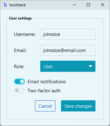
A styled form (end-to-end)
import bootstack as bs

app = bs.App(theme="ocean-light")

form = bs.LabelFrame(app, text="User settings", padding=20)
form.pack(padx=20, pady=20, fill="x")

grid = bs.GridFrame(form, columns=["auto", 1], gap=(10, 8), sticky_items='ew')
grid.pack(fill="x")

bs.Label(grid, text="Username:").grid()
bs.Entry(grid).grid()

bs.Label(grid, text="Email:").grid()
bs.Entry(grid).grid()

bs.Label(grid, text="Role:").grid()
bs.OptionMenu(grid, options=["User", "Admin", "Guest"]).grid()

toggles = bs.PackFrame(form, gap=5, fill_items='x')
toggles.pack(fill="x", pady=(15, 0))
bs.Switch(toggles, text="Email notifications").pack()
bs.Switch(toggles, text="Two-factor auth", accent="success").pack()

actions = bs.PackFrame(form, direction="horizontal", gap=10)
actions.pack(anchor="e", pady=(16, 0))

bs.Button(actions, text="Cancel", accent="secondary", variant="outline").pack()
bs.Button(actions, text="Save changes", accent="primary").pack()

app.mainloop()
9. Common pitfalls
Don't hardcode colours. Hardcoded values bypass theming entirely and break dark mode.
# Bad
label.configure(foreground="#ff0000")

# Good
bs.Label(parent, text="Failed", accent="danger")
Don't mix accent and ad-hoc background/foreground. Pick one model
per widget. ttk widgets ignore background= from a configure() call in
most cases anyway.
Always test both modes. A palette that reads well in light mode can fall apart in dark mode (or vice versa). Toggle once before shipping.
Surface tokens beat tone math. Reach for surface="card" before
background="background[+1]". Surfaces stay consistent across themes; tone
math drifts.
Pair light/dark when shipping a custom theme. Users expect dark mode. Half a theme is worse than no custom theme at all.
Related
- Design System → Colors — full token catalog and design philosophy
- Design System → Variants — variant reference per widget
- Design System → Custom Themes — what themes control conceptually
- Typography — font tokens and modifiers
- Icons — icon usage and naming