Spacing & Alignment
This guide is the practical reference for arranging widgets in bootstack: how to add space between things, how to line them up, and how to control which parts of the layout grow when the window resizes.
It is organized around the bootstack vocabulary you actually use day to day —
padding, gap, sticky_items, fill_items, column/row size specs,
auto_flow. The Tk-level mechanics (padx, pady, sticky, fill,
expand) are covered near the end as background, for when you need to drop
into raw pack() or grid().
If you have not yet picked a container, start with Layout — that guide explains which container fits your shape. This guide explains how to fine-tune the spacing and alignment inside it.
Spacing
There are two spacing controls you reach for first: padding (space
inside a container, around its children) and gap (space between
children).
padding
padding is a container property. Use it to keep children from touching the
container's edge.
import bootstack as bs

app = bs.App(title="Padding", minsize=(320, 200))

panel = bs.PackFrame(app, padding=16)
panel.pack(fill="both", expand=True)

bs.Label(panel, text="16px of breathing room on every side").pack()

app.mainloop()
padding accepts an int for uniform padding or a tuple for asymmetric
padding (padding=(left_right, top_bottom) or
padding=(left, top, right, bottom)). It works on every bootstack frame —
Frame, PackFrame, GridFrame, Card, LabelFrame.
gap
gap is a container property that sets the space between children. Set it
once on the container instead of repeating padx/pady on every child.
form = bs.PackFrame(app, direction="vertical", gap=8, padding=16)
form.pack(fill="both", expand=True)

bs.Label(form, text="Username").pack(anchor="w")
bs.Entry(form).pack(fill="x")
bs.Label(form, text="Password").pack(anchor="w")
bs.Entry(form, show="*").pack(fill="x")
bs.Button(form, text="Sign in", accent="primary").pack(anchor="e")
PackFrame applies gap along its direction (vertical → between rows,
horizontal → between columns). GridFrame accepts either an int (same gap
in both directions) or a (column_gap, row_gap) tuple:
grid = bs.GridFrame(app, columns=["auto", 1], gap=(12, 6), padding=16)
Card defaults
Card is the bootstack idiom for a grouped block with built-in spacing. Its
defaults — padding=16, accent='card', show_border=True — are what most
panels want, so you rarely need to set padding yourself when you reach for a
card.
card = bs.Card(app)
card.pack(fill="x", padx=12, pady=12)

bs.Label(card, text="Display", font="heading-sm").pack(anchor="w")
bs.CheckButton(card, text="Reduce motion").pack(anchor="w")
bs.CheckButton(card, text="Show hidden files").pack(anchor="w")
Override padding= only when the card content has its own internal layout
that already provides breathing room.
Worked example: settings panel
A typical pattern: a vertical stack of cards, each with its own grid form
inside. Container-level gap and padding mean no per-widget spacing flags.
import bootstack as bs

app = bs.App(title="Settings", minsize=(420, 360))

page = bs.PackFrame(app, direction="vertical", gap=12, padding=12)
page.pack(fill="both", expand=True)

# General card
general = bs.Card(page)
general.pack(fill="x")

bs.Label(general, text="General", font="heading-sm").pack(anchor="w")

form = bs.GridFrame(general, columns=["auto", 1], gap=(12, 8))
form.pack(fill="x", pady=(8, 0))

bs.Label(form, text="Name").grid(sticky="e")
bs.Entry(form).grid(sticky="ew")
bs.Label(form, text="Email").grid(sticky="e")
bs.Entry(form).grid(sticky="ew")

# Notifications card
notifications = bs.Card(page)
notifications.pack(fill="x")

bs.Label(notifications, text="Notifications", font="heading-sm").pack(anchor="w")
bs.CheckButton(notifications, text="Email me about activity").pack(anchor="w", pady=(8, 0))
bs.CheckButton(notifications, text="Email me about security").pack(anchor="w")

app.mainloop()
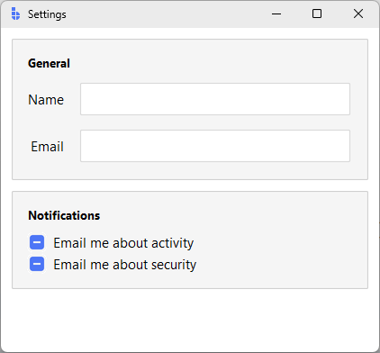
Notice spacing decisions live on the containers: the page sets gap=12
between cards, each card uses its default padding=16, and the inner grid
uses gap=(12, 8) to space label/value pairs. No widget below the
container level sets padx/pady.
Alignment
Alignment is about where in its allotted space a widget sits when there is
extra room. The relevant container properties are sticky_items,
fill_items, anchor_items, and direction.
sticky_items (GridFrame)
sticky_items sets the default stickiness for every child of a GridFrame.
Stickiness is a string of compass directions describing which sides of the
cell the widget is anchored to. Combinations stretch the widget:
| Value | Behaviour |
|---|---|
"w" |
Pinned to the left of its cell |
"e" |
Pinned to the right of its cell |
"ew" |
Stretched horizontally to fill the cell |
"ns" |
Stretched vertically to fill the cell |
"nsew" |
Filled in both directions |
grid = bs.GridFrame(app, columns=["auto", 1], gap=(12, 6),
                    sticky_items="ew")
grid.pack(fill="x", padx=12, pady=12)

bs.Label(grid, text="Host").grid(sticky="e")     # override default for label
bs.Entry(grid).grid()                             # uses sticky_items="ew"
bs.Label(grid, text="Port").grid(sticky="e")
bs.Entry(grid).grid()
Per-widget sticky= overrides the container default — useful for a single
right-aligned label in an otherwise stretching grid.
fill_items and anchor_items (PackFrame)
fill_items is the PackFrame equivalent of sticky_items. It applies
fill="x", fill="y", fill="both", or fill="none" to every child.
sidebar = bs.PackFrame(app, direction="vertical", gap=2, padding=8, fill_items="x")
sidebar.pack(side="left", fill="y")

bs.Button(sidebar, text="Inbox").pack()
bs.Button(sidebar, text="Sent").pack()
bs.Button(sidebar, text="Drafts").pack()
Because fill_items="x" is set, every button stretches to the sidebar's
width without per-widget pack(fill="x") calls.
anchor_items controls where a non-filling widget sits along the cross
axis — "w", "center", "e" for vertical packs; "n", "center", "s"
for horizontal.
header = bs.PackFrame(app, direction="vertical", padding=12, anchor_items="w")
direction (PackFrame)
direction controls both the flow axis and the order of insertion:
| Direction | Flow |
|---|---|
"vertical" / "column" |
Top → bottom (default) |
"horizontal" / "row" |
Left → right |
"row-reverse" |
Right → left |
"column-reverse" |
Bottom → top |
row-reverse is the natural fit for groups that should hug the right edge —
toolbars, status bars, dialog button rows.
Worked example: toolbar with left/right groups
A common shape: actions on the left, account controls on the right. Use a
plain Frame as the bar, then two PackFrames with side="left" and
side="right".
import bootstack as bs

app = bs.App(title="Toolbar", minsize=(560, 80))

bar = bs.Frame(app, padding=8)
bar.pack(fill="x")

left = bs.PackFrame(bar, direction="row", gap=4)
left.pack(side="left")
bs.Button(left, text="Open").pack()
bs.Button(left, text="Save", accent="primary").pack()

right = bs.PackFrame(bar, direction="row", gap=4)
right.pack(side="right")
bs.Button(right, text="Profile").pack()
bs.Button(right, text="Sign out", variant="ghost").pack()

app.mainloop()
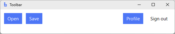
The two groups define their own internal flow with direction="row";
right-alignment of the group is handled by side="right" on the outer bar.
Sizing & expansion
Spacing and alignment decide where a widget sits inside its slot. Sizing decides how big the slot is and how leftover space is shared.
Column and row size specs (GridFrame)
GridFrame accepts a list for rows= or columns= where each entry is a
size spec:
| Spec | Meaning |
|---|---|
"auto" |
Hug the content; never grows |
"100px" |
Fixed minimum size (still grows if weighted) |
1 (int) |
Weight — share of the leftover space |
If any column has weight 0 (the default for "auto" and "100px"), it
does not absorb extra space. If multiple columns have positive weights, they
share extra space proportionally — [1, 2] gives the second column twice
the leftover width of the first.
# Sidebar: 220px, content: takes the rest.
shell = bs.GridFrame(app, columns=["220px", 1], rows=[1], sticky_items="nsew")
shell.pack(fill="both", expand=True)

# Form: label hugs its text, value takes the rest.
form = bs.GridFrame(app, columns=["auto", 1], gap=(12, 6), sticky_items="ew")
For vertical layouts the same ideas apply to rows=. A common shape is
rows=["auto", 1, "auto"] — fixed-size header, scrollable middle, fixed-size
footer.
expand_items (PackFrame)
In a PackFrame, expansion (does this widget claim leftover space along
the flow direction?) is separate from fill (does this widget stretch to
fill the slot it has?). expand_items=True makes every child expand:
columns = bs.PackFrame(app, direction="row", gap=8, padding=8,
                       fill_items="both", expand_items=True)
columns.pack(fill="both", expand=True)

bs.Card(columns)  # left
bs.Card(columns)  # middle
bs.Card(columns)  # right — three equal-width cards
fill vs expand
These two flags do different things and you usually want both for a component that should grow with the window:
fill— stretch the widget to occupy the slot it was assigned.expand— give the slot extra space when there is any.
A button with fill="x" but expand=False stretches across its slot but
never claims leftover space. A button with fill="x" and expand=True keeps
growing as the window grows.
Worked example: master-detail pane
A fixed-width sidebar plus a content area that absorbs all leftover space — the canonical desktop-app shape.
import bootstack as bs

app = bs.App(title="Master/detail", minsize=(720, 420))

shell = bs.GridFrame(app, columns=["220px", 1], rows=[1], sticky_items="nsew")
shell.pack(fill="both", expand=True)

# Sidebar: stacked buttons, all the same width.
sidebar = bs.PackFrame(shell, direction="vertical", gap=2, padding=12, fill_items="x")
sidebar.grid()

bs.Label(sidebar, text="Folders", font="label").pack(anchor="w", pady=(0, 8))
bs.Button(sidebar, text="Inbox", variant="ghost").pack()
bs.Button(sidebar, text="Sent", variant="ghost").pack()
bs.Button(sidebar, text="Archive", variant="ghost").pack()

# Detail: a card that fills the rest of the window.
detail = bs.PackFrame(shell, direction="vertical", gap=12, padding=16)
detail.grid()

bs.Label(detail, text="Inbox", font="heading-md").pack(anchor="w")
bs.Label(detail, text="No new messages.").pack(anchor="w")

app.mainloop()
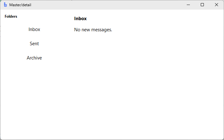
Three things make this work:
columns=["220px", 1]— the sidebar gets a fixed slot, the detail column absorbs the rest.rows=[1]— the single row has weight, so vertical resizing flows to the children.sticky_items="nsew"— children fill their cells, so the panes follow the window as it grows.
Auto-flow
When you have many same-shape children — a gallery, a tag list, a card grid —
you don't want to assign row= and column= by hand. GridFrame.auto_flow
controls how children get placed automatically.
| Value | Behaviour |
|---|---|
"row" (default) |
Fill row by row, wrap to next row when full |
"column" |
Fill column by column, wrap to next column when full |
"row-dense" |
Like "row", but back-fill earlier gaps |
"column-dense" |
Like "column", but back-fill earlier gaps |
"none" |
All children stack at (0, 0) — useful for overlays |
The dense variants matter when some children span multiple cells. Without
-dense, gaps that appear before a tall or wide tile stay empty. With
-dense, later children back-fill those gaps.
Worked example: dense gallery
import bootstack as bs

app = bs.App(title="Gallery", minsize=(560, 420))

gallery = bs.GridFrame(app, columns=4, gap=8, padding=12,
                       sticky_items="nsew", auto_flow="row-dense")
gallery.pack(fill="both", expand=True)

# Make each row stretch evenly. Rows are created on demand by auto-flow,
# so we configure weights on the GridFrame after-the-fact.
for r in range(3):
    gallery.configure_row(r, weight=1)
for c in range(4):
    gallery.configure_column(c, weight=1)

bs.Card(gallery).grid()
bs.Card(gallery).grid(columnspan=2)   # wide tile
bs.Card(gallery).grid()
bs.Card(gallery).grid(rowspan=2)      # tall tile
bs.Card(gallery).grid()
bs.Card(gallery).grid()
bs.Card(gallery).grid(columnspan=2)
bs.Card(gallery).grid()

app.mainloop()
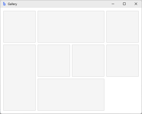
row-dense packs the small tiles around the wide and tall ones instead of
leaving holes. Switch to auto_flow="row" to see the difference.
Under the hood
PackFrame and GridFrame are built on Tk's pack and grid geometry
managers. The container properties above are higher-level vocabulary for the
same Tk options. When you need to drop down — porting old code, building a
custom container, debugging an unfamiliar layout — these are the underlying
controls.
External padding (padx, pady)
Per-widget padding outside the widget. Affects the distance to neighbours.
This is what gap is built on top of.
[ padx ][ widget ][ padx ]
bs.Button(parent, text="OK").pack(side="right", padx=8, pady=4)
padx/pady accept an int for symmetric padding or a (left, right) /
(top, bottom) tuple.
Internal padding (ipadx, ipady)
Per-widget padding inside the widget — increases the widget's drawn size.
Use padding= on the widget (when supported) before reaching for these.
[ widget ( ipadx | content | ipadx ) ]
sticky (grid)
A string of compass directions describing which sides of the cell a widget is
anchored to. Combined directions stretch the widget. This is what
sticky_items is built on; per-widget sticky= overrides the default.
bs.Entry(frame).grid(row=0, column=1, sticky="ew")
Note: a child only stretches when its column or row has weight. Without
columnconfigure(N, weight=...), sticky="ew" has nothing extra to absorb.
GridFrame's columns=[...] size specs configure these weights for you.
side, fill, expand (pack)
pack's three primary controls:
side="top"|"bottom"|"left"|"right"— which edge of the remaining space the widget is packed against.directionpicks the default for aPackFrame's children.fill="x"|"y"|"both"|"none"— stretch the widget to fill its slot.expand=True|False— make the widget claim leftover space along the pack axis.
bs.Frame(parent).pack(fill="both", expand=True)
anchor (pack)
Where a non-filling widget sits inside its slot — "n", "e", "s", "w",
their corners ("ne" etc.), or "center". anchor_items is the container
default.
When to drop to raw Tk
Reach for pack()/grid() directly when:
- You are porting existing Tk code and want to keep the original geometry calls.
- You are inside a custom widget and need full control over a small, hand-tuned layout.
- You are debugging an existing layout and want to see exactly which Tk options are in play.
- A specific child needs an option (
ipadx,before,after,in_) that the container abstractions do not surface as a default.
PackFrame and GridFrame accept all standard pack/grid options as
per-widget overrides — you can mix container-level defaults with one-off raw
options on individual children.
Common pitfalls
- Setting
sticky="ew"but the widget doesn't stretch. The column has no weight. Either pass a numeric weight incolumns=[...], or callframe.configure_column(index, weight=1). - Setting
fill="x"but the widget doesn't stretch. It does — to its slot. If you want the slot itself to grow, also setexpand=True. - Mixing
packandgridin the same container. Tk forbids it. Each container picks one. Use nested frames if you need both. - Spacing scattered across every child. Move spacing to container
properties (
gap,padding) so changing a value is a single edit. - Reading widget size in
__init__. Geometry is resolved on the next event-loop tick. Usewidget.update_idletasks()or a<Configure>binding if you need post-layout dimensions.
Next steps
- Layout — choosing between
PackFrame,GridFrame,Card, andFrame. - PackFrame and GridFrame — full parameter references.
- ScrollView — how spacing interacts with scrolling content.
- Geometry & Layout — Tk-level background on geometry managers and layout resolution timing.