Button
Buttons allow users to take actions with a single click. They communicate available actions and are commonly used throughout an interface—such as in dialogs, forms, and toolbars.
Quick start
Create a button by providing text and a command callback.
import bootstack as bs

app = bs.App()

def on_save():
    print("Saved!")

bs.Button(app, text="Save", command=on_save).pack(padx=20, pady=20)

app.mainloop()
When to use
Use a button when the user needs to trigger an action immediately, such as submitting a form, saving a change, or opening a dialog.
Consider a different control when…
- Use CheckButton / CheckToggle for persistent on/off state.
- Use RadioButton / RadioGroup for choosing one option from a set.
- Use ToggleGroup for compact single or multi selection (segmented control).
- Use MenuButton / DropdownButton when the action reveals a menu of choices.
Appearance
Buttons are styled using semantic colors and variant tokens. Variants describe visual weight and interaction style, not meaning.
See Design System → Variants for how variants map consistently across widgets.
Accents
The accent parameter accepts semantic color tokens:

bs.Button(app, text="Primary", accent="primary").pack(pady=4)
bs.Button(app, text="Outline", accent="primary", variant="outline").pack(pady=4)
bs.Button(app, text="Ghost", accent="primary", variant="ghost").pack(pady=4)
bs.Button(app, text="Link", accent="primary", variant="link").pack(pady=4)
bs.Button(app, text="Text", accent="secondary", variant="text").pack(pady=4)
Variants
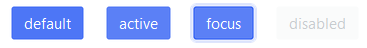
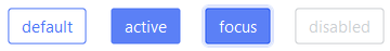
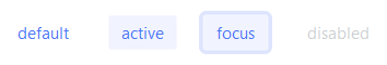
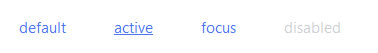
The supported variants for Button are: solid (default), outline, ghost, link, and text.
Solid (default) Use for the primary, highest-emphasis action on a view (e.g., "Save", "Submit", "Continue").
bs.Button(app, text="Solid")
Outline Use for secondary actions that should stay visible but clearly defer to the primary button (e.g., "Cancel", "Back").
bs.Button(app, text="Outline", variant="outline")
Ghost Use for low-emphasis, contextual actions embedded in panels, lists, or toolbars where the UI should stay visually quiet until hover or press.
bs.Button(app, text="Ghost", variant="ghost")
Link Use for navigation or "take me somewhere" actions that should read like text (e.g., "View details", "Open settings").
bs.Button(app, text="Link", variant="link")
Text Use for the lowest-emphasis utility actions—especially in dense UIs—where you want minimal chrome but still want button semantics (e.g., "Edit", "Clear", "Dismiss").
bs.Button(app, text="Text", variant="text")
Examples & patterns
Using icons
Icons are integrated into the button widget and provide theme-aware and state-enabled icons. The compound controls
where the icon/image is positioned relative to the label, and this is "left" by default.
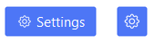
# button with label & icon
bs.Button(app, text="Settings", icon="gear").pack(pady=6)

# icon-only button
bs.Button(app, icon="gear", icon_only=True).pack(pady=6)
See Icons & Images for icon sizing, DPI handling, and recoloring behavior.
Custom Icons
You can pass an icon spec instead of a string to customize the color, size, and state of the icon. See Design System → Icons.
Disable until ready (state)
Disable a button until the user has completed a step.
btn = bs.Button(app, text="Continue", accent="primary", state="disabled")
btn.pack()

# later…
btn.configure(state="normal")
Size and emphasis (padding, width, underline)
bs.Button(app, text="Wide", width=18, padding=(12, 6)).pack(pady=6)
bs.Button(app, text="Exit", underline=1).pack(pady=6)
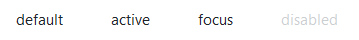
Behavior
Buttons support keyboard focus and activation.
- Tab / Shift+Tab moves focus.
- Space / Enter activates the button.
- Disabled buttons do not receive focus or emit events.
See State & Interaction for focus, hover, and disabled behavior across widgets.
Localization
If your application localization is enabled, you can pass a message token as text. The displayed label is resolved
through the active message catalog.
bs.Button(app, text="button.save").pack()
See Localization for how message tokens are resolved and how language switching works.
Reactivity
Use a signal when the label should update dynamically at runtime (for example, Start/Stop, Connect/Disconnect).
label = bs.Signal("Start")
bs.Button(app, textsignal=label).pack()

label.set("Stop")
See Signals for how signal-backed widget values and text updates work.
Additional resources
Related widgets
Framework concepts
- Design System → Variants
- Design System → Icons
- Icons & Imagery
- Signals
- Localization
- State & Interaction