Layout
This guide explains how to organize widgets on the screen—grouping, alignment, spacing, and resizing using bootstack's layout containers.
bootstack takes an opinionated approach to layout. Instead of asking you to manage low‑level geometry flags everywhere, it encourages expressing layout intent using purpose‑built containers.
Recommended approach
For most applications, you should start with bootstack's layout containers:
- PackFrame — for linear layouts (vertical or horizontal)
- GridFrame — for structured, row/column layouts
These containers are built on Tk's geometry managers, but remove much of the repetitive and error‑prone configuration
required when using pack() or grid() directly.
They are not required — but they are strongly recommended.
Choosing a layout container
PackFrame
Use PackFrame when your layout flows primarily in one direction.
Common examples:
- forms stacked vertically
- horizontal toolbars
- sidebars
- panels with simple ordering
PackFrame lets you describe what you want:
- direction (
verticalorhorizontal) - spacing between children
- whether children expand to fill available space
Instead of how to pack each widget.
import bootstack as bs
app = bs.App()
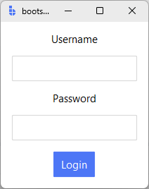
form = bs.PackFrame(app, direction="vertical", gap=8, padding=12)
form.pack(fill="both", expand=True)
bs.Label(form, text="Username").pack()
bs.Entry(form).pack()
bs.Label(form, text="Password").pack()
bs.Entry(form, show="*").pack()
bs.Button(form, text="Login", accent="primary").pack()
app.mainloop()
PackFrame is ideal when alignment between columns is not important.
GridFrame
Use GridFrame when widgets need to align across rows and columns.
Common examples:
- label–value forms
- settings panels
- dashboards
- inspector or property views
GridFrame allows you to declare:
- row and column structure
- gaps between rows and columns
- default sticky alignment
- spanning behavior
- auto-placement — row/column positions are inferred from the column count
without manually configuring every cell.
import bootstack as bs
app = bs.App()
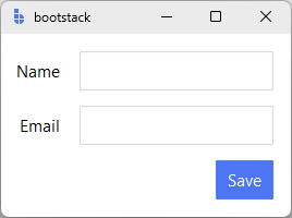
grid = bs.GridFrame(app, columns=["auto", 1], gap=(12, 6), padding=12, sticky_items="e")
grid.pack(fill="both", expand=True)
# Auto-placement: wraps to next row after filling columns
bs.Label(grid, text="Name").grid()
bs.Entry(grid).grid()
bs.Label(grid, text="Email").grid()
bs.Entry(grid).grid()
bs.Button(grid, text="Save", accent="primary").grid(columnspan=2)
app.mainloop()
GridFrame is the recommended choice when visual alignment matters.
Card
Use Card to group related content in a visually elevated container with a border.
Card is a convenience wrapper around Frame with accent='card', show_border=True, and padding=16 by default.
import bootstack as bs
app = bs.App()
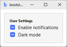
card = bs.Card(app)
card.pack(fill="x", padx=12, pady=12)
bs.Label(card, text="User Settings", font="label").pack(anchor="w")
bs.CheckButton(card, text="Enable notifications").pack(anchor="w")
bs.CheckButton(card, text="Dark mode").pack(anchor="w")
app.mainloop()
Cards are ideal for:
- grouping related form fields or controls
- visually separating sections of content
- creating panel-style layouts
Using Frame with pack or grid
Standard Tk layout using Frame with pack() or grid() is fully supported.
You may choose this approach when:
- porting existing Tkinter code
- implementing highly custom geometry behavior
- debugging layout edge cases
- learning or teaching raw Tk geometry
This approach gives you maximum control — but requires deeper knowledge of geometry flags and interactions.
frame = bs.Frame(app)
frame.pack(fill="both", expand=True)

label = bs.Label(frame, text="Hello")
label.grid(row=0, column=0, sticky="w", padx=8, pady=4)
See Spacing & Alignment for a deep dive into how pack, grid, padding, and alignment work in Tk.
Nesting containers
Nested containers are normal and expected.
Use nesting to:
- separate layout regions
- control spacing at the container level
- isolate scrolling or resizing behavior
Prefer shallow, intentional nesting over deeply nested widget‑level configuration.
grid = bs.GridFrame(app, columns=[1, 1], gap=12, padding=12, sticky_items="nsew")
grid.pack(fill="both", expand=True)

# Left column
left = bs.PackFrame(grid, direction="vertical", gap=6)
left.grid()
bs.Label(left, text="General", font="label").pack()
bs.CheckButton(left, text="Enable feature").pack()

# Right column
right = bs.PackFrame(grid, direction="vertical", gap=6)
right.grid()
bs.Label(right, text="Advanced", font="label").pack()
bs.CheckButton(right, text="Verbose logging").pack()
Method chaining
Both pack() and grid() return the widget for method chaining:
form = bs.PackFrame(app, direction="vertical", gap=8)
form.pack(fill="both", expand=True)

# Create and pack in one line, store reference
entry = bs.Entry(form).pack()

# Chain further calls
bs.Button(form, text="Submit").pack().configure(command=submit)
Scrollable layout
Scrolling is a container responsibility, not a widget responsibility.
bootstack provides composite containers such as ScrollView that:
- manage viewport and content sizing
- coordinate scrollbars
- adapt to dynamic content
- normalize mouse-wheel behavior across platforms
Widgets placed inside scroll containers should not manage scrolling themselves.
import bootstack as bs

app = bs.App()

scroll = bs.ScrollView(app)
scroll.pack(fill="both", expand=True, padx=20, pady=20)

content = scroll.add(padding=12)
for i in range(40):
    bs.Label(content, text=f"Row {i + 1}").pack(anchor="w", pady=2)

app.mainloop()
ScrollView accepts scroll_direction (vertical / horizontal / both) and
scrollbar_visibility (always / never / hover / scroll). See
ScrollView for the full parameter list.
Common pitfalls
- attaching scrollbars directly to leaf widgets — let the container coordinate
- mixing scrolling and
expand=Truesiblings without intent — only the scroll region should grow; fixed neighbors should stay sized - deeply nested layouts inside a scroll viewport — flatten where possible to keep redraw cost predictable
What layout containers do not hide
PackFrame and GridFrame do not replace Tk's geometry system.
They:
- sit on top of
packandgrid - apply structured defaults
- reduce boilerplate
You can always drop down to raw geometry managers when needed.
Understanding the underlying system remains valuable — but it does not need to be your starting point.
Common layout mistakes
- mixing
packandgridin the same container - managing spacing on every widget instead of at the container level
- over‑nesting containers without intent
- querying widget size before layout is realized
Most layout issues disappear when containers are used intentionally.
Next steps
- Spacing & Alignment - how padding, margins,
sticky, and expansion behave under the hood when using rawpackandgrid. - ScrollView - how scrolling is handled as a container responsibility.
If you're new to bootstack layout, start with PackFrame or GridFrame, then return to Spacing & Alignment only when you need finer control.