Layout & Spacing#
bootstack arranges widgets with container widgets. A container both holds
its children and decides how they are placed; a widget is parented to the nearest
enclosing container — the with block it is created in. There is no parent=
wiring in the common case and no manual coordinates.
There are three containers:
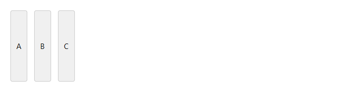
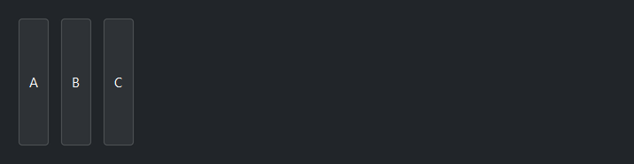
VStackstacks its children top to bottom.HStackstacks them left to right.Gridplaces them in rows and columns.
Nest them to build any layout — a toolbar (HStack) above a body (VStack),
a form laid out in a Grid, and so on.
with bs.VStack(gap=8, padding=16):
    bs.Label("Name")
    bs.TextField(fill="x")
    with bs.HStack(gap=8):
        bs.Button("OK", fill="x", expand=True)
        bs.Button("Cancel")
Spacing: padding versus gap versus margin#
Three knobs control whitespace, and keeping them straight removes most layout fiddling:
padding— space inside a container, between its edge and its children. Set it on the container.gap— space between a container’s children. Set it on the container.margin(andmargin_x/margin_y) — extra space around one child, overriding the container’sgapfor that widget. Set it on the child.
with bs.VStack(padding=16, gap=8):     # 16px inset, 8px between rows
    bs.Label("Settings", font="heading-md")
    bs.Switch("Dark mode", margin_y=12)   # extra breathing room around this one
When a widget needs different spacing on each axis, use margin_x for left/right
and margin_y for top/bottom; each also accepts a (before, after) pair for
asymmetric spacing.
fill, expand, and anchor#
These three options decide how a child sits within its parent. They are the most common source of layout surprises, so it is worth knowing exactly what each one does.
fill stretches the widget to occupy its allotted slot along an axis —
fill="x" makes it as wide as the slot, fill="y" as tall, fill="both" for
both. Without fill, a widget is only as big as its content.
expand decides whether that slot grows to claim leftover space in the
parent. expand=True shares the parent’s spare room among the expanding
children; expand=False (the default) keeps the slot at its natural size.
The two are independent, and they are most often needed together. A widget
that should soak up all remaining space needs both — expand=True to claim the
space and fill="both" to actually occupy it:
with bs.VStack(padding=8, gap=8):
    bs.Label("Header")
    bs.ListView(items=rows, fill="both", expand=True)   # takes all leftover height
    bs.Button("Add")                                    # stays its natural size
expand=True without fill centers the widget in the enlarged slot (it claims
the space but does not occupy it). fill without expand stretches the widget
within its natural slot only. Reach for both when you want a region to grow.
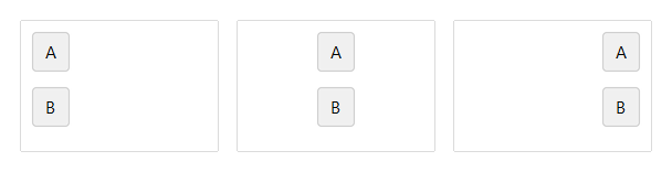
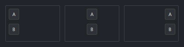
Below, three buttons share a fixed-height row; with fill on the cross axis,
each stretches to the full row height:
anchor decides where the widget sits when it does not fill its slot —
anchor="w" left, anchor="e" right, anchor="center" (the default for stacks)
in the middle. Once a widget fills an axis, anchor has nothing left to do on
that axis.
Setting defaults for all children#
Rather than repeat fill=/expand=/anchor= on every child, set the
container-level defaults fill_items, expand_items, and anchor_items once.
Any child can still override them with its own kwarg:
with bs.VStack(gap=6, fill_items="x"):    # every row fills horizontally…
    bs.TextField()
    bs.TextField()
    bs.Button("Submit", fill="none", anchor="e")   # …except this one
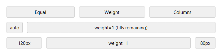
Grids#
Grid places children in cells. The columns= argument sets
the column sizing: a list of weights ([1, 2] makes the second column twice as
wide), or the shorthand columns=3 for three equal columns (0 means size a
column to its content). Children flow into cells automatically, or you can pin
them with row=/column= and span with rowspan=/columnspan=.
with bs.Grid(columns=[0, 1], gap=8, sticky_items="ew"):
    bs.Label("Name");  bs.TextField()
    bs.Label("Email"); bs.TextField()
Column weights control how the spare width is shared — a fixed column, a flexible one, and another fixed column:
In a grid, sticky replaces fill/anchor: a string of compass directions
that both aligns and stretches a child within its cell — "ew" stretches it
horizontally, "nsew" fills the whole cell. Set sticky_items on the Grid
for a default.
Bordered containers#
For a visually grouped region, use Card (an elevated panel)
or GroupBox (a labeled border). Both lay out their children
like a VStack. Give them padding — a border drawn flush against its content
looks cramped:
with bs.GroupBox("Account", padding=16, gap=8):
    bs.TextField(label="Username", fill="x")
    bs.PasswordField(label="Password", fill="x")
Common quirks#
A handful of behaviors trip people up the first time:
Stacks center their children by default. A row of buttons created directly in an
ApporVStackwill appear centered with empty space beside it. Wrap the row inHStack(fill="x")(and anchor the buttons) to left-align it — this is why button rows are almost always inside their ownHStack.Setting `width=`/`height=` on a stack collapses the other axis. A
VStackgiven a fixedheightstops stretching horizontally. Addfill=andexpand=Truefor the axis you still want to grow.`expand=True` alone looks like nothing happened. The slot grew but the widget stayed its natural size and centered. Add
fillto make the widget occupy the space you just gave it.A bordered container needs `padding`. Without it,
Card/GroupBoxdraw their border directly against the content.Unrecognized placement kwargs are silently ignored. A grid option like
stickypassed to a child inside aVStack(which usesfill/anchor) does nothing — match the option to the parent container.
Placement options reference#
Every widget accepts these self-placement options as keyword arguments. Which ones apply depends on the parent container.
All widgets accept self-placement kwargs via **kwargs. The parent
container determines which options apply — stack-based parents use stack
kwargs, grid-based parents use grid kwargs. Unrecognised keys are
silently ignored.
Stack#
Used inside VStack, HStack, App, and other stack containers.
|
Fill direction: |
|
Grow to consume extra space in the parent. |
|
Alignment when the widget does not fill the available slot:
|
|
External spacing in pixels. Accepts an integer (equal on all
sides), a 2-tuple |
|
Horizontal external spacing (left and right). Accepts an integer
or a 2-tuple |
|
Vertical external spacing (top and bottom). Accepts an integer
or a 2-tuple |
Grid#
Used inside a Grid container.
|
Zero-based row and column indices. |
|
Number of rows or columns to span. |
|
Alignment and fill within the grid cell. Any combination of
|
|
External spacing in pixels. Accepts an integer, a 2-tuple
|
|
Horizontal external spacing. Accepts an integer or |
|
Vertical external spacing. Accepts an integer or |