Composing Custom Fields#
Every bootstack field — TextField,
NumberField, DateField, and the rest —
can carry small addons inside its border: an icon, a label, a button, or an
on/off toggle, sitting before or after the input. Addons are how you turn a plain
field into a purpose-built one — a search box, a price input, a copyable key —
without writing a new widget class.
This guide builds those fields by composition. To read and bind a field’s value, see Getting Input; to arrange and validate several fields together, see Building Forms.
The addon model#
Add an addon by calling insert_addon(kind, position) on any field. There are
three kinds and two positions:
kind —
'button'(clickable),'label'(static text or icon), or'toggle'(an on/off control).position —
'before'(left of the input) or'after'(right of it).
An addon is a real widget, not a decoration. You give it text or an icon to
show and an accent for color; a button or toggle also takes an on_click
handler. Pass a name to keep a handle on it — named addons can be restyled or
removed later. The recipes below introduce each option where it earns its keep.
Labels: icons and affixes#
The simplest addon is a label — static text or an icon that describes the field
without reacting to anything. Affixes are the everyday case: a symbol on each
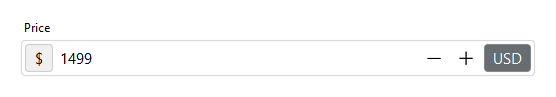
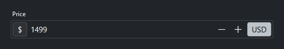
side that says what a bare value means. Frame a NumberField
with a currency symbol before the number and a unit after it, and 1499 reads as
a price:
price = bs.NumberField(value=1499, label="Price", fill="x")
price.insert_addon("label", "before", text="$")
price.insert_addon("label", "after", text="USD", accent="secondary")
The trailing unit takes a muted accent so it stays subordinate — the value, not
the label, is what the eye should land on first.
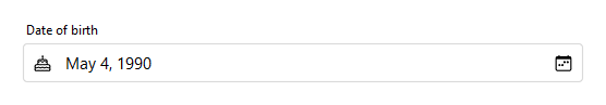
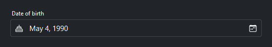
An icon label does the same job with fewer words. Dropped in front of a
DateField, a cake glyph reads as birthday on sight,
sparing you a longer caption. The call is the same on any field, text or not:
import datetime

bday = bs.DateField(label="Date of birth", value=datetime.date(1990, 5, 4), fill="x")
bday.insert_addon("label", "before", icon="cake")
Buttons: acting on the value#
A button addon runs an on_click handler — usually something that touches the
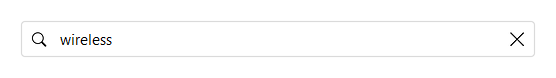
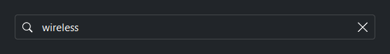
field’s value. A search box is the familiar shape: a magnifying-glass label on
the left for recognition, and a clear button on the right that empties the field:
field = bs.TextField(placeholder="Search products...", fill="x")
field.insert_addon("label", "before", icon="search")

def clear():
    field.value = ""

field.insert_addon("button", "after", name="clear", icon="x-lg", on_click=clear)
Only the button carries the handler; the leading icon is an inert label.
Giving the button a name lets you reach it again later.
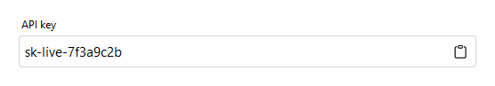
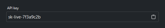
A button that changes the value, though, has no business working on a read-only
field — and by default it won’t. An addon follows its field’s read-only state and
dims along with it, which is exactly right for a clear button or the number spin
buttons. A button that only reads the value is the exception: this copy button
writes the field to the clipboard, so it opts back in with
active_when_readonly=True:
key = bs.TextField(value="sk-live-7f3a9c2b", label="API key", read_only=True, fill="x")

def do_copy():
    key.set_clipboard(key.value)

key.insert_addon("button", "after", name="copy", icon="clipboard",
                 on_click=do_copy, active_when_readonly=True)
A fully disabled field still dims every addon, the opt-in ones included —
disabled means inert, no exceptions.
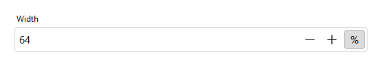
Toggles: state you can read#
A toggle addon holds an on/off state instead of firing once. Bind it to a
Signal and that state becomes readable from anywhere in your
app — here, whether a width is measured in pixels or percent:
size = bs.NumberField(value=64, label="Width", fill="x")
percent = bs.Signal(False)        # False -> px, True -> %
size.insert_addon("toggle", "after", name="unit", text="px", signal=percent)

def show_unit(is_percent):
    size.update_addon("unit", text="%" if is_percent else "px")

percent.subscribe(show_unit)
The Signal is the source of truth: the toggle flips it, and the subscriber
relabels the addon through update_addon so the button always shows the current
unit. Anywhere else in your code, percent() tells you which unit to apply.
Managing addons#
A named addon stays reachable after the field is built, so you can restyle or drop it as your state changes:
field.update_addon("clear", icon="trash", accent="danger")
field.remove_addon("clear")
field.addons               # the live addon widgets, keyed by name
update_addon changes only the options you pass and leaves the rest in place;
remove_addon detaches and destroys the addon. Reach for the addons mapping
when you need a widget directly.
Reusable fields#
bootstack has no public base class for authoring an entirely new field type — but you rarely need one. A configured field is an ordinary object, so the practical way to ship a custom input is to wrap a recipe in a function:
def search_field(**kwargs):
    field = bs.TextField(**kwargs)
    field.insert_addon("label", "before", icon="search")

    def clear():
        field.value = ""

    field.insert_addon("button", "after", name="clear", icon="x-lg", on_click=clear)
    return field

# use it like any other field
with bs.VStack(gap=8):
    query = search_field(placeholder="Search...", fill="x")
    bs.Button("Go", on_click=lambda: run_query(query.value))
search_field() returns a real TextField, so .value,
validation, and signal binding all work on it exactly as they would on a plain
field. Call it wherever you would build one.
See also#
Getting Input — reading and binding a field’s value.
Building Forms — laying out and validating groups of fields.
Validation — validation rules for field input.