Statistical plots with seaborn#
Draw seaborn’s statistical plots — bars, boxes, distributions — onto a themed, on-brand chart.
How it works#
seaborn draws onto a matplotlib Axes, and a
managed render callback hands you exactly that — so seaborn works with no
special integration. Call it with ax=ax:
import seaborn as sns

def render(ax):
    sns.barplot(data=rows, x="quarter", y="revenue", hue="region", ax=ax)

bs.Chart(render=render, grow=True)
When seaborn is installed and imported, Chart seeds its palette from the
theme’s accent colors, so a categorical plot is on-brand and flips with
light/dark — no palette= needed. Because seaborn’s plots are usually
area-filled (bars, violins, KDE), the seeded colors are softened from the full
accent saturation; tune that with seaborn_desat (0–1, default
0.75), or pass an explicit palette= to override entirely.
Note
Install the extra with pip install bootstack[viz-seaborn]. seaborn stays
off the import path — Chart only seeds its palette when you have imported
seaborn.
The same axes takes any seaborn plot — swap the one call for the chart you need:
sns.boxplot(data=rows, x="group", y="value", ax=ax)        # distributions
sns.violinplot(data=rows, x="group", y="value", ax=ax)
sns.heatmap(matrix, ax=ax)                                 # a matrix
sns.regplot(data=rows, x="x", y="y", ax=ax)                # a fit line
Example#
1
2# A small tidy dataset: revenue by quarter, split by region.
3QUARTERS = ["Q1", "Q2", "Q3", "Q4"]
4REGIONS = ["North", "South", "East"]
5DATA = {"quarter": [], "region": [], "revenue": []}
6for i, q in enumerate(QUARTERS):
7 for j, r in enumerate(REGIONS):
8 DATA["quarter"].append(q)
9 DATA["region"].append(r)
10 DATA["revenue"].append(20 + 8 * i + 5 * j)
11
12
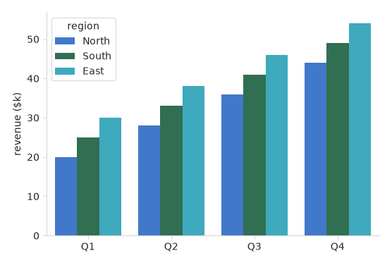
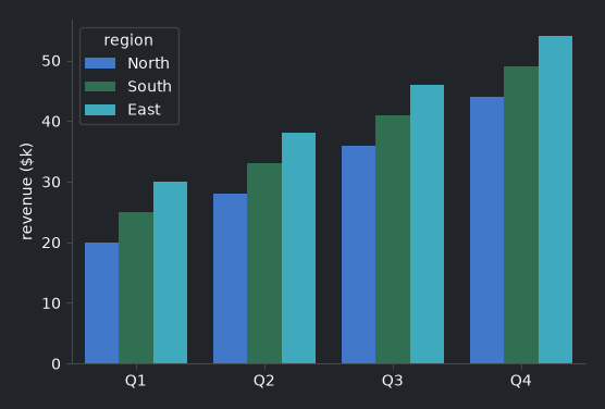
13def render(ax):
14 """A grouped bar chart — seaborn picks up the seeded accent palette."""
15 sns.barplot(data=DATA, x="quarter", y="revenue", hue="region", ax=ax)
16 ax.set_xlabel("")
17 ax.set_ylabel("revenue ($k)")
18
19
20with bs.App(title="Statistical plots", size=(640, 460), padding=16, gap=12) as app:
21 bs.Label("A seaborn bar chart, on-brand and themed", font="heading-md")
22 bs.Chart(render=render, grow=True, horizontal="stretch")
23 bs.Button("Toggle theme", on_click=bs.toggle_theme)
24
25app.run()
When to use#
Reach for seaborn when you want statistical summaries — grouped bars, box and
violin plots, heatmaps, regressions — with minimal code. For plain line/bar/
scatter plots, matplotlib alone is enough (Plotting your data). seaborn plots
are reactive too: drive them from a signal or data source exactly as in
Live and data-driven charts. Palette and seaborn_desat details are on the
Chart guide.